Abstract
To what extent did jobless Americans benefit from unemployment insurance (UI) during the COVID-19 pandemic? This article documents geographic disparities in access to UI during 2020. We leverage aggregated and individual-level claims data to perform an integrated analysis across four measures of access to UI. In addition to the traditional UI recipiency rate, we construct rates of application among the unemployed, rates of first payment among applicants, and exhaustion rates among paid claimants. Through correlations across California counties and across states, we show that areas with more disadvantaged residents had less access to UI during the pandemic. Although these disparities are large in magnitude, cross-state analysis suggests that policy can play a salient role in mitigating them.
The unemployment insurance (UI) system is a key part of the U.S. social safety net. It provides assistance to unemployed workers and becomes increasingly important during recessions, when the number of jobless workers and the time they spend unemployed increase. UI offers workers who lose their jobs both weekly payments to replace part of their lost income and assistance in finding a new job. The program can be difficult to access, however, and unemployed workers frequently do not receive benefits. For example, before the pandemic the share of all unemployed workers who received UI was only around 20 percent on average across states. Even among workers who filed for UI before the pandemic, nearly a quarter never received benefits (either because they were denied benefits or quickly found a new job) in California.
Researchers have studied the disparate impacts of both formal and informal barriers to access on different types of workers during periods before the COVID-19 pandemic (Blank and Card 1991; Anderson and Meyer 1997). For example, formal eligibility rules require workers to have earned a minimum level of income to qualify for the program. Informal administrative burdens also prevent otherwise eligible workers from receiving benefits such as language or technological assistance. These hurdles can prove to be significant barriers for workers from disadvantaged backgrounds (O’Leary, Spriggs, and Wandner 2021; Shaefer 2010).
The unprecedented surge in job losses and UI claims during the COVID-19 pandemic, and the surge in unemployment among lower-wage workers from sectors directly affected by the pandemic, refocused these long-standing concerns about equity and access to the UI system (see, for example, White House 2021). In response to the pandemic, states eased certain formal eligibility rules, such as job search requirements, that could improve access for some workers, but public health orders that closed government offices could exacerbate the informal barriers to access for others. Additionally, federal policymakers created new programs that increased the duration and generosity of UI benefits, which could have affected workers differently.
This article makes three contributions toward measuring disparities in access to UI during the COVID-19 pandemic. First, we introduce a broader conceptual framework to track a jobless worker’s access to UI benefits across the main stages in the lifecycle of a potential UI claim. Second, we use publicly available UI claims data and confidential administrative claims data from California to build and refine measures for each of our four stages of access across states and at more local levels within California. Third, we use these measures to document key patterns of community-level disparities in access to UI during the pandemic by correlating them with state- and county-level attributes reflecting policy regimes and socioeconomic characteristics, among others.
We find that, on average, access to UI increased substantially during the pandemic, but that differences in access were significant across states and demographic groups. During the pandemic, the share of unemployed workers receiving UI (called the recipiency rate) reached 60 percent on average across the United States, up from around 20 percent before the pandemic. However, the pandemic also saw substantial variation in recipiency rates across states, from over 90 percent in California to less than 25 percent in Florida. We also find that states with higher average incomes and lower Black population shares have higher recipiency rates and that states with more generous UI policies, such as alternate base periods and longer potential benefit durations, have higher recipiency rates. The correlation between policy and access indicates that states may have a great deal of discretion in how generous they make access to UI, and that state UI programs could support a larger share of unemployed workers if the state chose to.
We find similar demographic patterns within California where counties with higher incomes saw higher recipiency rates and counties with more Black and Hispanic residents had lower recipiency rates. We provide additional evidence on differences in access across the three other stages of access described in our conceptual framework, but they are broadly consistent with the recipiency rate findings that more advantaged groups have higher access and states with more generous policies have greater access. Despite the disparities in access, the overall increase in recipiency rates in our results and the poverty reduction benefits found in Marianne Bitler, Hilary Hoynes, and Diane Schanzenbach (2023, this issue) indicates that the UI system responded well to the challenges of the pandemic and effectively provided support to many distressed workers.
For this analysis, we use public data from the U.S. Department of Labor (DOL) Employment and Training Administration and the Current Population Survey (CPS) as well as our team’s unique access to California’s UI claims micro data, facilitated by a partnership with the state’s Employment Development Department (EDD). We combine these data with detailed demographic, labor market, and public health characteristics across states for the entire United States and at the county level in California. We also collected information on state-level differences in the UI programs and states’ tax and benefit systems.1
UI SYSTEM DURING THE PANDEMIC AND CONCEPTUAL FRAMEWORK
In the United States, the unemployment insurance system is operated by the states within a federal framework. As a result, states can differ in eligibility requirements or benefit generosity. In general, if a worker loses their job through no fault of their own and has earned a minimum level of income (known as the monetary eligibility limit), in a certain base period, they are eligible to receive payments that replace a portion of their previous income (weekly benefit amount, or WBA) for a certain number of weeks (potential benefit duration, or PBD). Some restrictions are universal across programs, for example self-employed workers and undocumented workers are not eligible for UI in any state. Further, all states have work search rules that require claimants to prove they are searching for work for each week that they receive benefits.
However, many other aspects of the program differ across states. Eligibility can vary on four attributes. First are differences in the minimum income a worker had to earn to be eligible for the program (the monetary eligibility limit). Second are differences in the type of employment covered, such as the treatment of agricultural workers differs across states. Third are differences in the types of transitions to unemployment that are covered; for example, in some states a worker who quit their job to move to the state for their spouse’s job can be eligible for UI. Fourth are differences, once a worker enters the UI system, in the number of work search activities they are required to do to maintain eligibility. Last, as true of other social insurance programs, are differences less easily quantified but that can influence accessibility, including technology, staffing levels, and internal procedures. In addition to differences in eligibility criteria, other characteristics of the program, such as the maximum WBA or the total PBD, differ across states and may influence which workers apply to UI (differences in UI programs across states, published each year, see DOL 2021a).
California provides a useful example of how the UI system operates. First, a worker had to be in a job that is covered by the UI system, meaning they are not self-employed (small business owners) or contractors (Uber drivers), and they had to be working legally (are not undocumented immigrants). They had to lose their job through no fault of their own, which means they could not quit their job or be fired for cause. As noted, the details of who is eligible based on the type of employment and how they lost their job can be different in California than in other states.
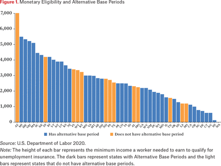
In addition, they have to meet California’s monetary eligible limit on earnings in a base period to be eligible for UI. In California, the base period is the first four of the last five completed calendar quarters before application to UI. The monetary eligibility limits are that a worker either had to earn at least $1,300 in their highest earning quarter or $900 in their highest earning quarter and $1,125 in the entire base period. If they do not meet the criteria in the standard base period, they can use an alternate base period (ABP), which applies the same monetary thresholds to the last four completed calendar quarters. Monetary eligibility limits and whether a worker can use an ABP varies by state. Figure 1 shows how monetary eligibility differs by state and which states allow ABPs.
Monetary Eligibility and Alternative Base Periods
Source: U.S. Department of Labor 2020.
Note: The height of each bar represents the minimum income a worker needed to earn to qualify for unemployment insurance. The dark bars represent states with Alternative Base Periods and the light bars represent states that do not have alternative base periods.
After workers meet these criteria, they are eligible for UI and receive a WBA and a PBD. In California, the WBA is equal to 50 percent of weekly wages in the worker’s highest earning quarter up to a limit of $450. This upper limit varies by state, Massachusetts having an upper limit of $850 and Louisiana having an upper limit of only $221. In California, a worker’s PBD will be between fourteen and twenty-six weeks. Although the maximum PBD in most states is twenty-six weeks, in some states it is substantially lower, Georgia and Alabama providing only fourteen weeks. To continue receiving benefits each week, claimants have to report their work search activities. California does not specify the number or type of work search activities that must be taken, but some states do, Utah, for example, requires four job searches each week.
During the pandemic, federal and state policymakers introduced a large number of temporary changes to the program. Federal policymakers introduced the Pandemic Emergency Unemployment Compensation (PEUC) program that provided additional weeks of UI to claimants who used all their regular UI benefits. They also provided supplemental weekly payments that added either $300 or $600 to claimants’ normal WBAs. They introduced a new insurance program called the Pandemic Unemployment Assistance (PUA) program that provided benefits to workers who are normally not eligible for regular UI such as self-employed workers. In addition to federal benefit extensions, in many states workers exhausting their regular UI benefits had access to the Extended Benefits (EB) program. The EB program varies across states but typically provides between thirteen and twenty weeks of additional UI benefits when a state’s unemployment rate rises above a certain level (for a discussion of the program, see Bell et al. 2022).
State policymakers also made temporary changes to the programs; for example, nearly all states suspended work search requirements at the beginning of the pandemic. Although these temporary federal programs had uniform eligibility rules, the ability to access them varied across states, partly due to administrative difficulties in implementing them, partly to existing differences in eligibility and access. Moreover, states ended reliance on these programs and reintroduced job search requirements at different times as the pandemic evolved.
Conceptual Framework
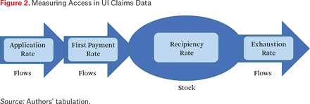
To study access to unemployment insurance, this article relies on an integrated conceptual framework for measuring community-level access based on four metrics—a traditional measure that considers the stock of workers receiving UI and three new measures based on flows of workers entering and exiting the UI system. Figure 2 provides a high-level overview of our data-driven framework.
Measuring Access in UI Claims Data
Source: Authors’ tabulation.
Our framework begins with the traditional measure of UI access, the recipiency rate. The recipiency rate is the share of unemployed (or underemployed) workers in a given week who were collecting regular UI benefits. In this article, given issues of data quality, we focus only on measuring the recipiency rate of regular UI, not of PUA. Further details on why we exclude PUA and how we implement this and other measures is provided later in the article.
The first of our three flow measures in the framework is the application rate, which begins at the point of a job separation.2 On becoming unemployed, the unemployed worker chooses whether to file a new initial claim for UI benefits. The rate at which they do so is our earliest measure of access. Completion of this step requires the worker to know about the UI system, comprehend the language in which the application is written, and in many cases (particularly during the pandemic) perform an identity verification check involving a smartphone with a camera. In general, the recipiency rate will be higher whenever the application rate is higher.
The second flow measure of our model starts after an unemployed worker has filed a new initial claim. We then check to see the rate at which new initial claims are paid at least once. Reasons for a claim to be rejected can be either monetary (such as insufficient prior earnings) or nonmonetary (such as quitting a job without good cause). We define this measure of the rate at which new initial claimants receive a first payment as the first payment rate.3 Although for the limited scope of this article we refer to the share of claims paid as a measure of access, in future work this measure can be further refined by removing from the denominator any claimants whose claim was not paid because the claimant found alternative work. As true of the application rate, the recipiency rate will be higher whenever the first payment rate is higher, all else equal.
Whereas the first two flow measures represent workers entering UI, the last measure represents unemployed workers leaving UI. The exhaustion rate measures the share of workers who received UI and used all the benefits for which they were eligible. The exhaustion rate is a useful measure of access because it reflects how fully insured workers were against the length of job loss they experienced. Still, like first payment rates, exhaustion rates are not solely a measure of access because they can also be influenced by claimant decisions around searching for and returning to employment. Future work should examine the reemployment prospects of workers who exhausted benefits during the pandemic. In contrast to the previous two flow variables, the recipiency rate will be higher when the exhaustion rate is lower.4
OPERATIONALIZING THE MEASURES OF ACCESS
The data for this article stems from the DOL and California’s EDD. Data from the DOL was taken from its Office of Unemployment Insurance through the publicly available Data Downloads portal on the office’s website, which is updated daily (DOL 2021b). The data extracted from this portal dates to 1984 and includes state-level employment information for all fifty states. The variables in these extracted datasets are reported on either a weekly or monthly basis. Several of our measures combine variables within the DOL data, such as our first payment rate.
For our within-California analysis, we use administrative data from EDD on initial and continuing claims. The initial claims data include all claims filed in the state of California. For each claim, the dataset has information on the date of claim filing, the benefit amount, and demographics, among other information. The continuing claims data include payments information for all claims filed in the state of California. The continuing claims data also contains information about the last payment of each claim for all available programs, allowing us to measure exhaustion rates. The administrative data on continuing claims and exhaustions offers several measurement advantages over the publicly available DOL data we describe in the appendix. Table 1 describes at a high level how each of the four measures of access are operationalized in the DOL and EDD datasets.
Definitions of Key Access Measures, Employment Development Department, and Department of Labor
Finally, the PUA program is excluded from the analysis because the high levels of reported fraud make it difficult to estimate how many workers actually used the program. For example, in California, the PUA program accounted for 95 percent of all identified fraudulent claims in the state. Additionally, the DOL has also said that the program was more vulnerable to fraud (for detail on California, see EDD 2021a). How the PUA program affected access to UI is an important topic, which we will return to later when discussing avenues of future research.
Measurement of Recipiency Rates
We measure the UI recipiency rate as the number of people collecting regular UI benefits divided by the number of U-6 (Unemployment) unemployed workers in an area. The numerator is the number of people collecting regular UI benefits, and is taken from both the DOL for the state-level analysis and EDD for the within-California analysis. The denominator is the number of U-6 unemployed derived from the Current Population Survey.5
Our numerator excludes claimants receiving PUA benefits, not only to reduce complications related to reports of fraudulent PUA claims in certain states, but also because some PUA claimants may be working reduced hours for noneconomic reasons, and thus would not be included in the denominator (for CPS definitions of unemployment, see BLS 2021).6 Furthermore, many business owners would be counted as employed if they worked just a single hour during the CPS reference week, but would still be eligible to receive PUA benefits if their business was affected by the pandemic (for California, see EDD 2021b; for the United States, see BLS 2021). Thus, by focusing just on claimants receiving regular UI benefits, we are able to form a more apples-to-apples comparison (for more on the construction of the measures, see table A.1).
Measurement of Application Rates
Whereas our analysis of recipiency rates during the pandemic focused on December 2020, when analyzing application rates we focus on claimants during the first half of 2020. This timing better aligns with when the pandemic-driven surge of unemployment began and peaked.
At present, we are able to measure application rates only at the state level. Our baseline measure of application rates at the state level divides the number of new initial claims in a state by the number of total separations in that state and month as reported by the Job Openings and Labor Turnover Survey (JOLTS) administered by the Bureau of Labor Statistics.7 The appendix provides details on alternative measures of the application rate that we use in robustness checks.
Measurement of First Payment Rates
Our state-level measure of first payment rates from the DOL data is constructed by dividing the total number of first payments in each state in each month by the total number of new initial claims in each state in each month.8 In the individual-level EDD data, the first payment rate is constructed by measuring the share of new initial claimants in each month who eventually receive a first payment, regardless of when that payment is made. Similar to the application rate, the first payment rate is also measured during the first half of 2020 to align with the surge in new initial claims filed. The appendix provides additional detail on two important caveats of this analysis when applied to the DOL data that can be assessed and remedied with microdata when the analysis focuses on California.
Measurement of Exhaustion Rates
Exhaustion rates have proven particularly difficult to measure, especially in the DOL data. Whereas the term exhaustion has at times been used to refer to claimants who exhausted their regular nonextension state UI benefits and moved on to extension programs, in this article we define exhaustions as those cases in which a claimant has exhausted all available UI benefits (including PEUC and EB), which is a more meaningful measure of access given policy changes during the pandemic.
The numerator of our exhaustion rate is an estimate of the number of claimants in a week who exhausted the final week of regular UI benefits available to them (including PEUC and EB). The appendix provides details on how the number of exhaustions is generated in the DOL and EDD data.
Whereas the numerator of our exhaustion rate in either dataset derives from the issuance of final payments, a question remains about what an appropriate at-risk group should serve as the denominator. In the DOL data, we use the number of continuing claimants as a denominator with which to construct an exhaustion rate. This choice of denominator is chosen largely for convenience. The aggregated nature of the DOL data makes it nearly impossible to relate the number of claimants who exhaust in a given week to any other group that is plausibly at risk of exhausting.
In the EDD microdata, we are able to construct two separate measures of exhaustion. In addition to relating the number of individuals exhausting benefits in a given week to the total number of individuals receiving benefits in that week (to compare with DOL results), we also see what share of claimants who established benefit years in a given week have eventually exhausted benefits. We call this measure the cohort exhaustion rate. In calculating the cohort exhaustion rate, we count all exhausted claimants within a cohort and report that number by date of the established benefit year. In the other measure, we report the number of exhausted claimants (regardless of their cohort) by the week they experienced exhaustion.
DESCRIPTIVE STATISTICS ON MEASURES OF ACCESS
Table 2 presents descriptive statistics on our four access measures from the EDD and DOL datasets for California. We present means of each measure before and during the pandemic, in the first weeks of December 2019 and 2020. Because the structure of data in DOL and EDD are different, we did not expect to observe identical estimates. Despite these differences, the estimates are in general reasonably close.
Comparisons of Key Access Measures, EDD, and DOL
The only case in which the EDD estimate is significantly larger (32 percent) is the exhaustion rate in 2020. In this case, we suspect our approach in the DOL data underestimates the exhaustion rate. To calculate the number of claimants exhausting in the DOL data, we use the number of final payments for the program that would be the last one available to most claimants, which was EB in December 2020. This likely misses some claimants who exhausted PEUC and were not eligible for EB (for more on EB eligibility in California, see EDD 2021c).
Aside from exhaustion rates, the remaining EDD estimates are about 5 to 10 percent smaller than DOL. The main differences in estimates for recipiency rates and 2019 exhaustion rates arise from the fact that the DOL data for continuing claims are reported by the processing week whereas EDD uses the week of unemployment to count continuing claims. Finally, the basis of discrepancy in the first payment measure is that in the EDD data we link individual-level data for new claimants to payment information to find the first payment rate; however, in the DOL data, we rely on aggregate monthly numbers.
RECIPIENCY RATES AMONG THE UNEMPLOYED
Recipiency Rates Across the United States
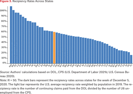
Across the United States, we estimate that 60 percent of Americans who were unemployed in December of 2020 collected regular UI benefits.9 Figure 3 shows that the national average masks substantial heterogeneity across states. In some states—such as Minnesota, Massachusetts, New York, and California—the number of UI claimants was essentially comparable to the number of people thought to be unemployed (a recipiency rate of at least 90 percent). In contrast, Tennessee, Idaho, Nebraska, and Florida all saw recipiency rates of less than 25 percent, meaning that even at the height of the pandemic, the vast majority of unemployed workers were not collecting benefits.10
Recipiency Rates Across States
Source: Authors’ calculations based on DOL, CPS (U.S. Department of Labor 2021b; U.S. Census Bureau 2020).
Note: N = 50. The dark bars represent the recipiency rates across states for the week of December 5, 2020. The light bar represents the U.S. average recipiency rate weighted by population in 2019. The recipiency rate is the number of continuing claims paid from the DOL divided by the number of U6 unemployed from the CPS.
To clarify the sources of this state-level variation, figure 4 presents correlations of recipiency rates with other state-level policy and socioeconomic factors. On the socioeconomic side, states that experienced higher recipiency rates during the pandemic tended to be wealthier, as evidenced by a strong positive correlation with median household income. States that had a higher Democratic vote share in the last presidential election also had higher recipiency rates. States with higher shares of Black residents had lower recipiency rates during the pandemic. This pattern shines light on racial disparities in access to the UI system documented by a growing historical and qualitative literature (Edwards 2020; Fields-White et al. 2020).11 A number of state-level policies were also strongly predictive of differences in recipiency rates. States that afforded claimants longer PBDs had substantially higher recipiency rates, as did states that allow the use of alternative base periods to establish monetary eligibility. States with public sick or paid leave programs also had higher rates of recipiency, which in this case could reflect that states with generous UI policies also have other generous labor-related policies.12 After including the vote share control the paid leave coefficient drops from 0.48 to 0.09 and loses significance. This provides some support for the theory that the bivariate correlations between sick or family leave and recipiency rates simply reflect more generous labor and UI policies overall. Although this is not a causal analysis, the correlations suggest significant scope for state-level policies to affect access to UI, and that states’ differing policies have resulted in geographic disparities in access to UI during the pandemic.13
Recipiency Rates Across States, Correlations
Source: Authors’ calculations based on DOL, CPS, ACS (U.S. Department of Labor 2021b; U.S. Census Bureau 2019, 2020).
Note: N = 50. Each dot represents the correlation between the covariate and recipiency rate in December 2020 weighted by population in 2019. All variables are measured at the state level. Error bars represent the 95 percent confidence interval. The recipiency rate is the number of continuing claims paid from the DOL divided by the number of U6 Unemployed from the CPS. For more details of covariates, see online data appendix.
Although these findings are correlational, the magnitudes of the correlations of recipiency rates with policy variables are substantial in many cases. Consider, for instance, the cross-state relationship observed between state PBD and recipiency rates. In December of 2020, the state UI maximum PBD in North Carolina was twelve weeks, whereas Massachusetts offered up to thirty weeks.14 Unsurprisingly, recipiency rates were substantially lower in North Carolina than in Massachusetts—44 percent versus 102 percent. Suppose that the observational correlation between state maximum PBD and recipiency were causal. If all states had a PBD of thirty weeks, the national recipiency rate would grow from 60 percent to 77 percent—a 28 percent increase. This would result in about three million more jobless workers collecting UI benefits each week, totaling about $1.7 billion in benefits. Online appendix table 2 shows that the association between the PBD and recipiency rates is robust to the inclusion of economic, demographic, and other policy controls, but nonetheless, such a calculation should be interpreted with caution as there are many other factors that differ across states. Still, the magnitude of this difference suggests likely great scope for state-level policies to influence recipiency rates during the pandemic.
Insights from California
Measuring recipiency rates for regions within California is an important but difficult task. Although we have precise measures of how many Californians collected benefits from a given geographic unit, estimating the number of unemployed workers in that place at that time is more cumbersome. In this analysis, we rely on official county-level estimates from the Bureau of Labor Statistics Local Area Unemployment Statistics (LAUS). However, estimating recipiency rates this way is far from ideal because—given the small sample size of the Current Population Survey—the LAUS estimates for unemployment at the substate level rely on certain measures of UI claims themselves (for more, see BLS 2022a). Although we have contrasted the LAUS county unemployment rates to comparable estimates based on the CPS microdata and found them to be similar, the fact remains that for many smaller geographic units the estimates are based on small samples and hence are prone to statistical noise. For this reason, the county-level estimates of UI recipiency rates presented below should be interpreted with caution.15
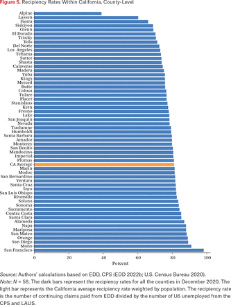
Analogous to figure 3, figure 5 shows how recipiency rates varied within California. Based on the comparisons of UI claimants to LAUS unemployment rates (rescaled to mirror U-6), Los Angeles County has by far the lowest recipiency rate among large counties in California. Figure 5 also demonstrates substantially less variation in recipiency rates across counties than across states.16 This could be a consequence of the UI program parameters being constant across counties, but substantially different across states.
Recipiency Rates Within California, County-Level
Source: Authors’ calculations based on EDD, CPS (EDD 2022b; U.S. Census Bureau 2020).
Note: N = 58. The dark bars represent the recipiency rates for all the counties in December 2020. The light bar represents the California average recipiency rate weighted by population. The recipiency rate is the number of continuing claims paid from EDD divided by the number of U6 unemployed from the CPS and LAUS.
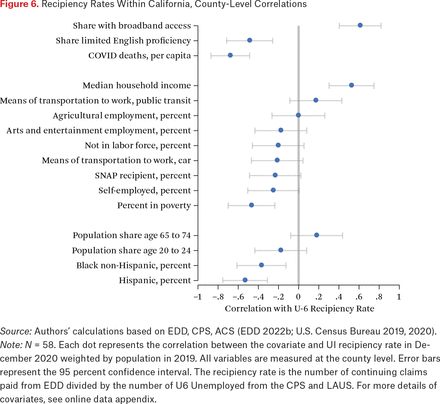
Figure 6 shows county-level correlations of recipiency rates with socioeconomic indicators. Similar to states, higher-income counties also saw higher rates of UI recipiency. Counties with higher rates of COVID-19 deaths saw lower rates of recipiency, as did counties with higher shares of Hispanic residents. Counties with more broadband access had substantially higher rates of UI recipiency, which points to the importance of technological gaps in access to UI during the pandemic. Counties with more residents with limited English proficiency also had lower rates of UI recipiency, suggesting that language barriers may also have played a role in limiting access. Many of these correlational findings corroborate more qualitative conclusions on the role that barriers to access during the pandemic have played in widening racial disparities, including stigma, burdens to produce documentation, and the digital divide (Fields-White et al. 2020). Although an authoritative dissection of the roots of these differences is beyond the scope of this article, a growing body of quantitative and qualitative evidence suggests that both legal eligibility and more nuanced barriers to accessibility of UI have played important roles in determining UI recipiency rates.
Recipiency Rates Within California, County-Level Correlations
Source: Authors’ calculations based on EDD, CPS, ACS (EDD 2022b; U.S. Census Bureau 2019, 2020).
Note: N = 58. Each dot represents the correlation between the covariate and UI recipiency rate in December 2020 weighted by population in 2019. All variables are measured at the county level. Error bars represent the 95 percent confidence interval. The recipiency rate is the number of continuing claims paid from EDD divided by the number of U6 Unemployed from the CPS and LAUS. For more details of covariates, see online data appendix.
Given the stark differences across geographic regions in UI recipiency rates, we next turn to analyzing geographic differences in rates of first payments.
APPLICATION RATES AMONG THE UNEMPLOYED
Application Rates Across the United States
At the national level, we estimate that 83 percent of workers who were separated from their employer in the first or second quarter of 2020 filed an unemployment insurance claim. The application rate varied substantially across states, from 63 percent to 87 percent. These estimates should be interpreted with some caution because we are relating separations in a month to new initial claims in a month even though the claims filed could be the result of separations in a previous month.17 One additional note of caution is that the high application rates in 2020 could be explained by high levels of fraud that was reported during the pandemic (Podkul 2021). Nevertheless, figure 7 shows the spread of application rates across states in the first half of 2020. Among the states that had the highest share of separated workers filing new claims were Georgia, Oklahoma, New York, Alabama, and Louisiana; among those that had the lowest share were South Dakota, Utah, Wyoming, and Colorado. Interestingly, some of the states with the highest application rates, such as Georgia, Oklahoma, Alabama, and Louisiana, also had some of the lowest first payment rates.18 This pattern is consistent with high levels of fraudulent claims in some states being appropriately rejected and leading to lower first payment rates.
Application Rate, Across States
Source: Authors’ calculations based on DOL, ACS, JOLTS (U.S. Department of Labor 2021b; U.S. Census Bureau 2019, BLS 2022c).
Note: N = 50. The dark bars represent the application rates across states for the first and second quarter of 2020. The light bar represents the U.S. average application rate weighted by population in 2019. The application rate is the number of new UI claims from the DOL divided by the number of separations from JOLTS.
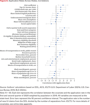
Figure 8 explores disparities in application rates by measuring the correlation between application rates and a set of state-level characteristics.19 Some state-level policies are statistically significantly correlated with application rates. States that either fully or partially suspended work search requirements were correlated with higher application rates. Although we cannot interpret this relationship as causal, one hypothesis that could be tested further is that suspending work search requirements could have encouraged people who were no longer in the labor force to file claims thereby raising the new UI claims without increasing new separations. In contrast to the other three other measures of access, economic affluence was not associated with greater application rates in 2020. Similarly, the share of the state that is Black is actually associated with greater application rates even though it is typically associated with lower access in the other three measures.
Application Rates Across States, Correlations
Source: Authors’ calculations based on DOL, ACS, JOLTS (U.S. Department of Labor 2021b; U.S. Census Bureau 2019, BLS 2022c).
Note: N = 50. Each dot represents the correlation between the covariate and the application rate in the first and second quarter of 2020 weighted by population in 2019. All variables are measured at the state level. Error bars represent the 95 percent confidence interval. The application rate is the number of new UI claims from the DOL divided by the number of separations from JOLTS. For more details of covariates, see online data appendix.
FIRST PAYMENT RATES AMONG CLAIMANTS
First Payment Rates Across the United States
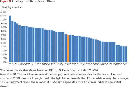
At the national level, we estimate that about 70 percent of new initial claims filed in the first two quarters of 2020 resulted in first payments. This measure of access varied dramatically across states, although this calculation shows noise in the DOL data because we are relating first payments issued in a month to new initial claims filed in a month (which are not necessarily the same claims). Still, figure 9 shows that states essentially span the entire range, from nearly 40 percent to approximately 100 percent.20 Among the states that paid the highest share of claims in the first half of 2020 were Virginia, Kansas, Iowa, and Hawaii; Montana, Arizona, and Georgia were among the lowest.
First Payment Rates Across States
Source: Authors’ calculations based on DOL (U.S. Department of Labor 2021b).
Note: N = 50. The dark bars represent the first payment rate across states for the first and second quarter of 2020 (January through June). The light bar represents the U.S. population weighted average. The first payment rate is the number of first claim payments divided by the number of new initial claims.
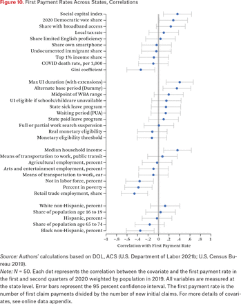
Figure 10 shows how the heterogeneity in first payment rates covaries with our set of state-level covariates. Certain state-level policies appear to relate to first payment rates in the expected directions. In states that allow claims to be established under alternative base period formulas, more claimants get paid. Although states with longer UI durations also see a larger share of claimants paid, we do not detect a significant correlation between the share of claimants paid and monetary eligibility thresholds. This is surprising given that a higher monetary eligibility threshold implies that (all else equal) fewer claimants are monetary eligible and therefore fewer claims will receive a first payment.21 However, a claim could go unpaid for other reasons, including nonmonetary eligibility criteria, short unemployment spells, or claimants failing to certify for benefits. These scenarios may be less common in states with higher monetary eligibility thresholds. Ultimately, the large variation in first payment rates across states and correlation with policy variables implies that state governments have a great deal of discretion in how generous they want to make access to UI. Another example is the use of facial recognition tools such as ID.me for identity verification, which may have helped reduce fraud but also made it harder for people to legitimately access benefits. In response, some states stopped using ID.me and others continued, illustrating the discretion that states have in making it easier or harder for unemployed workers to access benefits. Massachusetts, for example, stopped in early 2020 (Sokolow 2022).
First Payment Rates Across States, Correlations
Source: Authors’ calculations based on DOL, ACS (U.S. Department of Labor 2021b; U.S. Census Bureau 2019).
Note: N = 50. Each dot represents the correlation between the covariate and the first payment rate in the first and second quarters of 2020 weighted by population in 2019. All variables are measured at the state level. Error bars represent the 95 percent confidence interval. The first payment rate is the number of first claim payments divided by the number of new initial claims. For more details of covariates, see online data appendix.
In general, states that paid a higher share of claims during the start of the pandemic tended to be more affluent (as measured by median household income or poverty rates) and slightly more economically unequal (evidenced by the negative correlation of first payment rates with the Gini coefficient). States with a higher share of Black workers paid out significantly lower shares of claims, though we did not detect a significant correlation with Hispanic share.
Insights from within CA
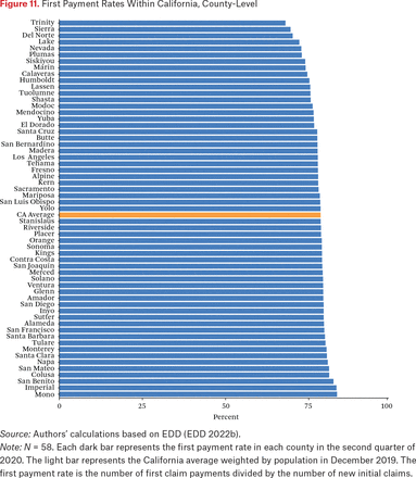
Relative to the amount of variation in first payment rates across states, the variation in first payment rates across California’s counties is more modest. The sample of the first payment analysis includes claimants with regular new initial claims in the second quarter of 2020. Figure 11 plots the rate of first payments in each of California’s fifty-eight counties. Trinity County saw the lowest rate of first payments in the second quarter of 2020 (about 68 percent); Sierra, Del Norte, and Lake also had low rates. Among the counties with the highest share of claims paid were Mono, Imperial, and San Benito (83, 83, and 82 percent, respectively). Los Angeles County, which ranked among the lowest counties in terms of recipiency rates as benchmarked in relation to LAUS estimates of unemployed people, ranked near the middle in terms of the share of claims from its residents that have been paid.
First Payment Rates Within California, County-Level
Source: Authors’ calculations based on EDD (EDD 2022b).
Note: N = 58. Each dark bar represents the first payment rate in each county in the second quarter of 2020. The light bar represents the California average weighted by population in December 2019. The first payment rate is the number of first claim payments divided by the number of new initial claims.
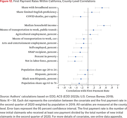
Figure 12 correlates counties’ first payment rates with our standard county-level set of covariates. By several measures, more affluent counties saw substantially higher rates of payments. Counties with higher-income and fewer Supplemental Nutrition Assistance Program recipients or those in poverty saw higher rates of payments among claimants. We also detect a positive relationship between broadband access and first payment rates.
First Payment Rates Within California, County-Level Correlations
Source: Authors’ calculations based on EDD, ACS (EDD 2022b; U.S. Census Bureau 2019).
Note: N = 58. Each dot represents the correlation between the covariate and the first payment rate in the second quarter of 2020 weighted by population in 2019. All variables are measured at the county level. Error bars represent the 95 percent confidence interval. The first payment rate is the number of new initial claimants who received at least one payment divided by the total number of new initial claimants in the second quarter of 2020. For more details of covariates, see online data appendix.
Having established geographic heterogeneity in the rate at which first payments were issued during and before the pandemic, the final stage of our analysis turns to exhaustion rates.
EXHAUSTION RATES
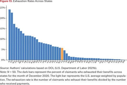
We estimate that in the first week of December of 2020, approximately 6 percent of Americans who were claiming UI benefits exhausted their benefits. The exhaustion rate varied substantially across states; Florida and Georgia, for example, saw more than 20 percent of their claimants exhausting. In contrast, about half of states saw exhaustion rates of 3 percent or less. The top five states with the most exhaustions in December 2020 were Georgia, Texas, Florida, North Carolina, and California, and together they accounted for 52 percent of all exhaustions nationwide that month. Figure 13 plots a bar graph of exhaustion rates across states.
Exhaustion Rates Across States
Source: Authors’ calculations based on DOL (U.S. Department of Labor 2021b).
Note: N = 50. The dark bars represent the percent of claimants who exhausted their benefits across states for the month of December 2020. The light bar represents the U.S. average weighted by population. The exhaustion rate is the number of claimants who exhaust their benefits divided by the number who received payments.
A wide variety of socioeconomic and policy variables are significant predictors of differences in state-level differences in exhaustion rates during the pandemic. Figure 14 presents these correlations. Of the covariates we studied, the strongest predictor was the maximum duration of UI benefits. Exhaustion rates were lower in states with more generous benefits (either in terms of duration or levels) and those that provided workers with sick leave programs (which may have functioned as alternatives to UI). In general, exhaustion rates were also substantially lower in more Democratic-leaning states and states with more high earners. Rates were slightly higher in states with more Black residents and older residents.
Exhaustion Rates Across States, Correlations
Source: Authors’ calculations based on DOL and ACS (U.S. Department of Labor 2021b; U.S. Census Bureau 2019).
Note: N = 50. Each dot represents the correlation between the covariate and the exhaustion rate in December 2020 weighted by population in 2019. All variables are measured at the state level. Error bars represent the 95 percent confidence interval. The exhaustion rate is the number of claimants who exhaust their benefits divided by the number who received payments. For more details of covariates, see online data appendix.
Insights from within CA
For our within-California analysis, we put forward two distinct measures of exhaustion rates. To mirror the definition of exhaustion rates we were able to operationalize in the DOL data, we first divide the number of claimants who exhausted UI in a given week by the total number of claimants who certified that week. Conceptually, this ratio is difficult to interpret. Although each claimant can count at most once in the numerator (during the week of exhaustion), the same individual would count toward the denominator for multiple weeks (during each week claimed). A more readily interpretable statistic is the share of UI entrants in a given week who will eventually exhaust UI. Because this statistic counts each claimant exactly once in the denominator (during the week of entry), it is more accurate. For the same reason, the more accurate measure tends to be higher than the traditional measure. A potential drawback is that it cannot be implemented nationally with available data.
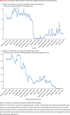
Figure 15 plots how these two definitions of exhaustion rates have evolved in California during the pandemic. Whereas the number of California’s claimants exhausting each week has typically amounted to less than 1 percent of that week’s continuing claimants (panel A), a different story emerges when analyzing exhaustees as a share of the weekly entry cohort (panel B). Among Californians whose benefit years began during the pandemic, between 10 and 20 percent of these claimants have already exhausted benefits as of the end of June 2021. However, we anticipate these cohort exhaustion rates to rise considerably as time goes on because this analysis does not take into account the large effects the recent September 2021 benefits expiration had on these cohorts.22
Exhaustion Rates Within California, Weekly Resolution, 2019–present
Source: Authors’ calculations based on EDD (EDD 2022b).
Note: N = 79. The line in panel A represents the number of claimants who exhausted benefits each week as a percentage of the number of continuing claims each week; the figure does not include claimants who only ever received PUA benefits. The line in panel B shows the share of all claimants who entered UI each week and who ultimately received all the benefits they were eligible for before and during the pandemic.
So far, our cohort-level exhaustion rate estimates during the pandemic have been somewhat lower than what prior literature has found during past recessions, though direct comparisons are difficult because our analysis focuses on California whereas other work has estimated national averages. Walter Nicholson and Karen Needels (2006) look at cohort exhaustion rates during recession years between 1970 and 2003. They show that the (national) exhaustion rate for the early 2000s recession was on average 32 percent. In general, it is difficult to predict the direction of exhaustion rates during recessions because when unemployment duration increases, the benefit duration also increases because of extension programs.
Andreas Mueller, Jesse Rothstein, and Till von Wachter (2016) estimate cohort exhaustion during the Great Recession. They show that, at the beginning of the recession, exhaustion rates decreased because of Extended Benefits, but eventually they started to increase because of the rise of unemployment durations.
Our estimates for cohort exhaustion rates in 2020 must be interpreted with caution because as of June 2021 a vast number of claimants still have remaining benefit durations. Ending extension benefits in September 2021 without a correspondingly meaningful decrease in unemployment duration will likely increase the cohort exhaustion rates significantly for 2020 cohorts.
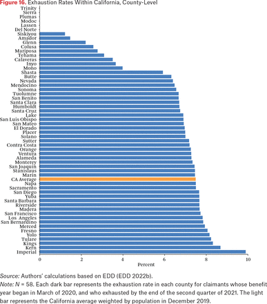
In contrast to our cross-state analysis of exhaustions as a share of continuing claimants in December 2020 in the DOL data, when examining geographic differences in exhaustion rates within California, we analyze the cohort-specific exhaustion rates of claimants who entered UI in March 2020. Figure 16 plots cohort exhaustion rates by county in California. Some of the highest rates of exhaustion among March 2020 entrants were in the counties of Imperial, Kern, and King.
Exhaustion Rates Within California, County-Level
Source: Authors’ calculations based on EDD (EDD 2022b).
Note: N = 58. Each dark bar represents the exhaustion rate in each county for claimants whose benefit year began in March of 2020, and who exhausted by the end of the second quarter of 2021. The light bar represents the California average weighted by population in December 2019.
Figure 17 describes how exhaustion rates vary across counties in relation to our standard set of county-level covariates. Exhaustion rates have been substantially higher in counties with more limited-English speakers, as well as those that reported more COVID-19 deaths. Poorer counties have also seen higher rates of exhaustion, as have those with higher share of Black or Hispanic residents. Interestingly, whereas states with more elderly residents had higher exhaustion rates, we find within California that counties with more elderly residents have substantially lower exhaustion rates.
Exhaustion Rates Within California, County-Level Correlations
Source: Authors’ calculations based on EDD and ACS (EDD 2022b; U.S. Census Bureau 2019).
Note: N = 58. Each dot represents the correlation between the covariate and the exhaustion rate weighted by population in 2019. All variables are measured at the county level. Error bars represent the 95 percent confidence interval. The exhaustion rate is the number of claimants whose benefit year began during the week of March 15, 2020 or March 22, 2020, and exhausted benefits by the second quarter of 2021, divided by the number of total claimants whose benefit year began those weeks. For more details of covariates, see online data appendix.
CONCLUSION
Using a broader set of measures that move beyond and complement the traditional measure of UI recipiency, this article examines the geographic correlates of access to regular UI during the pandemic. We generated four measures of access to UI that can be operationalized in commonly accessible datasets based on public DOL aggregated data: application rates, first payment rates, recipiency rates, and exhaustion rates. In the context of California, we have validated and explored extensions to these measures using UI claims microdata. We produced these measures for the pandemic period, before the vaccine rollout from March to December 2020.
Several key patterns have emerged when comparing our measures of UI access during the pandemic across states and across counties within California. Across states, a clear pattern emerges that residents of states with more generous UI policies have seen higher rates of UI access during the pandemic. Demographic and socioeconomic patterns have also emerged, both across states and within California. Our metrics of access to UI generally indicate higher access in areas with more affluent residents, more access to broadband internet, and more English-speaking residents, and less access in areas with more Black or Hispanic residents. The findings are strongly suggestive that policy has played an important role in driving disparities in access to UI across states. Further research would be needed to establish a causal link between particular policies, programs, or practices and differences in UI access. This is of course a difficult question, given that policies themselves may be affected by the fundamental forces helping to determine UI access.
The potential impact of state policies and the substantial discretion states have in choosing program parameters and administrative procedure within the federal framework has implications for efforts to improve access to the UI program nationwide. In the past, the federal government has provided monetary incentives to encourage states to make their programs more inclusive. The ongoing disparities provide some support to the notion that stronger federal guidelines, or the establishment of federally managed components (such as a common application portal), may be required to broaden access to UI throughout the country.
Several important questions remain. A key question for future research will be how access to unemployment insurance changed when several states terminated PEUC and PUA early in the summer of 2021. Similarly, more research will be needed to understand the impacts of the September 2021 benefits expiration. Comparing the magnitudes of these turn-offs to those of the Great Recession would be useful in this context. Additionally, the data used in this article are also not recent enough to ascertain how vaccination efforts have affected the role of UI in the economy. Also, research into how the PUA program has shaped access to UI during the pandemic would be valuable. Researchers should estimate recipiency rates of PUA, with a focus on self-employed workers and wage workers not eligible for regular UI. Comparisons of the effect of the PUA program on labor supply choices would also be valuable for policymaking. Finally, this analysis is largely cross-sectional in that it compares differences in access across space. Given the vast number of state-level policy changes (such as changes in benefit levels or durations, changes in monetary and nonmonetary eligibility), that have occurred during the decades for which data are available, additional work implementing difference-in-differences strategies would provide policy-relevant estimates of the effects of UI policy changes on various measures of access.
APPENDIX
This appendix discusses in greater depth the various measures used in this study and mentioned in this article.
Recipiency Rates
We measure the UI recipiency rate as the number of people collecting regular UI benefits divided by the number of U-6 unemployed workers in an area. In the EDD data, the number of people collecting benefits in a week is defined as the number who were paid for unemployment experienced in a given week, regardless of when the benefits were paid. This definition more accurately represents the number of unemployed people receiving UI benefits in a given week, and is the natural counterpart to the number of unemployed people as measured in survey data (Bell et al. 2022). In contrast, in the DOL data, the number of people collecting benefits in a week corresponds to the number of payments that were issued that week for regular state UI, PEUC, or EB.23 Discrepancies can arise when a large number of individuals file and are paid for multiple weeks retroactively. During the crisis, this led to large discrepancies between the two measures; before the crisis, however, the number of payments issued in a given week was on average similar to the number of individuals receiving payments for unemployment in a given week (for more, see Bell et al. 2022).
Our denominator—an estimate of the number of people who experienced unemployment in a week—is derived from CPS microdata. We use the so-called U-6 measure of unemployment, which is broader than the traditional number of unemployed published by the Bureau of Labor Statistics, also called U-3. As we discuss elsewhere in our series of unemployment policy briefs, we use this broader measure to account for the fact that workers working part time involuntarily can receive UI benefits, and that during the crisis, individuals available for work but not actively searching for a job could receive UI benefits.24
Application Rates
In addition to our baseline specification that normalizes new initial claims by total separations, we also assess robustness of results to two alternative denominators. First, because an employee would separate from an employer for many reasons that would not constitute basis for a UI claim—most quits—we also evaluate robustness to using layoffs from JOLTS as the denominator rather than the broader category of total separations. Second, whereas the JOLTS data is derived from firm-level surveys, we also constructed an alternative denominator from the CPS worker-level survey. In particular, we evaluated robustness of our correlational results to normalizing new initial claims relative to CPS respondents in a state who reported having been unemployed for less than five weeks. Although the levels of the three measures differ—total separations showing the largest counts—we did not detect meaningful differences in the spatial correlations when applying different denominator measures.
First Payment Rates
First, in the DOL data, payment timing issues are substantial. We are only able to look at each state’s number of first payments issued in a given month relative to the number of new initial claims filed in that month. To the extent that not all first payments are paid in the month in which the claim was filed, we expect this measure to be relatively noisy at the state level, which would be a particular problem near the start of the pandemic, when long payment lags were common. This timing issue can help explain the inflated (greater than 100 percent) first payment rates reported in figure 12. This is not an issue in the EDD data, where we can see whether each individual received a first payment regardless of when the claim was filed or the first payment received.
Second, during the pandemic cases are likely in which a claim does not result in a first payment under the regular UI program, but the claimant is later able to receive payment under the PUA program. In the DOL data, we are unable to account for these cases because we cannot observe whether the same person applied for, or was paid under multiple programs. In the individual-level analysis from EDD, we drop anyone who ever filed a PUA claim so as to make this measure comparable across time, given that the PUA program did not exist before the pandemic. An important avenue for future work, which is beyond the scope of this article, is to document the role the PUA program played in expanding access to UI.
Exhaustion Rates
During periods when no extensions are available, the number of people exhausting is the number of final payments issued for the regular UI program.
When extensions are available, we follow different strategies in the two datasets to count exhaustions. In the DOL data, we infer exhaustions based on the number of final payments made under the program that we believed was the last extension program available to most claimants at the time. For instance, because claimants in California were eligible for Extended Benefits during most of the pandemic, we infer the number of exhaustions based on the number of final payments for EB processed that week.25 In the EDD data, we improve on this measure by counting exhaustions as the co-occurrence of two separate events. The first event is that a final payment flag was set for a particular UI program, and the second is that another payment does not follow within four weeks.26 Similar to the other access measurements in this analysis, we study only regular (non-PUA) claimants. However, in the EDD data, in cases when claimants receive their last regular payment and then transit to PUA within four weeks, we do not count them as exhausted because they are still receiving payments—just under a different program. The number of such cases is small, but including them improves the accuracy of our exhaustion rate measurement.
In either dataset, counts of exhaustions should be handled with caution. As pandemic-era extensions have temporarily lapsed and restarted, it is possible that some claimants may be coded as having exhausted, but have in reality been eligible to resume collecting payments after new policies came into effect. Furthermore, even if a claimant exhausts all of their benefits available under one benefit year, if their earnings were high enough, they may be able to establish a new claim. Moreover, the data for exhaustion analysis is up to June 2021. Changes in extension programs afterward will likely affect our estimates.
Correlations Among Key Access Measures, December 2020
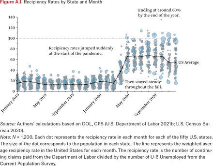
Recipiency Rates by State and Month
Source: Authors’ calculations based on DOL, CPS (U.S. Department of Labor 2021b; U.S. Census Bureau 2020).
Note: N = 1,200. Each dot represents the recipiency rate in each month for each of the fifty U.S. states. The size of the dot corresponds to the population in each state. The line represents the weighted average recipiency rate in the United States for each month. The recipiency rate is the number of continuing claims paid from the Department of Labor divided by the number of U-6 Unemployed from the Current Population Survey.
Recipiency Rates by County and Month
Source: Authors’ calculations based on EDD, CPS (EDD 2022b; U.S. Census Bureau 2020).
Note: N = 1,798. Each dot represents the recipiency rate in each month for each of the fifty-eight counties in California. The size of the dot corresponds to the number of U-6 unemployed in each county. The line represents the weighted average recipiency rate in California for each month. The recipiency rate is the number of continuing claims paid from Employment Development Department divided by the number of U-6 unemployed from the Current Population Survey and Local Area Unemployment Statistics.
FOOTNOTES
↵1. Our online appendix (https://www.rsfjournal.org/content/9/3/78/tab-supplemental) contains more details on data sources of socioeconomic and policy variables. We draw on the work of many others, including Raj Chetty, John Friedman, and colleagues (2020); Raj Chetty, Nathaniel Hendren, and colleagues (2014); Alix Gould-Werth and H. Luke Shaefer (2013); Cassidy Viser and colleagues (2021); Pew Research Center (2019); New York Times (2021); and Cook Political Report (2021).
↵2. Not all separations result in a worker being qualified for UI. In robustness checks, we define this event more stringently in terms of layoffs.
↵3. Although the focus here is whether claims are paid, important questions have arisen during the pandemic concerning the timeliness of payments (for more, see Century Foundation 2022).
↵4. In table A.1, we show that the raw correlations between the recipiency rate and other three measures of access are consistent with the mechanisms described here.
↵5. If a substantial number of workers receive partial UI for noneconomic reasons, the recipiency rate could rise above 100 percent (as seen in figure 3), because these workers can collect UI (and thus be counted in the numerator), but because their reduced hours are for noneconomic reasons, they may not be counted as unemployed in the CPS. Furthermore, because DOL’s continuing claims are reported in the week payments are processed, and not the corresponding week of unemployment, some state-level estimates of recipiency may be artificially high or low, depending on the backlog of claims in the state. This timing issue is discussed in the appendix.
↵6. In addition, certain states had substantial delays in reporting PUA claims, particularly in the first several months of the pandemic.
↵7. The number of new initial claims has been a small subset of the number of initial claims during most of the pandemic. For a more detailed investigation of the ways in which initial claims overstate entrances to unemployment, see Bell et al. 2021.
↵8. For the full definition of a new initial claim in California, see EDD 2022a. In general, one can divide initial claims into two main categories: new initial claims and additional claims. New initial claims correspond to “an application for the establishment of a benefit year,” and an unemployed person who wants to collect UI benefits must file a new initial claim. Additional claims correspond to claimants who experience an interruption in their benefit certification for one or more weeks because they are employed. Claimants still must be within their benefit year and have remaining benefits to file an additional claim. Because additional claims represent only re-entries to UI, we exclude them from our analysis and focus on new initial claims.
↵9. Figure A.1 shows that this U-6 recipiency rate in December 2020 is a large increase from the pre-pandemic period, when the U-6 recipiency rate was around 20 percent. In December 2020, the average U-3 recipiency rate was near 100 percent (see figure OA1 in the online appendix). Averaging across the year, DOL estimates that the U-3 recipiency rate for the country was 78 percent, a substantial increase from 28 percent in 2019, and 24 percentage points above the previous peak of 54 percent, occurring in 1952 (DOL 2004).
↵10. Figure A.1 demonstrates how this state variation changed over time.
↵11. An original aim of this study was to quantify the extent to which racial and ethnic disparities at the national level could be explained by low rates of access in states with certain racial and ethnic demographic compositions. We were unable to answer this question because the race and ethnicity information contained in the DOL data are not comparable with the race and ethnicity information available in the Current Population Survey (from which unemployment estimates are constructed).
↵12. Regressing the recipiency rate on a dummy for whether a state has sick or family leave policies and Democratic vote share as a signal for more generous UI policies provides a limited test of this hypothesis (see table OA1 in the online appendix).
↵13. Figure OA2 plots the correlations between each covariate and the U3-based version of the recipiency rate (see online appendix). The results are nearly identical.
↵14. The Massachusetts UI PBD increases from twenty-six to thirty weeks when unemployment is high.
↵15. In our ongoing series of policy briefs, we compare geographic patterns of recipiency rates using the LAUS county-level definition of unemployment to the tract-level unemployment estimates near the start of the pandemic (Ghitza and Steitz 2020). We have not detected meaningful differences in the spatial correlations using either measure of unemployment.
↵16. Figure A.2 also demonstrates how this county variation changed over time.
↵17. For example, a large increase in separations at the end of a month could lead to a large increase in new UI claims filed at the beginning of the next month depending on how long it takes a worker to file for UI after separating from their employer.
↵18. Georgia’s high application rate is possibly the result of their unique PUA application process. In Georgia, applicants who wanted to sign up for PUA benefits had to first apply and be rejected for regular UI benefits before applying for PUA; in other states, applicants could directly apply for PUA benefits. This would mechanically increase the application rate and decrease the first payment rate in Georgia.
↵19. Figures OA3 and OA4 depict the same correlations but using the alternative layoffs and recently unemployed denominators discussed in the measurement appendix (see online appendix). The pattern of results is very similar.
↵20. That some states are above 100 percent is an artifact of how DOL reports claims filed in a month and claims paid in a month, but these are not necessarily the same claims. This is a limitation we face in our cross-state analysis but not in our within-California analysis relying on microdata.
↵21. A monetary eligibility threshold is the minimum amount of earnings that a jobless worker must have earned in the base period to establish a UI claim. The monetary eligibility threshold in January 2020 ranged from $130 in Hawaii to $7,000 in Arizona.
↵22. We do not estimate the cohort exhaustion rate at the state level. To estimate the cohort exhaustion rate, one needs to find the size of each cohort and the number of exhausted claimants in the related cohort. To calculate such a rate, we need to make assumptions based on PBD. The main reason for avoiding using DOL data to calculate cohort exhaustion rate is the substantial disparities in PBD, especially after COVID under extension programs.
↵23. Georgia and Florida did not report any PEUC claims during 2020.
↵24. According to the BLS definition, the U-6 measure of unemployment includes workers who fall under the traditional measure of unemployed (U-3), along with those working part time for economic reasons and with those marginally attached to the labor force. We supplement the U-6 measure to include workers the BLS believes may have been misclassified as employed despite not being at work during the reference week for reasons related to the pandemic (These workers instead should have been classified as unemployed on temporary layoff). We follow the methodology outlined in question 5 of the December Employment Situation FAQ to adjust our unemployment estimate for these misclassifications (BLS 2022b). In the text, when we refer to using U-6, we reference this adjusted version of U-6, which includes these misclassified workers. The BLS does not publish a monthly estimate of U-6 at the state level, so the study team generated a measure of U-6 for California based on the CPS micro data following the definition of the national U-6 measure. Although we use U-6 exclusively for the main analysis, we also calculate state recipiency rates using U-3 unemployment and present the figures in the online appendix. Results using either measure are typically similar and comparisons are highlighted in the notes throughout the recipiency rate section.
↵25. This is a less-than-ideal approximation, as not all claimants are eligible for EB. For instance, our earlier work found that approximately 7 percent of those claimants who would have exhausted regular UI benefits in December of 2020 had PEUC not been extended then would have not been eligible for EB (Bell et al. 2020).
↵26. In the EDD data, both the final payment flag and gap weeks in payment are based on the week of unemployment.
- © 2023 Russell Sage Foundation. Bell, Alex, Thomas J. Hedin, Peter Mannino, Roozbeh Moghadam, Geoffrey Schnorr, and Till von Wachter. 2023. “Disparities in Access to Unemployment Insurance During the COVID-19 Pandemic: Lessons from U.S. and California Claims Data.” RSF: The Russell Sage Foundation Journal of the Social Sciences 9(3): 78–109. DOI: 10.7758/RSF.2023.9.3.04. The California Policy Lab produced the figures and calculations through an ongoing partnership with the Labor Market Information Division of the California Employment Development Department. Any statements should only be attributed to the California Policy Lab, and do not reflect the views of the Labor Market Information Division of the California Employment Development Department. The calculations were performed solely by the California Policy Lab, and any errors or omissions are the responsibility of the California Policy Lab, not of the Labor Market Information Division of the California Employment Development Department. We thank the participants of the RSF Socioeconomic Impacts of COVID-19 conference for their valuable feedback on this project. We also thank Matthew Forbes and Ziqi Zhao for providing helpful research assistance. Direct correspondence to: Till von Wachter, at tvwachter{at}econ.ucla.edu, 283 Bunche Hall MC 147703, Los Angeles, CA 90095, United States.
Open Access Policy: RSF: The Russell Sage Foundation Journal of the Social Sciences is an open access journal. This article is published under a Creative Commons Attribution-NonCommercial-NoDerivs 3.0 Unported License.


