
Abstract
Traditionally, prisoner reentry has been regarded as an urban phenomenon, with most returning prisoners concentrating into a select few disadvantaged urban neighborhoods. However, metropolitan-area changes—including the demolition of public housing, the suburbanization of poverty, and desegregation—may have altered the prevailing spatial distribution of returning prisoners, thereby spreading the challenges of prisoner reintegration to new geographic domains. Accordingly, I examine the extent to which the geographic distribution of formerly incarcerated individuals in Chicago and Illinois has changed since the late 1990s, including both the causes and consequences of changes, drawing on sixteen years of prisoner release data from the Illinois Department of Corrections, combined with data from the U.S. Census, the American Community Survey, the Chicago Police Department, and the Chicago Housing Authority.
From 1925 to 1975, the imprisonment rate in the United States hovered around 110 per hundred thousand residents (Maguire 2010). The remarkable stability of the imprisonment rate occurred across both prosperous and recessionary periods as well as in times of war and of relative peace. However, since the mid-1970s, the use of imprisonment in the United States has skyrocketed to previously unfathomable levels (for example, see Blumstein and Cohen 1973), leading David Garland to coin the term mass imprisonment to characterize the colossal shift in the scale of the use of imprisonment (2001). The imprisonment rate currently stands at approximately five hundred per hundred thousand residents, which includes only incarcerations in prisons (Maguire 2010). If we include incarcerations in jails, which house individuals convicted of short sentences as well as those awaiting trial, then 1 percent of the adult population in the United States is currently in prison or jail (NRC 2014).
The academic research literature has coalesced around a general agreement that the tough-on-crime era and the rise of mass imprisonment has produced dramatic social costs in terms of unemployment, housing insecurity, debt, ill health, disintegration of families, civic death, and more (Turney and Wakefield 2019; see Kirk and Wakefield 2018; NRC 2014). Given the reach of the criminal justice system into U.S. society, the scholarly community has come to see mass imprisonment as an “engine of inequality” (Western 2006, 198) that serves as one of the major stratifying mechanisms of modern society (Wakefield and Uggen 2010).
In a recent issue of this journal, George Galster and Patrick Sharkey argue that “space is a particularly severe, and underappreciated, dimension of inequality in the United States” (2017, 21–22). Consistent with their argument, Robert Sampson observes that incarceration is unevenly distributed across geographic space—that is, “a small proportion of communities bear the disproportionate brunt of U.S. crime policy’s experiment with mass incarceration” (2012, 102). Traditionally, returning prisoners have been highly concentrated in a relatively small number of urban neighborhoods. For instance, Nancy La Vigne, Cynthia Mamalian, and colleagues find that more than half of individuals released from Illinois prisons in 2001 returned to the city of Chicago; among these, one-third were concentrated in just six of the seventy-seven community areas in the city (2003). In this sense, the conception of mass imprisonment may conjure up misleading images of individuals being scooped up by the law in neighborhoods throughout the country (Sampson and Loeffler 2010). In reality, mass imprisonment occurs in relatively few, extremely affected neighborhoods. But has the geographic location of mass imprisonment changed over time? Do the same neighborhoods year after year continue to bear the brunt of America’s exceptionalism in punishment practices?
Sampson convincingly shows that spatial inequality has a durable nature (2012). Multiple forms of social disadvantage—poverty, violence, physical abuse, infant mortality, disease, injury, educational failure—remain stubbornly entrenched, such that the hierarchy of neighborhoods by disadvantage within any given U.S. city reproduces itself year after year. Yet, the early twenty-first century has witnessed substantial changes to urban and suburban environments. To name but a few changes, the Great Recession produced dramatic economic consequences for metropolitan areas, including spikes in unemployment and the collapse of the housing market characterized by a steep rise in mortgage defaults and foreclosures (Grusky, Western, and Wimer 2011). Poverty has fluctuated since 2000 and has suburbanized. On the other hand, even through the Great Recession, the “Great Crime Decline” that began in the early 1990s marched on (Sharkey 2018). Progress in the form of declining racial residential segregation also continued, as it has since the 1970s (Glaeser and Vidgor 2012; Krysan and Crowder 2017). Gentrification and immigration, too, have altered metropolitan environments. Did the typical locations of residence for the formerly imprisoned remain fixed in place over the past two decades, or did they change in sync with the transformations of metropolitan areas?
This article seeks to unite two streams of research that often operate in isolation despite considerable synergies: examinations of the collateral consequences of criminal justice contact (particularly imprisonment) and the study of the spatial inequality of neighborhoods. To do so, I take stock of the geographic distribution of returning prisoners in one U.S. metropolitan area (Chicago) and how it has changed over time.
This longitudinal perspective is unique. Existing studies of the geographic distribution of either prison admissions or exiting prisoners tend to be based on just a snapshot in time (for an exception focused on prison admissions, see Sampson and Loeffler 2010). Neighborhoods and metropolitan areas are dynamic entities, however, and the study of spatial inequality should therefore employ a dynamic analytical approach (for a discussion, see Kirk and Laub 2010). Accordingly, I ask four questions: To what extent are the formerly incarcerated geographically concentrated in space and how persistent is the geographic concentration of returning prisoners over time? To the extent that the residential locations of former prisoners have changed since the turn of the millennium, which urban and suburban locations have seen declines in the rates of former prisoners and which areas have had increases? What factors account for changes to the geography of returning prisoners? And, finally, what have changes in the geographic distribution of returning prisoners meant in terms of the neighborhood conditions that former prisoners face?
THE CONTEXT OF MASS IMPRISONMENT AND MASS REENTRY
An underappreciated fact of the era of mass imprisonment is that 95 percent of prisoners are eventually released from incarceration and returned to society (Langan and Levin 2002). In 1978, roughly 140,000 individuals were released from U.S. prisons. By 2008, yearly releases surpassed 735,000, representing more than a 400 percent increase in three decades (Carson and Mulako-Wangota 2018). The number of yearly releases has declined recently, but the volume still surpasses 625,000 each year. In total, roughly five million formerly imprisoned individuals live in U.S. neighborhoods at this moment (Shannon et al. 2017).
As noted, research by the Urban Institute revealed that more than half of prisoners released from Illinois prisons in 2001 returned to Chicago, and one-third of them were concentrated in only six community areas (La Vigne, Mamalian, et al. 2003). Similarly, in Maryland, nearly 60 percent of prisoners released in 2001 returned to Baltimore, and 30 percent of them were concentrated in just six neighborhoods (La Vigne, Kachnowski, et al. 2003). Of course, metropolitan areas in the United States have changed considerably since the turn of the millennium and the publication of these studies. Still, outside a select few studies, research on the changing geographic patterns of formerly incarcerated individuals is underexplored (see, for example, Harding, Morenoff, and Herbert 2013; Kirk 2016; Simes 2018a). Research exploring geographic patterns outside of urban areas is virtually nonexistent (but see Simes 2018a).
WHY CONCENTRATED?
The reasons ex-prisoners have tended to concentrate in the same neighborhoods is understandably associated with the fact that crime and other social problems are highly concentrated in space and that people admitted to prison generally come from the same relatively few neighborhoods to which they ultimately return (Kirk 2009; Sampson and Loeffler 2010). Many ex-prisoners move back to home neighborhoods, even those who express an interest in avoiding such places, because of a lack of housing opportunities elsewhere and because of the availability of family and social supports in their pre-prison neighborhoods (Western 2018). Indeed, recent estimates from Michigan suggest that the first postprison place of residence for roughly 35 percent of newly released prisoners is within one mile of their pre-prison place of residence, and that a full 60 percent reside within five miles (Harding, Morenoff, and Herbert 2013). As a result, prison admissions and prison releases generally churn in and out of the same neighborhoods (Clear 2007).
Macro Dynamics
The reasons for this concentration of returning prisoners are many and include individual-level factors related to preferences and social networks as well as macroeconomic factors and the dynamics of the housing market. At the macro-level, over the past four decades the relative share of total income held by the top decile of the income distribution in the United States increased from 35 percent to 50 percent (Piketty 2014). Yet inequality has expanded not just between the top 10 and the bottom 90 percent of the distribution; it has also increased within the bottom 90 percent.
In conjunction with these macro patterns of income inequality, analyses by Sean Reardon and Kendra Bischoff reveal a growing segregation by income across neighborhoods (2011, 2016). They find that the percentage of metropolitan families in the United States residing in “poor” neighborhoods—defined in their analysis as neighborhoods in which the median family income is less than 0.67 of the metropolitan-area median income—has increased dramatically since 1970. In that year, only 8.4 percent of metropolitan-area families lived in such neighborhoods. By 2012, 18.6 percent of families lived in neighborhoods in which the median income of the neighborhood was less than 0.67 of the metro-area median family income.
This growing income segregation contributes to both the persistence of concentrated poverty and concentrated affluence over time. In a recent study, Robert Sampson analyzes the persistence in levels of median family income by neighborhood from 1990 to the 2008 to 2012 period for all metropolitan-area census tracts in the United States (2016). To do so, he divides all census tracts into quintiles by median family income for three periods: 1990, 2000, and from 2008 to 2012. Despite widespread evidence of gentrification in many urban areas as well as the demolition and redevelopment of public housing, upward mobility of neighborhoods was more the exception than the rule. Similarly, despite the foreclosure crisis and the other ramifications of the Great Recession, he finds little evidence of downward mobility among upper-income neighborhoods. Roughly 80 percent of tracts that were in the bottom or top quintiles by neighborhood median income in 2000 remained in the same quintile between 2008 and 2012 (and the same was true from 1990 to 2000). Hence, income segregation and poverty are quite entrenched, although some neighborhoods transitioned to better socioeconomic positions over time.
Housing Market Dynamics
Along with the lack of income and unstable employment, access to housing for persons with criminal records is hindered by the dearth of affordable housing in the United States. The number of cost-burdened renter households in the United States—defined as households spending more than 30 percent of their income on housing—increased from 17.7 million in 2008 to 21 million in 2017 (Joint Center for Housing Studies 2016, 2018). There are eleven million renter households paying more than 50 percent of income for housing.
Also related to limited housing opportunities for ex-prisoners is the rental vacancy rate. Rental vacancy rates plunged to a thirty-one-year low in 2016, down from double digits to 6.9 percent, before rising slightly to 7.2 percent in 2017 (Joint Center for Housing Studies 2017, 2018).
Given the few possibilities for housing in the private market, the formerly incarcerated may look to the public housing market. However, public housing and voucher programs tend not to be viable options for people with substantial criminal records, or even people without criminal records. Based on analysis of the 2013 American Housing Survey, the Center on Budget and Policy Priorities reports that only 25 percent of families eligible for federal rental assistance actually receive it—that is, all families, not just those with a member with a criminal record (Fischer and Sard 2017; see also Joint Center for Housing Studies 2017).
Of the subsidized housing available for lower-income populations in the United States, much of it is out of reach to people with serious criminal records. Technically, only two circumstances under federal law legally preclude eligibility for public housing assistance: an individual is a lifetime registered sex offender or has been convicted of manufacturing methamphetamine on the premises of federally assisted housing (Federal Interagency Reentry Council 2011). Public housing bans for other crimes, including drug crimes, are discretionary. Specifically, the Government Accountability Office explains that “Under federal law and implementing regulations, PHAs have the discretion to evict tenants for drug-related criminal activity but are not required to evict such tenants. Rather, they are required to use leases that provide that any drug-related criminal activity on or off the premises by a public housing tenant shall be cause for termination of the tenancy” (2005, 63). An example of such discretionary practices, which were widely used during the rise of mass imprisonment, was President Clinton’s infamous “one strike and you’re out” public housing policy, in which families could be denied admission or evicted from public housing for the alleged criminal behavior of an occupant or a guest, even if the criminal behavior had not been prosecuted (Kirk 2018).
During the Obama presidency, the Department of Housing and Urban Development (HUD) took steps toward removing barriers to assisted housing for individuals with criminal records. However, continued disinvestment in federal housing and stringent admission criteria still mean that the formerly incarcerated have little hope of accessing federally assisted housing.
As a result of these dynamics in the private and public housing markets, the formerly incarcerated are left with few possibilities for housing. The options for housing are generally confined to those few neighborhoods from where the formerly incarcerated originated and where a relative who can offer shelter resides (Western 2018).1
URBAN TRANSFORMATIONS AND NEIGHBORHOOD CHANGE
Despite abundant reasons to presume that the formerly incarcerated will remain clustered in a relatively small number of neighborhoods in a given metropolitan area, whether that cluster remains entrenched in the exact same neighborhoods or transitions to another set of neighborhoods is an empirical question. Several related urban transformations, including the demolition of public housing, the suburbanization of poverty, and desegregation, may have produced shifts in the residential locations of the formerly incarcerated.
One of the most important changes over the past two decades to impoverished urban neighborhoods has been the demolition of many high density public housing developments, with much of the demolition funded through grants from the federal HOPE VI program. This massive effort sought to redevelop those communities plagued by severely distressed public housing (Kirk and Laub 2010; Tach and Emory 2017). These demolitions embody a shift in federal and local strategies from providing housing assistance through high-rise public housing to low-density scattered-site housing as well as housing vouchers. In 1990, 1.2 million housing vouchers were issued to households in the United States and 1.4 million public housing units were available for residence (Schwartz 2015). In contrast, by 2012, the number of voucher holders had increased to nearly 1.7 million households whereas the number public housing units had declined to 1.15 million (Schwartz 2015).
The impetus for changes in the volume of public housing stock has been the well documented consequences of the concentration of poverty (Wilson 1987). As Laura Tach and Allison Dwyer Emory note, although public housing constituted a relatively small share of the total housing stock in the United States even at its peak, such housing was disproportionately sited in disadvantaged areas, and public housing has been a common fixture of many of the poorest neighborhoods in the country (2017).
One consequence of the demolition of public housing, in conjunction with other metropolitan developments, has been a deconcentration of poverty in urban areas and also a substantial growth in suburban poverty over the past two decades (Chaskin and Joseph 2015; Tach and Emory 2017). Between 2000 and 2014, poverty grew by 65 percent in U.S. suburbs, doubling the growth rate of poverty in major urban areas (Kneebone 2016). In fact, there are more impoverished households in the suburbs in the United States than in urban areas, and that has been true since at least the 2000 Census (Allard 2017; Kneebone and Berube 2013).
Along with the demolition of public housing as well as the suburbanization of poverty has been a decline in racial residential segregation in most metropolitan areas of the United States (Tach and Emory 2017). Edward Glaeser and Jacob Vigdor observe that black-white segregation, as measured by the dissimilarity index, was lower in 2010 than in 1970 in all but one of the 658 housing markets the Census Bureau tracts (2012). When instead assessing the exposure of black residents to other groups, they find that none of the 658 housing markets had a higher level of isolation in 2010 than it did in 1970. Relatedly, Maria Krysan and Kyle Crowder find that the number of all-white metropolitan-area neighborhoods in the United States (that is, with 90 percent or more white residents) decreased from 35,409 in 1980 to 14,214 by 2010, and the number of all-black neighborhoods decreased from 1,889 to 1,787 (2017). Although Glaeser and Vigdor do find evidence that immigration and gentrification spurred some integration of urban neighborhoods, they attribute much of the progress toward declining segregation to population loss in predominantly black neighborhoods, particularly in urban areas in the Midwest and Northeast, which have long been sites of hypersegregation (2012).
In summary, returning prisoners tend to be geographically concentrated into the same neighborhoods, but twenty-first-century changes to metropolitan areas call into question whether clusters of returning prisoners remain embedded in urban cores or have followed changes such as the demolition of public housing, the suburbanization of poverty, and declining levels of metropolitan-area residential segregation.
Data and Research Design
Much of what is known about the geographic distribution of returning prisoners is from an earlier period of the mass imprisonment era prior to the peak in 2009. I proceed now with an examination of more recent patterns of prisoner reentry and its causes and consequences. My focus is on the Chicago metropolitan area, both the city and suburban Cook County.
Data used in this study come from five sources: the Illinois Department of Corrections (IDOC); the 2000 Census; multiple years—2007–2011, 2008–2012, 2009–2013, 2010–2014, and 2011–2015—of the American Community Survey (ACS); the Chicago Police Department; and the Chicago Housing Authority (2018). IDOC data are available by zip code, and represent the location where individuals first lived after release from prison. Zip code is the unit of analysis I use throughout the study.2
The IDOC data were obtained from the Illinois Criminal Justice Information Authority and consist of information on the geographic distribution of prisoners released from prisons in Illinois from fiscal year 1998 to 2013.3 Releases include those from new court commitments as well as rereleases from prison following a recommitment from a parole violation. I draw on all sixteen years of data for descriptive analyses, and then in later analysis examining the predictors of change in rates of prisoner reentry I focus on the years overlapping the 2000 Census and the ACS data—that is, from 1998 to 2000 and from 2011 to 2013.
In this study, I use two measures of the concentration of returning prisoners—one based on the count of returning prisoners and the other based on the relative share of returning prisoners in a zip code compared to the rest of the population in the zip code.4 For the latter, I created a yearly measure of the concentration of released prisoners per thousand adult residents in a zip code by dividing the total number of prisoners released to a zip code in a given year over the estimated adult population size (age eighteen to sixty-four) in the zip code, and then multiplying by one thousand. I used interpolation to derive estimates of the adult population count by zip code in the intercensal years.
In regression analyses, I also use a measure of the residual change in the relative share of former prisoners among residents of each neighborhood. This measure is constructed by regressing the 2011 to 2013 average yearly share on the 1998 to 2000 average share. I then output the residual following estimation. These residuals represent the unexpected change in the share of released prisoners after the prior share of former prisoners among neighborhood residents is accounted for. Because a residual change score is the dependent variable, the measure of change in the share of returning prisoners during the first decade of the 2000s is uncorrelated with the initial concentrations of returning prisoners (that is, the share in 1998 to 2000). Residual change scores are useful for identifying neighborhoods that changed more or less than expected, where the expected change is a function of citywide changes in shares of returning prisoners.
I use two time points of sociodemographic indicators from the 2000 Census and the 2009–2013 ACS, respectively: the percentages of impoverished residents, of female-headed family households, of individuals age sixteen and older who are unemployed, of households receiving public assistance, of non-Latino black population, of Latino population, and of owner-occupied dwellings in the zip code. For the first four of these indicators, I pooled data from both datasets (that is, each zip code had two observations) and used factor analysis to construct a measure of concentrated poverty. By pooling the data, the factor loadings for each of these indicators do not vary across the two time points, thus ensuring comparability across time. I follow the same procedure to construct residual change scores of the sociodemographic indicators and then use these change scores in regression analysis.
Incident-level crime data were obtained from the Chicago Police Department via the City of Chicago Open Data Portal.5 Stored on the Data Portal is a file of all criminal incidents by longitude and latitude from 2001 to the present. I subset the data to only include Index crimes, and then created separate files for 2001 Index crimes and 2011 Index crimes. I then spatially joined the point-level longitude/latitude data to Chicago zip codes via tools in ArcGIS.6 I created measures of the 2001 and 2011 Index crime rates per zip code per 1,000 adult residents by dividing the count of crimes by the adult population size age 18 to 64 and then multiplying by 1,000. I also created a residual change score of the change in the crime rate from 2001 to 2011.
Finally, drawing upon information on the demolition and redevelopment of public housing from the Chicago Housing Authority’s website and its Moving to Work annual reports, I constructed a binary measure indicating whether zip codes contained public housing that had been renovated or demolished and redeveloped anytime over the study period from the late-1990s through 2010.7
Analytical Framework
Analyses follow five paths. First, I use descriptive analyses based on the count of formerly incarcerated individuals in the various Chicago metropolitan zip codes to examine temporal patterns of the geography of prisoner reentry, including changes over time in the clustering and segregation of the formerly incarcerated in Chicago and Cook County. Second, I map the concentrations of returning prisoners in Cook County in 2013 as well as the change over time in the rate of prisoners returning to Cook County zip codes.
Third, I split the distribution of the rates of returning prisoners by zip code into quintiles for two time points: 1998 and 2013. I then compute a transition matrix (that is, a cross-tab) comparing the two years. The intent is to examine whether any upward or downward mobility is discernible in the concentration of returning prisoners in Chicago. For instance, do most of the zip codes with the highest concentrations of returning prisoners in 1998 still have the highest concentrations in 2013? In many ways, the Chicago metropolitan area over the past several decades has seen considerable change, including a changing geographic distribution of employment, gentrification, public housing demolition, the suburbanization of poverty, and mass foreclosures in the wake of the Great Recession (Allard 2017; Hyra 2008; Kirk and Hyra 2012; Pattillo 2007; Sampson 2012). It is therefore important to examine whether the pockets of returning prisoners in the city changed measurably over the course of the transformation of the region.
Fourth, I use a linear regression model to examine the predictors of zip code changes in the concentration of returning prisoners over time. For this analysis, it is important to account for the influence of geographic and temporal patterns of crime as a predictor of the geographic distribution of returning prisoners. Point-level crime data are readily available for Chicago zip codes from the City of Chicago Open Data Portal but are not available outside the city limits. Accordingly, I restrict regression models to zip codes within the Chicago city limits. For this analysis, I use the residual change from 1998 through 2000 to 2011 through 2013 in the relative share of former prisoners among residents of each zip code as the dependent variable.
Finally, given evidence of the changing geographic distribution of former prisoners, I examine the consequences in terms of the types of neighborhood conditions to which former prisoners are exposed. Specifically, I examine to the extent to which exposure to neighborhood poverty and racial isolation by former prisoners may have changed over the past two decades.
RESULTS
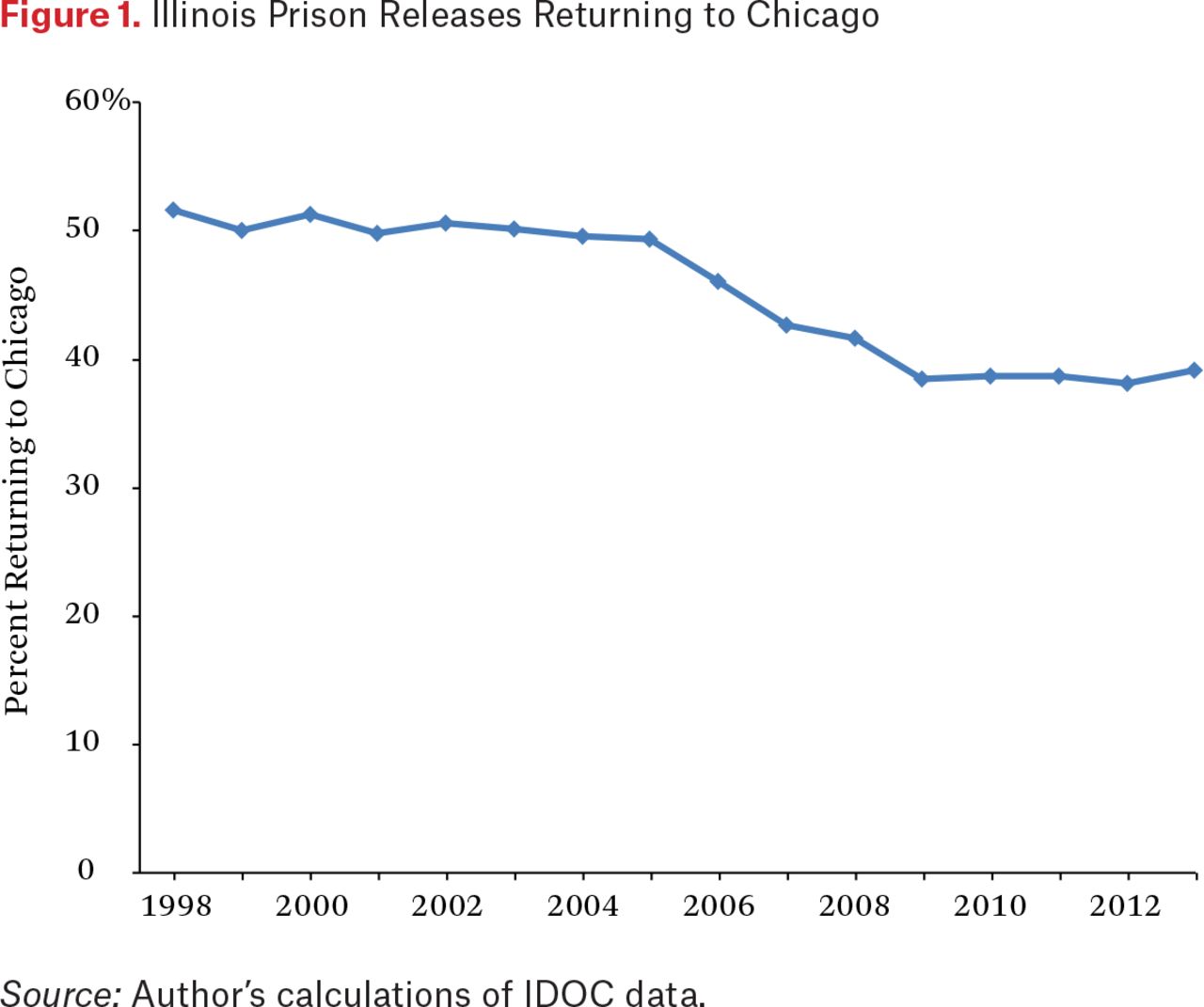
To start, I examine temporal patterns in the residential location of formerly incarcerated individuals in Chicago. Figure 1 demonstrates that the percentage of IDOC prison releases returning to Chicago in a given year declined from 52 percent in 1998 to 39 percent in 2013. Although not shown in the figure, the decline in the percent of Illinois prisoners returning to Chicago is the product of two shifts: a declining share of IDOC releases to the wider Chicago-Naperville-Elgin core-based statistical area (CBSA) and a suburbanization of releases in the Chicago-Naperville-Elgin CBSA to suburban areas located outside of the Chicago city limits. In the late 1990s, roughly 75 percent of the newly released prisoners to the CBSA lived within Chicago city limits. By 2013, 64 percent did.

Illinois Prison Releases Returning to Chicago
The Segregation of the Formerly Incarcerated
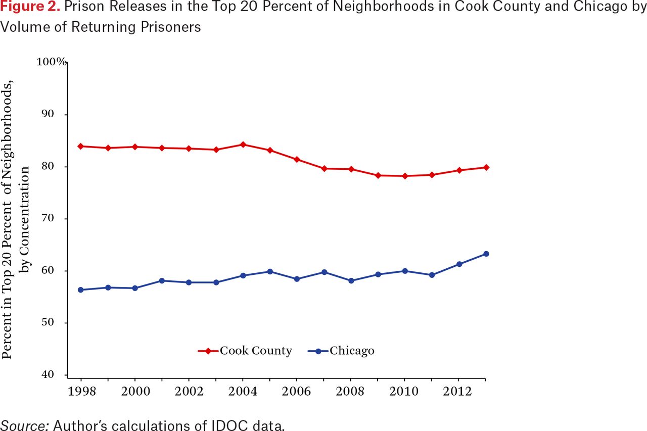
Given the suburbanization of former prisoners into zip codes previously inhabited by few formerly incarcerated individuals, it is likely that the spatial concentration of former prisoners would have dissipated in Cook County. This is what we see in the top line in figure 2 (the Cook County line reflects all zip codes in Cook County, including Chicago).8 In the late 1990s, roughly 84 percent of prison releases residing in the Chicago CBSA were concentrated in just 20 percent of the zip codes. This percentage steadily declined until 2011 before increasing slightly more recently. Nevertheless, in Cook County as a whole, the suburbanization of the formerly incarcerated has led to a reduction in at least one measure of neighborhood inequality—that is, the clustering of the formerly incarcerated in a select few zip codes.9

Prison Releases in the Top 20 Percent of Neighborhoods in Cook County and Chicago by Volume of Returning Prisoners
Interestingly, the bottom line in figure 2, which focuses on zip codes within the Chicago city limits rather than all of Cook County, reveals that the concentration of the formerly incarcerated has steadily increased over time. In the late 1990s, 57 percent of prison releases in Chicago were concentrated in just 20 percent of the zip codes. By 2013, this figure had increased to 63 percent. Hence, the Chicago zip codes diverge from the rest of the county and wider metropolitan area; the concentration of former prisoners by zip code in Chicago is increasing, but declining in Cook County and the metro region as a whole.
Another way to visualize the geographic patterns in Cook County and Chicago is to examine trends in segregation measures. Presented in figure 3 are the patterns in the index of dissimilarity, which in this case measures how evenly spread the formerly incarcerated are across Cook County, the top line, and Chicago alone, the bottom line (Massey and Denton 1988). The dissimilarity index measures the percentage of a group’s population, typically based on race and ethnicity, that would need to change residence for each zip code to have the same percentage of that group as the total geographic area overall. My focus here is on the segregation of the formerly incarcerated from the nonincarcerated. In Cook County the trend in segregation is mostly flat. In 2013, 49 percent of former prisoners would have needed to change zip codes for the distribution of the formerly incarcerated across the county to be evenly spread.10 Subset to the Chicago zip codes, we see a pronounced increase in segregation, from a dissimilarity index of 0.37 in 1998 to 0.46 in 2013.
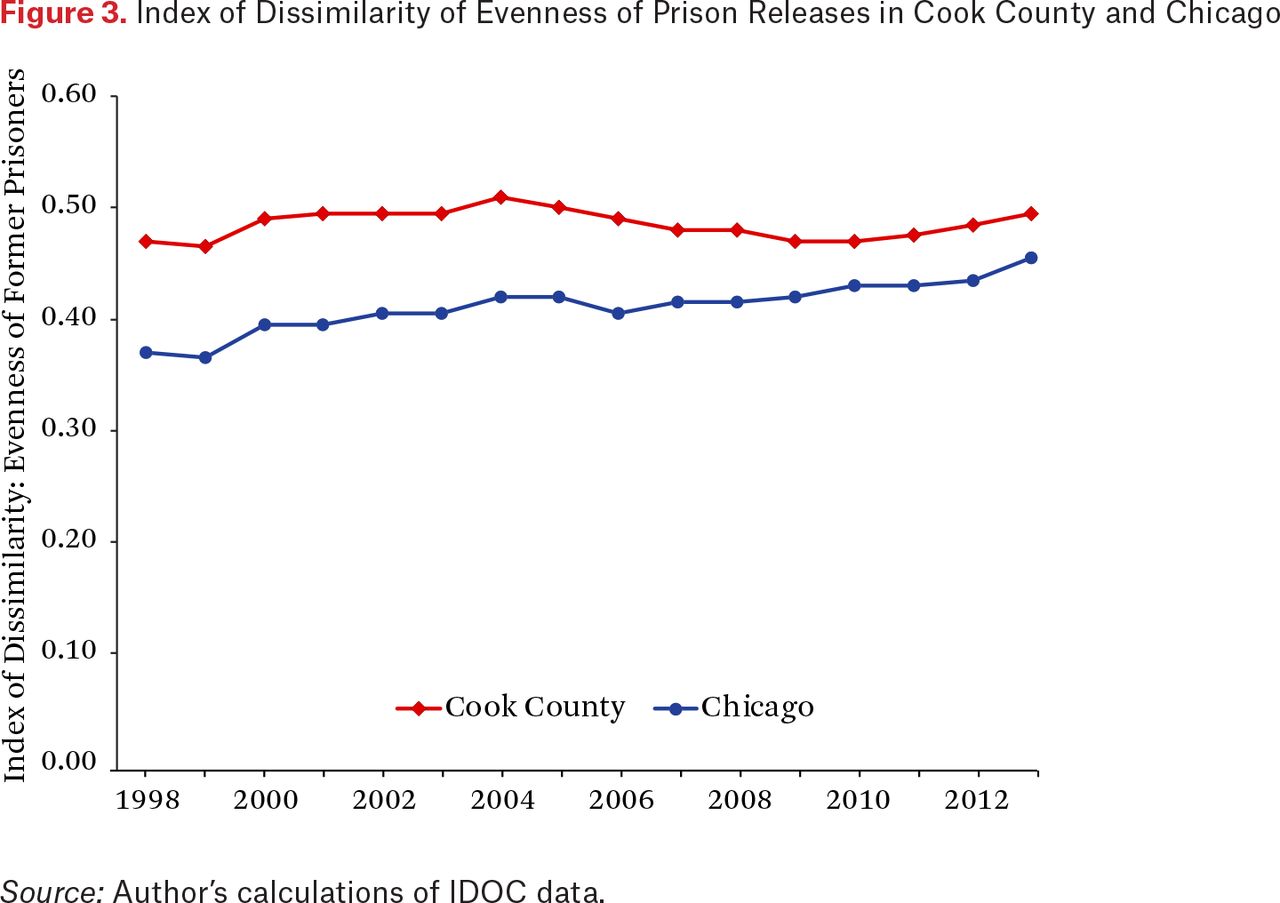
Index of Dissimilarity of Evenness of Prison Releases in Cook County and Chicago
To summarize, by the 80:20 inequality ratio, the suburbanization of released prisoners has produced a more even geographic spread of the formerly incarcerated in Cook County than in prior decades. The dissimilarity index for Cook County mostly reveals a flat trend in the segregation of the formerly incarcerated. For Chicago, however, both the 80:20 ratio and the dissimilarity index reveal increasing patterns of clustering and segregation of former prisoners.
Mapping the Changing Geography of the Formerly Incarcerated
Figures 1, 2, and 3 reveal a complex temporal dynamic among individuals released from prison in Illinois: proportionally fewer of them live in the Chicago city limits, leading to a dispersion in the spatial concentration of former prisoners when looking at the wider Chicago metropolitan area as a whole. However, those former prisoners residing within the city limits are increasingly concentrated and segregated spatially. These findings lead to several important questions: which sections of suburban Cook County may have absorbed the formerly incarcerated who would have resided in Chicago in prior decades, and which parts of Chicago still have a large volume of formerly incarcerated residents?
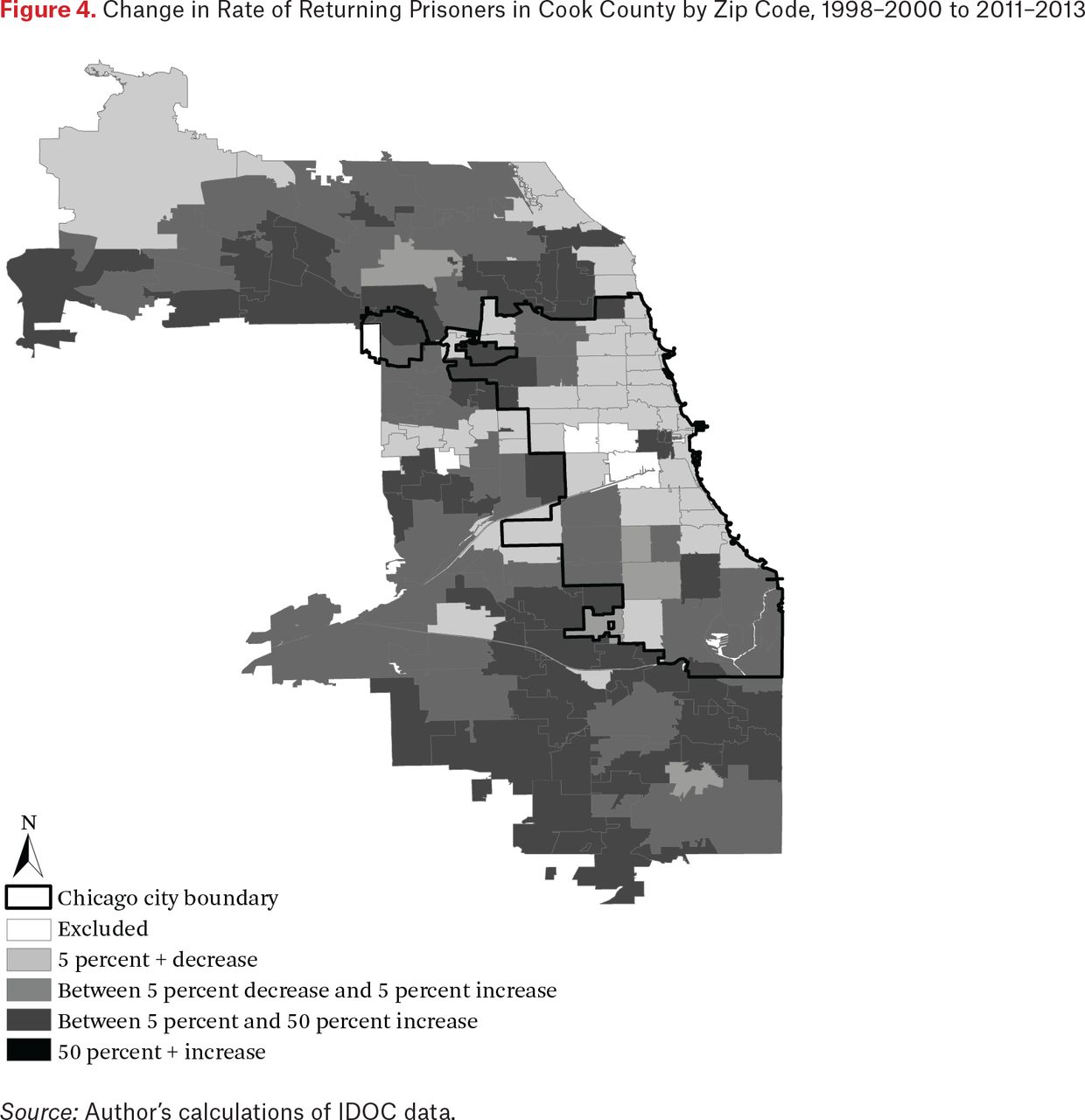
Figure 4 begins to answer these questions. It displays the changing pattern of the formerly incarcerated in Cook County from 1998 through 2000 to 2011 through 2013. Figure 4 is based upon the rate of recently released individuals in the zip code—that is, the count of released prisoners divided by the size of the adult population, and then multiplied by a thousand. The light gray shading in figure 4 represents declines in the relative share of former prisoners among the adult residents in the zip code. The dark gray shading represents an increasing share.

Change in Rate of Returning Prisoners in Cook County by Zip Code, 1998–2000 to 2011–2013
Figure 4 reveals that for most of the Chicago city limits, zip codes had declining proportions of formerly incarcerated residents. The exceptions are the Near West Side near downtown Chicago as well as the southern border of the city. In contrast, just outside the city limits in the west and especially southwest sections of Cook County, growth in the relative share of formerly incarcerated individuals in the zip codes was substantial. For instance, zip code 60409 in Calumet City, on the border with Indiana in the southern part of the Chicago metropolitan area, was on the receiving end of 164 returning prisoners in 2013 and forty-seven in 1998. Zip code 60419 in Dolton, just across the southern border of the Chicago city limits, had 101 returning prisoners in 2013 and fifty-nine in 1998. Zip code 60402 in Berwyn, just west of Chicago, had ninety returning prisoners in 2013 versus sixty-two in 1998. Zip code 60120 in Elgin, which lies in the northwest part of Cook County and is its second largest city, also saw an increase in the number of returning prisoners between 1998 and 2013, from sixty-five to 123.
Whereas the growth in the rate of returning prisoners has mainly occurred outside the Chicago city limits, Chicago zip codes still have a disproportionate volume of returning prisoners even if prisoner reentry has been suburbanized. Figure 5 depicts the count of newly released prisoners in each zip code in Cook County. Clearly the largest counts are still within the city, particularly areas west and south of downtown.
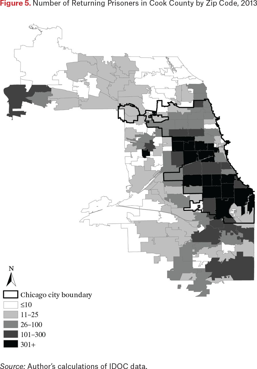
Number of Returning Prisoners in Cook County by Zip Code, 2013
Transition Matrices to Assess Zip Code Stability and Change
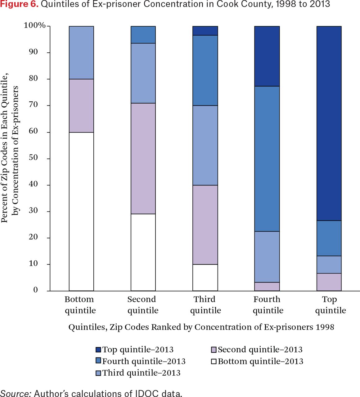
Another way to visualize stability and change in the concentration of returning prisoners over the course of the last two decades is through transition matrices. Transition matrices are a common method for examining social mobility—for example, to examine upward and downward socioeconomic mobility of children relative to their parents. In this case, I examine the upward and downward mobility of zip codes as measured by their concentration of returning prisoners relative to other zip codes in the metropolitan area.
Figure 6 presents the neighborhood change in rates of ex-prisoner concentration for all zip codes in Cook County from 1998 to 2013, ranked from those with few to no former prisoners (bottom quintile) to those with a high proportion of residents who were formerly incarcerated (top quintile). If transitioning of zip codes in terms of the rank ordering by concentration of returning prisoners was minimal, then a given column would be shaded mostly the same throughout.

Quintiles of Ex-prisoner Concentration in Cook County, 1998 to 2013
This figure reveals both persistence and change in the concentration of returning prisoners. Sixty percent of zip codes in the bottom group in 1998 (the white portion of the bar) were still in the bottom grouping in 2013. These zip codes had few to no returning prisoners in 1998 and remained that way in 2013. However, another 20 percent of the bottom group in 1998 transitioned to the second quintile by 2013 and another 20 percent transitioned to the third quintile. These zip codes started out with essentially zero returning prisoners in 1998, but saw growth in the rate of returning prisoners over the fifteen-plus-year period.
Seventy-three percent of zip codes in the top quintile in 1998 were still in the same quintile in 2013. However, the remaining 27 percent transitioned to a relatively lower ranking by 2013. In summary, figure 6 reveals that although many geographic areas with high concentrations of former prisoners tend to persist over time, there is some transitioning in the rank ordering of zip codes.
Correlates of the Changing Geography of Former Prisoners
Given the general stability in the concentration of returning prisoners and many other indicators of social disadvantage, what accounts for some transitioning among neighborhoods in figure 6 in terms of their relative ranking of density of returning prisoners (see Sampson 2012)?
One possibility is that the geographic distribution of returning prisoners is following changes in the volume and geographic distribution of crime. Whereas Chicago has made far too many headlines in recent years for bursts of lethal violence, it is still true that since the early 1990s crime is dramatically down in Chicago, just as it is in many major U.S. cities, particularly in neighborhoods where violence and poverty have historically been most severe (Sharkey 2018). Research reveals that suburbs, too, saw declines in crime from 1990 to the present, although cities had larger declines, on average (Kneebone and Raphael 2011). Of importance, the crime decline has been uneven within suburban areas. Older, inner-ring suburbs generally had large declines in violent and property crime from 1990 to the present, but newer, emerging suburbs as well as exurban areas actually had increases in crime and violence over the same period (Kneebone and Raphael 2011). These trends would suggest that suburban and exurban areas would therefore have a relatively greater share of prison admission and releases than in the past.
Besides the changing distribution of crime as a likely contributor to the changing geography of returning prisoners, it is likely that other socioeconomic shifts—such as the razing of public housing, the suburbanization of poverty, and the decline in residential segregation in Chicago—are also correlated with changes in the location of the formerly incarcerated.
In table 1, I focus on zip codes in the Chicago city limits to examine why, as seen in figure 4, many neighborhoods in Chicago have had declining rates of returning prisoners since the late 1990s. Specifically, table 1 presents regression estimates of the residual change in the zip code share of returning prisoners from 1998 through 2000 to 2011 through 2013, unstandardized coefficients in the second column and standardized coefficients in the fourth.11 Consistent with research on neighborhood variation in prison admissions and to improve the precision of my measurement of prisoner return rates, I pool data from three-year periods (see Sampson and Loeffler 2010; Simes 2018a). Analyses presented in figures 2, 3, and 5 reveal that former prisoners are clustered within a relatively small subset of zip codes in the city, evidence of the spatial clustering of returning prisoners. However, in preliminary analysis I examined whether spatial autocorrelation existed in the residual change in returning prisoners net of controls for crime and other zip code characteristics, but did not find evidence of any dependence. Accordingly, I estimate a linear regression model rather than a spatial regression model.
Residual Change in Geographic Concentration of Former Prisoners, Chicago Zip Codes 1998–2000 to 2011–2013
It can be seen in table 1 that there is positive association between the residual change in prisoner reentry and the poverty rate at baseline as well as the growth in poverty (here and elsewhere, baseline refers to the first time point of data, typically the year 2000). As expected, zip codes with increasing levels of concentrated poverty are more likely to have gains in the share of former prisoners. Conversely, neighborhoods with declining rates of poverty, as occurred in many Chicago neighborhoods through gentrification and the redevelopment of public housing, are predicted to have declining shares of returning prisoners.
The baseline share of black population is negatively predictive of concentrated prisoner reentry, although baseline concentrated poverty and the baseline percentage of black population are highly correlated with a variance inflation factor for each close to 9. If I remove concentrated poverty from the analysis as I did in a supplementary analysis, I find a positive relationship between the baseline percentage of black population and the concentration of returning prisoners.12 I do not find evidence of an association between changes in the share of returning prisoners and changes in the share of black population in a zip code, net of other predictors.
Both the baseline share and growth in the Latino population are related to declines in the concentration of returning prisoners, whereas the level and growth in home ownership in a zip code is unrelated to share of former prisoners in the neighborhood.
As expected, I find that the geographic distribution of returning prisoners is correlated with the distribution of crime, at least at baseline. Also as expected, zip codes where public housing has been demolished or renovated had declining rates of prisoner reentry.
Standardized coefficients in the far right column of table 1 reveal the importance of poverty in explaining the geographic distribution of the formerly incarcerated. Whereas I have not in this analysis estimated the reciprocal association between neighborhood poverty and the locations of returning prisoners, in all likelihood they are mutually reinforcing. At the most basic level, mass imprisonment and mass prisoner reentry may exacerbate the concentration of poverty by inundating neighborhoods with undereducated individuals with limited skills and enormous debt who face the daunting task of overcoming the numerous barriers to postprison employment such as denials of occupational licensing and discrimination in hiring (see, in this volume, Apel and Powell 2019; Friedman and Pattillo 2019).
Neighborhood Attainment
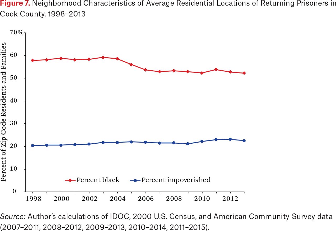
Results suggest that the geographic shift in the residential locations of returning prisoners is the product of several forces, including the changing geographies of poverty and crime, but what has this shift meant in terms of the neighborhood conditions to which the formerly incarcerated are exposed? The literature shows a growing emphasis on understanding the neighborhood conditions the formerly incarcerated face after leaving prison (Lee, Morenoff, and Harding 2016; Massoglia, Firebaugh, and Warner 2013; Simes 2018b). The emphasis, however, is typically on racial-ethnic differences in neighborhood attainment rather than changes in neighborhood conditions over time. To complete the analysis, I examine neighborhood attainment in terms of two characteristics: family poverty rate and percentage of black population in zip codes. Figure 7 displays the mean racial composition and mean poverty rate of the zip codes inhabited by newly released prisoners each year from 1998 to 2013.

Neighborhood Characteristics of Average Residential Locations of Returning Prisoners in Cook County, 1998−2013
In terms of racial composition, it is pertinent to note that the size of the non-Hispanic black population in Chicago fell dramatically over the period of investigation, from 1.054 million in 2000 to 863,000 in 2009 through 2013. In comparison, the total population of Chicago fell from 2.9 million to 2.7 million during the same time frame. Similarly, in Cook County, the non-Hispanic black population declined from 1.39 million in 2000 to 1.26 million in 2009 to 2013, whereas the total population size fell from 5.38 million to 5.2 million. In terms of segregation, the dissimilarity index measuring black-white segregation in Chicago declined from 85.2 to 82.5 between the 2000 and 2010 U.S. censuses, and declined from 80.4 to 75.2 for the Chicago metropolitan area as a whole (American Communities Project 2018).
Consistent with trends in desegregation and the declining size of the black population in Chicago and Cook County, the formerly incarcerated in Cook County live in zip codes characterized by an average of 52 percent black residents versus 58 percent back in 1998. In terms of poverty, figure 7 reveals an increasing exposure to poverty even though, as we saw in figures 1 and 4, the location of returning prisoners since the late 1990s has shifted from concentration in core urban neighborhoods to suburban areas. This increasing exposure to poverty is the product of two trends: that the suburbanization of prisoner reentry echoed the suburbanization of poverty such that former prisoners in the suburbs are still largely located in impoverished areas, and that former prisoners in Chicago remain concentrated in areas of severe disadvantage. In sum, the residential experiences of returning prisoners have changed over the past couple of decades: the formerly incarcerated of the current decade are residing in relatively more impoverished areas than their counterparts in the late 1990s, on average, but in areas with a smaller share of black residents.
DISCUSSION
In this study, I sought to examine the extent to which the geographic distribution of formerly incarcerated individuals in Chicago and Illinois has changed, if at all, since the late 1990s as metropolitan areas underwent substantial changes related to the Great Recession, the demolition of public housing, declining levels of racial residential segregation, and the deconcentration of poverty in central cities and the expansion of poverty to the suburbs. Specifically, I asked four questions: To what extent are the formerly incarcerated geographically concentrated in space and how persistent is the geographic concentration of returning prisoners over time? Which urban and suburban locations have seen declines in the rates of former prisoners and which areas have had increases? What factors account for changes to the geography of returning prisoners? What have changes in the geographic distribution of returning prisoners meant in terms of the neighborhood conditions that former prisoners face?
Data brought to bear on these questions reveal several novel findings. Prisoner reentry is not just a city issue, because proportionally fewer (and absolutely fewer) exiting prisoners are returning to the Chicago city limits than in the past, more going to suburban locations as well as other cities in the state. When the formerly incarcerated do reside in Chicago, they tend to be more tightly clustered and segregated from the larger population than in previous periods of the mass imprisonment era. Both stability and change are to be found in the densest clustering of the formerly incarcerated in Chicago, with the West Side long a residential site for returning prisoners and with newer pockets on the far South Side. Transition matrices reveal both stability and change in the rank ordering of zip codes by concentrated prisoner reentry. Changes in the geographic distribution of returning prisoners tend to mirror changes in the distribution of poverty. Last, these various changes mean that former prisoners now reside, on average, in areas with proportionally fewer black residents but more poor residents than in the past.
These findings point to several additional areas of inquiry for future research. For instance, what are the implications of the changing geography of returning prisoners on their ability to reintegrate back into society? Are local and state criminal justice and social service systems even aware of the changing geographic patterns of returning prisoners, and are they equipped to manage the implications of this change? As Scott Allard explores in detail, the social service infrastructure in the suburbs, including government programs as well as nonprofits, is often severely limited and strained (2017). Relative to urban environments, the suburbs have fewer social service organizations and their operations are stretched across a far more expansive service delivery area given the definitional sprawl of suburbs. Because social services for the formerly incarcerated typically concentrate in central cities, the migration of the formerly incarcerated to the suburbs means that it is more challenging for former prisoners to access services such as drug and mental health treatment that are so critical to well-being and desistance from crime. An in-depth exploration of the consequences of the changing geography of returning prisoners on rehabilitation and reintegration is warranted.
An additional line of inquiry is to examine the reciprocal relation between new geographic patterns of prisoner reentry and community conditions, including the concentration of poverty (Kirk 2015). For instance, does an influx of returning prisoners lead to a spike in unemployment in a neighborhood? Are returning prisoners a burden on households to the extent that some households fall below the poverty line? Do neighborhoods on the receiving end of many formerly incarcerated individuals become stigmatized, thereby leading to the outmigration of working and middle-class populations as well as neighborhood institutions and businesses? These questions must be addressed in the future for us to fully comprehend how the geography of mass imprisonment and prisoner reentry has affected spatial inequality in the United States.
FOOTNOTES
↵1. See, in this volume, Heather Harris and David Harding’s analysis of the correlates associated with residential dependence of the formerly incarcerated on parents and family members (2019).
↵2. I recognize that zip codes do not necessarily constitute neighborhoods, particularly outside of Chicago where a zip code may be quite expansive in terms of geographic space. Nevertheless, I do occasionally use the terms zip code and neighborhood interchangeably for the purposes of making a neighborhood-level argument.
↵3. The fiscal year in Illinois starts on July 1 and includes the last six months of the prior calendar year through the first six months of the next calendar year (for example, FY1998 ran from July 1, 1997, through June 30, 1998).
↵4. Housing instability is common among the formerly incarcerated (Kirk 2018). David Harding, Jeffrey Morenoff, and Claire Herbert find that parolees in Michigan move an estimated 2.6 times per year for the median parolee (2013). Again drawing on data from Michigan, Herbert, Morenoff, and Harding find that most periods of residence for parolees last just a few months, with 50 percent of the residential periods lasting eight weeks or less (2015). Accordingly, it is likely that the newly released individuals in Illinois change residences with some frequency, although given the expansiveness of zip codes, it is highly likely that the residential moves occurred within the same zip code in which the individual first resided, or an adjacent zip code.
↵5. See the Chicago Open Data Portal (https://data.cityofchicago.org/Public-Safety/Crimes-2001-to-present/ijzp-q8t2, accessed September 18, 2018).
↵6. For a list of index crime classifications used by the Chicago Police Department, see the “Illinois Uniform Crime Reporting (IUCR) Codes” (https://data.cityofchicago.org/Public-Safety/Chicago-Police-Department-Illinois-Uniform-Crime-R/c7ck-438e, accessed September 18, 2018).
↵7. See Chicago Housing Authority (http://www.thecha.org/about/plans-reports-and-policies, accessed September 18, 2018).
↵8. For the analysis presented in figure 2 and the remainder of the article, I excluded five zip codes that contain jails, immigrant detention centers, and adult transition centers (types of halfway houses). These zip codes receive large numbers of returning prisoners, but many of them are immediately reincarcerated in another facility and are never actually released from custody. For instance, zip code 60608 is the location of the Cook County jail, where individuals with an active criminal case and detainer in Cook County may be transferred on release from an IDOC prison. Zip code 60155 is the location of the Broadview immigration detention center, which may process released IDOC prisoners for deportation. I exclude these zip codes because many of the prisoners released to them remain in institutional environments rather than in residential environments, and including them would artificially inflate the counts of former prisoners in certain parts of the metropolitan area.
↵9. Similar findings emerge when I expand the analysis to include not just Cook County but all of the Illinois counties in the wider Chicago-Naperville-Elgin CBSA (that is, Cook, DeKalb, DuPage, Grundy, Kane, Kendall, Lake, McHenry, and Will counties). In this case, 87 percent of prison releases residing in the CBSA in the late 1990s concentrated in just 20 percent of the zip codes versus 81 percent in 2013.
↵10. If I expand the analysis to focus on the wider Chicago-Naperville-Elgin CBSA, I find notably similar patterns and levels of segregation as in the analysis subset to Cook County.
↵11. As in the other analyses (see footnote 6), I exclude zip codes that contain jails, immigrant detention centers, and adult transition centers. I also exclude the zip code that largely consists of O’Hare airport (60666) as well those with populations of less than five hundred as of the 2000 Census.
↵12. Results available from the author.
- © 2019 Russell Sage Foundation. Kirk, David S. 2019. “Where the Other 1 Percent Live: An Examination of Changes in the Spatial Concentration of the Formerly Incarcerated.” RSF: The Russell Sage Foundation Journal of the Social Sciences 5(1): 255–74. DOI: 10.7758/RSF.2019.5.1.11. Direct correspondence to: David S. Kirk at david.kirk{at}sociology.ox.ac.uk, Department of Sociology, University of Oxford, Nuffield College, New Road, Oxford OX1 1NF, United Kingdom.
Open Access Policy: RSF: The Russell Sage Foundation Journal of the Social Sciences is an open access journal. This article is published under a Creative Commons Attribution-NonCommercial-NoDerivs 3.0 Unported License.
REFERENCES
In this issue


Jump to section
Related Articles
Cited By...
- No citing articles found.