Abstract
We develop and illustrate a general and innovative method for describing in detail the joint distribution of race and income among neighborhoods when only coarse income data are available. The approach provides estimates of the average income distribution and racial composition of the neighborhoods of households of a given racial category and specific income level. We illustrate the method using 2007–2011 tract-level data from the American Community Survey. We show, for example, that blacks and Hispanics of any given income typically live in neighborhoods substantially poorer than those of whites and Asians of the same income. Our approach provides a general method for fully characterizing the joint patterns of racial and socioeconomic segregation, and so may prove useful in understanding the spatial foundations and correlates of racial and socioeconomic inequality.
Although racial and socioeconomic segregation are persistent features of the residential landscape, both have changed over the last four decades in the United States. Racial segregation has declined moderately, particularly segregation between white and black households, but remains high in many places (Logan and Stults 2011; Logan, Stults, and Farley 2004). Segregation by income has risen sharply since 1970, mostly in the 1980s and the 2000s (Reardon and Bischoff 2011; Bischoff and Reardon 2014; Jargowsky 1996, 2003; Watson 2009). Less clear, however, are the trends and patterns of the joint distribution of neighborhoods’ racial and socioeconomic characteristics. That is, we do not have a clear description of how much neighborhoods differ, in terms of racial and economic composition, among households with the same income but differing race, or same race but differing income. Without such a description, it is unclear whether and how changes in racial and economic segregation have altered disparities in neighborhood conditions.
In U.S. census and American Community Survey (ACS) data, income is tabulated—by race and census tract—by a set of ordered income categories. Exact information on the means, medians, and variances of these income distributions is generally not available. As a result, the spatial patterns of the full joint distribution of race and income are also not readily available, making a complete description of racial and economic segregation difficult to obtain.
In this paper, we demonstrate an innovative approach to describing the joint distribution of race and income among neighborhoods when only coarse income data are available. We are not the first to suggest methods of describing features of this joint distribution (see, for example, Logan 2002), but the innovation of our approach is that it is much more general and versatile than existing techniques. It yields an estimate of the complete cumulative income distribution function, averaged among neighborhoods, by race and income. This makes it possible to make meaningful comparisons of the joint distribution across time and place despite differences in income distributions or differences in how income is coarsened. We show that estimating a set of multidimensional exposure functions is sufficient to generate a wide range of useful statistics regarding the joint distribution of racial and economic composition of neighborhoods, including many of the measures proposed and used in a more ad hoc fashion in much of the literature. We also explain how these measures can be used by other researchers and why it is beneficial to have a fully continuous measure of inequality.
Our interest in developing these methods derives from the theoretical and empirical literature describing the ways in which neighborhoods affect their residents’ educational, socioeconomic, and health outcomes. In much of the neighborhood effects research, neighborhood poverty (or socioeconomic conditions more generally) is hypothesized to be a key distal driver of neighborhood effects, operating by directly or indirectly affecting housing conditions, school and childcare quality, access to healthy food, green spaces, safe playgrounds, social networks, the prevalence of adult role models, and a range of other institutional and collective resources that are beneficial for child development (Acevedo-Garcia and Lochner 2003; Brooks-Gunn, Duncan, and Aber 1997; Leventhal and Brooks-Gunn 2000; Sampson 2008; Sampson, Raudenbush, and Earls 1997; Wodtke, Harding, and Elwert 2011).
Although some research has suggested that neighborhoods have no significant effect on many aspects of children’s development, educational success, and social, behavioral, or economic outcomes (Ludwig et al. 2013; Kling, Liebman, and Katz 2007; Sanbonmatsu et al. 2006), recent experimental and quasi-experimental research suggests that neighborhood socioeconomic conditions can have substantial effects on such outcomes, particularly as a result of sustained exposure during childhood (Chetty, Hendren, and Katz 2015; Burdick-Will et al. 2011; Harding 2003; Wodtke, Harding, and Elwert 2011; Santiago et al. 2014). Indeed, Raj Chetty and his colleagues’ (2015) analysis of the Moving to Opportunity experiment shows that children in families who used a (randomly assigned) housing voucher to move to a low-poverty neighborhood have substantially higher college attendance rates and 31 percent higher earnings by their mid-twenties than those in a control group not assigned a voucher, a finding that suggests that neighborhood poverty (or its correlates and sequelae) is harmful to young children’s development.
These findings highlight the importance of precisely measuring average neighborhood socioeconomic conditions, and differences in these conditions across time, racial or ethnic group, and households of varying incomes. Yet many of the measures currently used in the literature lack features that would allow for meaningful comparisons across these dimensions. For example, many measures lack detail on how conditions differ across the income distribution, instead relying on broad, arbitrarily defined categories such as low-, middle-, or high-income. These same measures tend to be limited to the income categories available in the source data. Finally, these measures can be difficult to compare across place, due to differences in the income distributions; and across time, due to changes in the categories available in the data. By describing the joint distribution of race and income among neighborhoods using percentile terms, our new measures avoid these issues. Our approach describes the average neighborhood racial and income composition for households of a given race and income level. Measuring neighborhood conditions with such sensitivity not only permits more detailed analyses of neighborhood effects, but also offers an opportunity to understand the spatial foundations of racial and socioeconomic inequality.
We develop and demonstrate in this paper a highly general approach to measuring the joint patterns of racial and economic neighborhood composition. In effect, this approach relies on estimating the average race-specific income distribution in the neighborhoods of individuals of any specific income and race. The functions describing these distributions can be used for a wide range of types of descriptive analyses, and provide a detailed account of the joint distribution of race and income across neighborhoods. Although we provide some example findings that result from our estimated functions, a full description and explanation of the joint distribution is beyond the scope of this paper. Our goal is to elucidate and illustrate this new approach so that others may use it or the data we produce in settings where a richer description of the interaction between race and income across neighborhoods is fruitful (see, for example, Reardon, Fox, and Townsend 2015).
Using the methods we develop here, we can construct a dataset containing detailed estimates of the joint distribution of race and income in each county, commuting zone, metropolitan area, and state in the United States and for each year for which census or ACS data are available. These provide both a detailed description of spatial inequality and a resource for studying spatial inequality. Our measures can be merged to other data to analyze the trends, causes, and consequences of segregation. For example, Chetty provides estimates of average adult earnings and other outcomes, conditional on childhood family income, for every county and commuting zone in the United States (www.equality-of-opportunity.org). Merging these data with our estimates of average neighborhood income distributions, conditional on family income, for each commuting zone, one might investigate the links among childhood family income, childhood neighborhood income distribution, and adult earnings, educational attainment, and childbearing. Because both our measures and Chetty’s mobility measures are available for families of any specific income percentile, they allow a detailed investigation of the extent to which neighborhood segregation mediates patterns of social immobility. This is but one example of the ways that detailed estimates of the joint spatial distribution of race and income might help research develop a more nuanced understanding of the spatial foundations of inequality.
MEASURING SEGREGATION
Hundreds of articles have been devoted to developing and describing ways of measuring racial and economic segregation; hundreds more are devoted to describing their trends (for example, James and Taeuber 1985; Massey and Denton 1988, 1993; Reardon and Firebaugh 2002; Reardon and Bischoff 2011; Reardon and Owens 2014). The welter of methodological approaches to measuring segregation is partly due to academics’ penchant for methodological hair-splitting. Nonetheless, important theoretical and conceptual distinctions among dimensions of segregation do lead to different measurement approaches.
Despite the abundance of ways of measuring segregation, most approaches are limited to measuring segregation along a single population dimension at a time. We know, for example, how to measure segregation among two or more racial groups (James and Taeuber 1985; Massey and Denton 1988; Reardon and Firebaugh 2002), among ordered occupational or educational groups (Reardon 2009), and by income or any other single continuous dimension (Reardon 2011; Reardon and Bischoff 2011; Jargowsky 1996). Methods of measuring multidimensional patterns of segregation, such as the joint distribution of race and income among neighborhoods, however, are less well developed.
Three approaches have been used to describe features of the joint distribution of racial and economic segregation patterns. One measures racial segregation among households of similar income (Adelman 2004; Denton and Massey 1988; Darden and Kamel 2000; Farley 1995; Iceland, Sharpe, and Steinmetz 2005; Iceland and Wilkes 2006; Massey and Fischer 1999), or income segregation among households of the same race (Farley 1991; Jargowsky 1996; Bischoff and Reardon 2014; Reardon and Bischoff 2011; Massey and Fischer 2003). Typically, this approach relies on evenness measures of segregation, such as the dissimilarity index or similar measures (James and Taeuber 1985). Some of these studies allow the comparison of overall racial segregation levels with within-income category segregation levels as a way of testing hypotheses about the role of income in shaping racial segregation levels; they do not provide a clear description of the joint distribution of race and income across neighborhoods, however.
A second approach looks at the distribution of neighborhoods along a variety of typologies and the interaction of those typologies. For example, Margery Turner and Julie Fenderson (2006) categorize neighborhoods according to how mixed they are on measures of race, ethnicity, nativity, and income. Cross-tabulating these categorizations shows the patterns of interaction between neighborhood racial and income composition. This approach shows the extent to which tracts with very low proportions of low-income residents are predominantly white or predominantly minority. Edward Goetz, Tony Damiano, and Jason Hicks (2015) take a similar approach, using it to identify what they call racially concentrated areas of wealth (RCAWs). They define RCAWs as tracts in which at least 90 percent of residents are white and more than half exceed an income threshold of four times the cost of living adjusted poverty threshold. Such approaches are useful for their specificity, but provide only partial descriptions of the joint distribution of race and income and depend on how racial and income distributions are dichotomized.
A third approach relies on so-called exposure measures of segregation to describe the average exposure of households of a given race-by-income category to those of another such category. Most commonly, these studies compute racial groups’ exposure to poverty: the average proportion of poor residents in the neighborhoods of members of different racial groups (Timberlake 2002, 2007; Timberlake and Iceland 2007; Logan 2002, 2011; Massey and Fischer 2003). These measures provide a much more interpretable description of differences in average neighborhood socioeconomic conditions than the evenness measures. John Logan (2011), for example, categorizes households by race and three income categories (poor, middle, and affluent) and measures the exposure of various race-by-income groups to other groups. This approach results in descriptive statements such as “Affluent blacks are currently less [exposed to black neighbors] than poor blacks (36.3 versus 42.9), and also somewhat more exposed to whites (42.9 versus 39.8)” (Logan 2011, 3). A related approach compares groups’ exposure with some measure of neighborhood quality. Samantha Friedman, Joseph Gibbons, and Chris Galvan (2014) use data from the American Housing Survey to compare neighborhood conditions among middle- and upper-class households of different races or ethnicities; they find that affluent blacks and Hispanics experience inferior neighborhood circumstances relative to affluent whites. Like the neighborhood typology measures, such approaches depend on the definition of income categorizations used.
The more general drawback of all these approaches is that, unless fine-grained income information is available, they are limited to comparisons based on the income categories reported in the data, which may be relatively crude. Moreover, these categories may change over time (for example, the Census Bureau has often changed the number and definition of the income categories reported in published tables). Even if they do not change, their location in the income distribution will vary across time and place because of differences in income distributions. Finally, even within a given place and time, the categories are not necessarily exactly comparable across groups. Suppose we define poor as having an income below $20,000. By this definition, the average poor black household will generally have a lower income than the average poor white household, simply because the black income distribution is lower than the white distribution. So a comparison of the neighborhoods of poor whites and blacks may be misleading when we base the comparison on broad income categories rather than exact income.
We adopt an approach similar to the third one here, but our innovation is to develop methods of estimating the joint distribution of racial and economic neighborhood composition in ways that are not sensitive to the definitions of income categories provided in the census or ACS. Our approach allows one to describe the average racial and income distributions in neighborhoods of households of different incomes, the average racial and income distributions in the neighborhoods of households of different income levels and race, and the average race-specific income distributions in the neighborhoods of households of different income levels and race. These measures are similar to the more standard exposure measures used by others (for example, the exposure of poor blacks to middle-class neighbors), but differ in that they are fully continuous, rather than categorical, measures of exposure. In effect, they describe the average joint distribution of race and income in the neighborhoods of individuals of any specific income and race. As a result, they can be used for a wide range of types of descriptive analyses, and provide a detailed account of the joint distribution of race and income across neighborhoods.
ESTIMATING AVERAGE NEIGHBORHOOD INCOME DISTRIBUTIONS, BY RACE AND INCOME
In this paper, we use g and h to denote racial groups (or other categorical groups); we use p and q to denote income levels, expressed as percentiles (scaled from 0 to 1, for convenience) of the population income distribution; and we use i to index neighborhoods. The function ρx(p) describes the income density function in some population x, where x may refer to a specific group or neighborhood; correspondingly, the function  denotes the cumulative income distribution function in population x. Finally, we use Tx to denote the count of households in population x, and πgi to indicate the proportion of households in neighborhood i that are in group g.
Primary Estimand and Estimation Approach
Our goal, in general, is to estimate the function fhg(p,q) that describes the average cumulative income distribution function of group h in the neighborhoods of members of group g with income p. That is,

Note that fhg(p,q), defined this way, is interpreted as the weighted average proportion of the households in a neighborhood that are members of group h and have incomes less than or equal to q, where the weights are the number of households of group g with income p in each neighborhood. In the segregation literature, such measures are called exposure measures because they describe the average extent to which members of one group (in this case members of group g with income p) are exposed to members of another group (members of group h with incomes less than or equal to q) in their local context (neighborhood in this case) (Massey and Denton 1988; Lieberson 1981). In appendix A, we describe how to estimate the functions fhg(p,q) by assuming they can be approximated by a set of multidimensional polynomials of p and q.
Other Quantities of Interest
If we know fhg(p,q) for all groups g and h, we can derive a number of additional useful quantities:
Functions describing exposure to overall (not race-specific) neighborhood income distributions, conditional on race and income. The average cumulative income distribution in the neighborhoods of members of group g with incomes p is simply the sum of the corresponding group-specific functions:

Functions describing exposure to race-specific neighborhood income distributions, conditional on income. The typical household with income p lives in a neighborhood where members of group h have an income distribution given by

The function describing exposure to overall neighborhood income distributions, conditional on income. Combining equations (2) and (3), we can derive the function ftt(p,q) which describes the average cumulative income distribution function in the neighborhoods of households with income p:

Average neighborhood racial composition, conditional on race and household income. The average racial composition of the neighborhoods of members of group g with income p (the exposure of members of group g and income p to members of group h) is simply fhg(p,1). The average racial composition in the neighborhoods of households with income p is likewise given by the functions fht(p,1). Note that ftg(p,1) = ftt(p,1) = 1 by definition (because all households in a neighborhood have incomes less than or equal to 1 by definition).
Average neighborhood race-specific income density functions, conditional on race and income. Because fhg(p,q) is a cumulative distribution function, we can obtain the corresponding density function, denoted ρhg(p,q), by taking the derivative of fhg with respect to q:

The formula holds when g or h or both g and h is replaced by t as well.
Percentiles of average neighborhood race-specific income distributions, conditional on race and income. First define

Now fg*h(p,q) describes, for members of group g with incomes p, the weighted average proportion of the households in a neighborhood that are members of group h with incomes less than or equal to q relative to the weighted average proportion of the households in a neighborhood that are members of group h, where the weights are defined as above. If we wanted to know the median income among the group h neighbors of a member of group g with income p, we would find q such that fg*h(p,q) = 0.50. More generally, the 100 ∙ cth percentile of the income distribution of members of group h in the neighborhoods of members of group g with income p is fg*h–1(p,c), where fg*h–1(p,c) returns the value q such that fg*h(p,q) = c.
Note that ftg(p,1) = ftt(p,1) = 1 by definition, but fht(p,1) ≠ 1 in general, so

Thus, estimating fhg(p,q) is sufficient to obtain a number of useful functions describing the joint neighborhood distribution of race and income. A number of other standard exposure measures, as well as measures of between-group differences in income, can be readily computed from the fhg(p,q) functions, as we describe in appendix C.
DATA
In this paper, we use data from the 2007–2011 ACS to illustrate the types of descriptive patterns that can be obtained from our approach. We use census tracts as our definition of neighborhoods. The ACS provides partial cross-tabulations of household counts by income and racial-ethnic categories. The 2007–2011 ACS data include sixteen categories of income, seven race categories, and one indicator for whether the household is of Hispanic origin. We focus here on five mutually exclusive and exhaustive race-ethnic groups: non-Hispanic Asian, non-Hispanic black, Hispanic, non-Hispanic white, and non-Hispanic other. We use an iterative proportional fitting (IPF) process to estimate the full cross-tabulations of these five race-ethnic categories by income within each census tract, using Public Use Microdata Samples (PUMS) data to seed the IPF tables (for complete details on the construction of the cross-tabulations and a discussion of the accuracy of the IPF process, see Reardon, Fox, and Townsend 2015). The result is a dataset containing estimated counts of the number of households in each race-ethnic group that are in each income category for each tract in the United States between 2007 and 2011.
Illustrative Application of the Approach
The purpose of this paper is to illustrate a new way of describing the joint distribution of race and income across neighborhoods. To do so, we use the 2007–2011 ACS data and the estimation methods described in the appendix to compute eighty observed values of ρg(p) and 6,400 values of fhg(p,q) for each of the values of g, h, p, and q observed in the ACS data. We fit multidimensional polynomials to these data to estimate the continuous functions ρg(p) and fhg(p,q). Using these, we derive the other functions described and construct a set of illustrative figures to demonstrate a number of ways that the estimates can be used to describe the joint neighborhood distributions of race and income. All of our calculations use income percentiles scaled from 0 to 1 (as noted), but the illustrative figures below show income on a percentile scale from 0 to 100 for ease of interpretation.
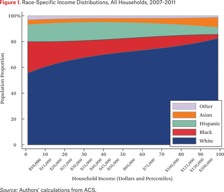
A first step in estimating the exposure measures is calculating race-specific household income densities, described by the functions ρg(p). These density functions are presented (stacked) in figure 1, which shows the proportion of households of a given race at each percentile of the national household income distribution. The horizontal axis measures household income in percentiles (with corresponding dollar amounts noted) of the national household income distribution. The vertical axis is population proportion. Reading the figure vertically, then, describes the proportion of households of each race among all households at a given income percentile. The shaded area for each group describes the group’s income distribution.
Figure 1 illustrates the unequal income distributions among white, black, Hispanic, and Asian households in the United States. Black households are disproportionately concentrated at the lower end of the income distribution, Hispanics in the bottom half, and white and Asian households above the national median. Nonetheless, a majority of low-income households are white in the United States, by virtue of their much larger population share. Although the patterns in figure 1 have been demonstrated in previous research, our estimation approach facilitates the presentation of these patterns in terms of percentile ranks of the national income distribution.
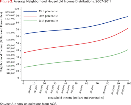
Figure 2 presents the 25th, 50th, and 75th percentiles of the average neighborhood income distributions of households at each point in the income distribution. These distributions are described by the function ftt(p,q). Rather than plot the full surface described by ftt(p,q), however, figure 2 plots selected percentiles of neighborhood income distributions. To compute these values, we construct the function ftt–1(p,c) (by numerically inverting ftt(p,q)) for the values c ∈ {.25, .50, .75} and for p ∈ {.01, .02, . . ., .99}. For example, to identify the 50th percentile income in the typical neighborhood of a household with 5th percentile income, we set ftt(.05,q) equal to 0.50 and solve for q via numerical interpolation. The horizontal axis represents a household’s income; the vertical axis represents neighborhood household income.1
As an example of how to read this figure, consider households with income of $20,000, which is approximately at the 18th percentile of the national income distribution. Such households, on average, live in neighborhoods where 25 percent of households have incomes at or below the 20th percentile of the national household income distribution (about $22,000); where the median of the average neighborhood household income distribution is roughly equal to the 42nd percentile of the national household income distribution (about $44,000); and where the 75th percentile of the average neighborhood household income distribution is at about the 68th percentile of the national household income distribution (roughly $77,000). Although figure 2 shows only the 25th, 50th, and 75th percentiles of the average neighborhood income distributions, these lines can be constructed for any desired percentile.
Figure 2 makes clear that households with higher incomes live, on average, in neighborhoods with higher household income distributions. The steepness of the lines in figure 2 describes the association between a household’s income and the 25th, 50th, and 75th percentile household income in the neighborhood. Indeed, the steepness of these lines provides an intuitive measure of income segregation (Reardon, Fox, and Townsend 2015). Consider the 50th percentile line. A flat line would indicate no or little income segregation: households at any income level live, on average, in neighborhoods with the same median income. Steep lines would indicate a strong association between one’s income and that of one’s neighbors. Because both axes are presented in percentile terms, the maximum value of the slope, averaged over the range of percentiles, is one. The lines are steeper in the right side of figure 2, indicating that segregation among upper-income households is moderately larger than among lower-income households, consistent with other research on income segregation (Bischoff and Reardon 2014; Reardon and Bischoff 2011; Reardon, Fox, and Townsend 2015). The lines here have average slopes of roughly 0.25 to 0.35, suggesting that segregation is roughly one-quarter to one-third as high as its theoretical maximum, which would only occur if all households lived in neighborhoods where they and their neighbors had identical incomes.
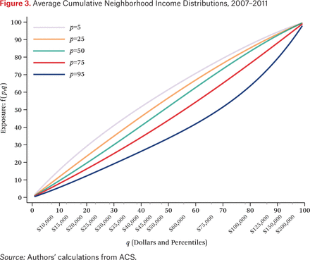
Figure 3 presents similar information to that in figure 2, but in a different way. Figure 3 presents ftt(p,q) for values of p ∈ {.05, .25, .50, .75, .95} and for values of q ∈ [0,1]. In figure 3, the estimated income exposure function (the exposure of households with incomes of p to those with incomes less than or equal to q) is drawn as a function of q for various values of p. To see the connection between the two figures, note that the 50th percentile (middle) line in figure 2 corresponds to where each of the lines in figure 3 crosses the value 50 on the vertical axis. The top line in figure 3, representing households with income at the 5th percentile, crosses this line around where q equals 38. This means that, on average, half of the neighbors of households with 5th percentile incomes have incomes below the 38th percentile. Figure 2 shows this as well: on the middle line, when p (scaled here from 0 to 100) equals 5, median neighborhood income is at the 38th percentile of the national income distribution. Drawing the functions as in figure 3 makes clear again that segregation between the affluent and the middle class is greater than between the middle class and the poor: the horizontal spaces between the p = 50, p = 75, and p = 95 lines are greater than between the p = 5, p = 25, and p = 50 lines, indicating larger discrepancies in neighborhood income distributions as household income increases.
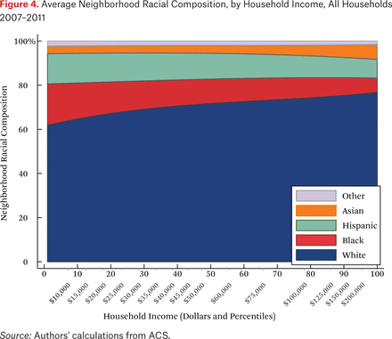
Figure 4 shows the average neighborhood racial composition for households of different incomes. These are given by the functions fht(p,1). In contrast to figure 1, figure 4 shows the average racial composition of households’ neighborhoods, not the population racial composition. On the vertical axis, the typical racial composition of the neighborhood sums to 100 percent, and the figure shows how the racial composition of the average neighborhood changes as a function of own household income. Higher-income households, on average, have more white and Asian neighbors and fewer black and Hispanic neighbors than lower-income households.
Note that figure 4 looks relatively similar to figure 1. If neighborhoods were sorted perfectly by income, then these two figures would be identical, because every household would have only neighbors with their same income, who would, by definition, have on average the same racial composition as the population at that income level. That said, there are other patterns that may make figure 4 similar to figure 1. For example, if neighborhoods were sorted perfectly by race, but not at all by income within racial groups, figures 1 and 4 would again be identical. Thus, the similarity of figures 1 and 4 is not particularly informative about the relative extent of racial and income segregation that underlie them.
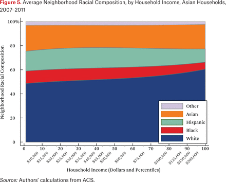
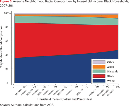
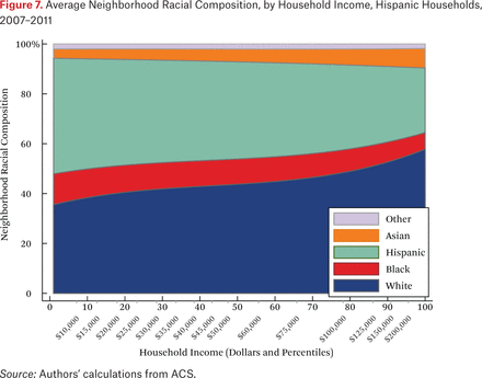
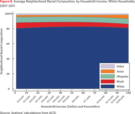
What is not clear from figure 4 is whether households of different races but the same income typically live in racially similar neighborhoods. Figures 5 through 8 are similar to figure 4, but present average neighborhood racial composition as a function of both householders’ race and income, as described by the functions fhg(p,1). For example, figure 5 shows the average neighborhood racial composition for Asian households, conditional on their household income percentile. Asian households at the 50th percentile of the income distribution live in neighborhoods where, on average, roughly 50 percent of households are white, 10 percent are black, 20 percent are Hispanic, and 20 percent are Asian. Note that here, and throughout the paper, income percentiles are always measured in terms of the overall national income distribution, not group-specific income distributions. Of course, the axes could be scaled to reflect race group-specific household income distributions, in percentiles or dollars, if that were the goal of the description.
One striking feature of figures 5 through 8 is the high proportion of same-race households in the neighborhoods of each race group, regardless of income. For example, the average neighborhood racial composition for Asian households shows that, across the income distribution, nearly 20 percent of households in the neighborhood are Asian households, despite the fact that Asian households make up only roughly 5 percent of the population. Likewise, even high-income black households typically live in neighborhoods that are more than 40 percent black and less than 50 percent white. Similar patterns are evident for each race group, but are most extreme for whites. White households live in neighborhoods that are around 80 percent white, and this racial isolation is consistent across the income distribution. In part this pattern results from between-region racial composition patterns. Many low-income white households are in rural areas and parts of the country with few nonwhite residents; as a result, most poor whites live in predominantly white neighborhoods. Nonetheless, the general patterns in figures 5 through 8, particularly when compared with figure 4, indicate high levels of racial segregation, even conditional on income.
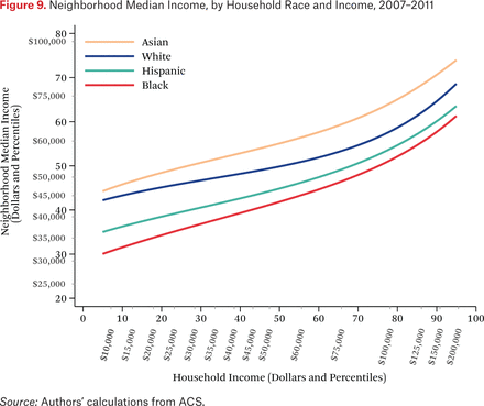
Figure 9 describes the average neighborhood income distributions for households of different races, by household income. Each line describes the median income of the average neighborhood income distribution for households of a given race group, as a function of their income. The lines come from the ftg–1(p,0.50) functions. The figure is similar to figure 2 (which shows the ftt–1(p,0.50) function), but shows only the median of the average neighborhood income distribution (not the 25th and 75th percentiles), and presents a separate line for each race group.
The most striking feature of figure 9 is that Asian and white households live in neighborhoods where the median income of their neighbors is much higher than that of the neighbors of similar income Hispanic and black households. The vertical distance between the lines yields a comparison of neighborhood conditions between households of different races. For example, poor black and Hispanic households live in neighborhoods where the median income is roughly two-thirds that of equally poor white and Asian households.
Another way to compare neighborhood conditions of the different groups is to look at the horizontal differences between the lines. From this perspective, the figure shows that black and Hispanic households typically live in similar neighborhoods (in terms of median income) as white households with much lower incomes. Black households with incomes of roughly $60,000, for example, live in neighborhoods with median incomes similar to those of white households earning roughly $12,000. This means that black households, on average, need to earn about five times that of poor white households to live in a similar neighborhood. Hispanic households must earn 3.7 times that of whites (see Reardon, Fox, and Townsend 2015).
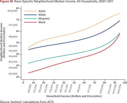
Figure 9 illustrates the income distribution in the typical neighborhood of households of different races. Figure 10, in contrast, illustrates the opposite: the income distributions of each race in the average neighborhood of households of a given income. Specifically, figure 10 plots the functions ft*h–1(p,0.50). Each line represents the median of the neighborhood income distribution of a specific group for typical households of specific incomes. For example, a typical household at the 25th percentile of the income distribution lives in a neighborhood where the median black income is at roughly the 30th percentile of the national income distribution and the median white income is at roughly the 47th percentile. The figure shows that, on average, Asian and white income distributions are higher than those of blacks and Hispanics for all values of household income, indicating that, for most households in the United States, black and Hispanic neighbors are poorer than Asian and white neighbors. Indeed, across the income distribution, the typical household’s black neighbors have median incomes roughly $20,000 less than those of white neighbors—a substantial difference. These patterns have important implications for perceptions of racial differences. If households were sorted only by income, the average household would experience no racial differences in income among their neighbors. The patterns here (as well as in figures 5 through 9) indicate that households are sorted not only on income, but on race as well. The average person looking at his or her neighbors experiences blacks and Hispanics as poorer than whites and Asians.
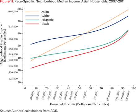
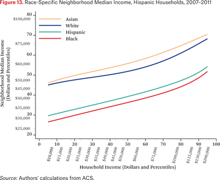
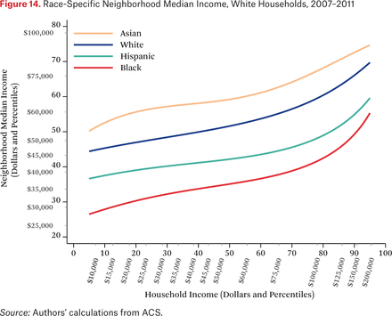
Figures 11 through 14 are similar to figure 10, but show race-specific median incomes in the neighborhoods of Asian, black, Hispanic, and white households, respectively. Specifically, each line in figures 11 through 14 is one of the fg*h–1(p, .50) functions. For example, the third (Hispanic) line in figure 11 indicates that the typical Asian household at the median of the national income distribution lives in a neighborhood where the median income among Hispanic households is around the 46th percentile of the national income distribution. As in the other figures showing the f–1 functions, one could choose other percentiles of these race-specific distributions to display as well.
In figures 11 through 14, the steepness of the same-race lines indicates the degree of within-race segregation. Figure 11 suggests, for example, that Asian households are highly segregated by income—low-income Asians live in neighborhoods where their Asian neighbors are poor, on average, and high-income Asians have much higher-income Asian neighbors. Within-group income segregation is also high for black households, but is somewhat lower among white and Hispanic households. These findings also suggest that perceptions of racial differences in income may differ across races and by income level. For example, very poor Asians typically have white and Hispanic neighbors who earn substantially more than themselves, while affluent Asians generally live in neighborhoods where they are the highest-income group. The average Hispanic, black, or white resident of any income typically experiences Asians as wealthier than all other race groups.
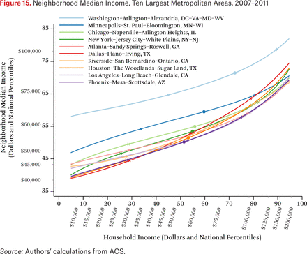
Each of the previous figures describes patterns for the United States as a whole. The methods we describe here can be applied to smaller geographic regions as well. Figure 15 provides an example. It shows median neighborhood income, as a function of household income, for each of the ten largest metropolitan areas in the United States.2 The lines come from metropolitan area-specific functions ftmt–1(Rm(p), .50), where Rm(p) is a function that converts national income percentiles to local income percentiles of metropolitan area m (that is, it is the cumulative income percentile distribution function for metropolitan area m). The figure indicates, for example, that households at the 50th percentile of the national income percentile distribution in the Washington, D.C., metropolitan area live in neighborhoods where the median income is above the 65th percentile of the national income distribution.
A notable feature of this figure is that both axes are shown in the national income distribution to allow for comparisons across metropolitan areas. Although the graph could be constructed using local income distributions, that would obscure comparisons among households of the same income in different metropolitan areas, because the 50th percentile of Chicago’s income distribution is not the same as the 50th percentile of New York’s income distribution. Using a common scale for income (percentiles of the national income distribution) makes evident that households in some metropolitan areas live, on average, in very different neighborhoods than similar income households in other areas. For example, Washington, D.C., households earning $60,000 live in much higher-income neighborhoods than similar income households in Los Angeles do; in fact, Washington, D.C., households earning $60,000 typically live in neighborhoods similar to those of Los Angeles households earning $150,000. For reference, the markers on the lines indicate the 25th, 50th, and 75th percentiles of each metropolitan area’s own household income distribution.
Also evident in figure 15 is that income segregation varies across metropolitan areas. Again, the steepness of the lines in figure 15 provides an intuitive measure of income segregation. In the Minneapolis metropolitan area, for example, segregation is lower than in the Dallas or Houston areas. In Dallas and Houston, for example, high- and low-income households live, on average, in neighborhoods very different in median income levels; the difference in neighborhood conditions in Minneapolis, particularly between high- and middle-income households, is much less pronounced.
DISCUSSION
The approach we outline here provides a variety of ways of characterizing the joint patterns of racial and socioeconomic segregation. A full characterization of these patterns is provided by the group-specific income distributions (the ρg functions, in our notation) and the set of exposure functions that describe the average neighborhood income distributions conditional on race and income (the fhg functions), but simply reporting the parameters of these functions is neither feasible nor particularly informative (in our illustration here, these functions are together characterized by a total of 480 parameters). Instead, we have chosen to illustrate key features of these functions in a series of figures, each of which highlights a different aspect of the joint distribution.
One could, of course, derive additional statistics from these functions. The slopes of the lines in figure 2, for example, may be useful as measures of segregation. In other words, the steepness of the lines indicates the strength of the association between one’s own income and that of one’s neighbors. The vertical or horizontal distances between the lines in figure 9, likewise, might be thought of as measures of racial inequality in neighborhood conditions net of differences due to between-race differences in household income. Measures of between-group differences in racial composition of neighborhoods (evident in figures 5 through 8) may be useful for measuring and understanding racial segregation. Statistics of these types can be derived from the estimated ρg and fhg functions and then may be usefully compared across time or metropolitan areas to assess changes or variation in patterns of racial/economic segregation.
Our goal here is to describe a general approach to measuring joint patterns of racial and socioeconomic segregation. Given that, a discussion of the substantive implications of the patterns illustrated in our figures here is beyond the scope of this paper, but a few features of the figures are particularly striking. First, the figures clearly show large racial differences in neighborhood racial and economic composition, even conditional on income. That is, equally poor white, black, Hispanic, and Asian households are located in very different neighborhoods from one another; for example, black households typically live in neighborhoods similar to those of white households making $40,000 to 50,000 less. This is consistent with research showing that economic disparities are insufficient to explain racial segregation and that middle-class blacks live in poorer neighborhoods than most whites (Logan 2002, 2011; Reardon, Fox, and Townsend 2015; Timberlake 2002, 2007; Timberlake and Iceland 2007; Adelman 2004; Friedman, Gibbons, and Galvan 2014; Pattillo 1999; see also Pattillo 2005; for a useful review of this literature, see Lareau and Goyette 2014). If racial segregation were simply the result of racial differences in income, we would expect racial differences in neighborhood composition to disappear once we condition on household income. The figures here clearly show that they do not.
Second, the figures reveal something about the income levels of households that different racial and income groups might encounter in their neighborhood. Figures 10 through 14 show that the typical household, regardless of income level or race, lives in a neighborhood where black and Hispanic neighbors have lower incomes than white and Asian neighbors. Indeed, the black and Hispanic neighbors of high-income households have lower median incomes, on average, than the white and Asian neighbors of low-income households. This pattern may play a role in shaping racial stereotypes.
Third, figure 15 shows substantial variation among metropolitan areas in the patterns of exposure to high- and low-income neighbors, conditional on income. Not shown here, but straightforward to compute from the methods described, are metropolitan patterns of racial differences in neighborhood economic conditions. A full description of variation across metropolitan areas in the joint neighborhood distribution of race and income would likely reveal considerable variability.
Recent scholarship demonstrates that neighborhood economic conditions affect child development and opportunities for educational and economic success. For example, Chetty, Hendren, and Katz (2015) demonstrate that moving to a lower-poverty area has a substantial positive effect on the life-course trajectory of young children. Given this evidence, it is likely that variation in economic neighborhood conditions across racial groups, households of different incomes, and metropolitan areas may lead to disparities in developmental, educational, and economic outcomes. In other words, segregation matters for children’s outcomes.
In general, children growing up in poor families face a double disadvantage. Their families have fewer private resources than richer families, and they tend to live in poorer neighborhoods, meaning they have access to fewer contextual resources as well. Even more troubling, figure 9 illustrates that low-income black and Hispanic children face a triple disadvantage relative to middle-class white children: not only do their families have fewer private resources and live in poorer neighborhoods, but they also live in much poorer neighborhoods than equally poor white children. Given that neighborhood conditions matter for children’s development, the joint patterns of racial and economic segregation described here suggest that children of different races and incomes face dramatically different life opportunities. The stark racial disparities in neighborhood conditions may be one source of persistent racial inequality.
The methods described here provide a consistent way of quantifying disparities in neighborhood conditions that is largely independent of the specific income thresholds used in tabulating income in the ACS data. This innovation makes possible much more detailed comparisons of racial and economic neighborhood conditions across place, time, and population groups than has been used in prior work. We expect that these methods and the resultant datasets will enable researchers to more carefully investigate the patterns, causes, and consequences of racial and economic segregation.
APPENDIX A: ESTIMATING INCOME DENSITY AND EXPOSURE FUNCTIONS
Estimating the income density and exposure functions proceeds in three steps. First, we estimate the group-specific income density functions ρg(p) and, from them, the group-specific cumulative income distribution functions Rg(p). Second, we estimate the functions fht(p,q) and, from them, the function ftt(p,q). Third, we estimate the functions fhg(p,q) and, from them, the functions ftg(p,q).3 We do this because the parameter estimates from each step of the model are used to inform the estimation of each subsequent step. Once we have estimated each of these functions, we use them to compute the various exposure functions of interest, as described in the text.
Notation
We use g and h to denote G racial groups; we use p and q to denote income levels, expressed as percentiles (scaled from 0 to 1, for convenience) of the population income distribution; and we use i to index neighborhoods. We use j, k = 1 . . . ., K to index the ordered income categories in which income is reported in the ACS. The ACS data we use in this paper includes five mutually exclusive racial-ethnic groups and sixteen income categories, so G = 5 and K = 16 here. Finally, we use Tx to denote the count of households in population x, and πgi to indicate the proportion of households in neighborhood i that are in group g.
Data
The data consist of tract-level counts of households of race g with income in category k in census tract i. These counts are denoted Tigk. Let  denote the total number of households of group g in tract i, let Ti∙∙ = ∑g Tig∙ denote the total number of households in tract i; and let T∙g∙ = ∑i Tig∙ denote the total number of households of group g in the population. The proportion of households of group g in tract i with incomes in income category k is

The proportion of households of group g in the population with incomes in income category k is

We denote the corresponding proportion of households with incomes in category k or below as  and
and  , respectively. Finally, the proportion of the total population of households that have income in income category k is denoted pk or qk:

COMPUTING EXPOSURE MEASURES
From the ACS data, we compute G2K2 = 6,400 values of fgjhk(for each combination of g, h, j, k, where g and h index five racial groups and j and k index sixteen income categories). Each fgjhk is an exposure index of members of group g with income in category j to members of group h in income category k or below. These are computed from the tract-by-group-by-income category counts as

We also compute GK2 = 1,280 values of ftjhk (for each combination of h, j, k). Each ftjhk is an exposure index of members of the population with income in category j to members of group h in income category k or below. These are computed from the tract-by-group-by-income category counts as

Estimating Rg(p) and ρg(p)
We assume the group-specific income density functions (the ρg(p)’s) can be well approximated as polynomials of order C:

This might be unrealistic if income were measured in dollars (because the long right tail of the cumulative income distribution function cannot be modeled well as a polynomial), but it is much less problematic when p measures income in percentiles of the population income distribution. In this case, the ρg(p) functions must satisfy a few conditions. Specifically,

The first condition in (A7) is simply the property that the density functions have integral 1. The second follows from the fact that the population income percentile distribution is, by definition, uniform. These two conditions imply, respectively, that
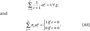
Therefore, we can estimate the ρg(p) functions by fitting the following regression model to the GK = 80 points (ρ∙gk, mk):

where Dg is an indicator variable taking the value 1 if an observation pertains to group g and 0 otherwise. Let mk = ½(pk–1 + pk) be the percentile that falls in the middle of category k.4 For the analyses reported in this paper, we set C = 3. Inspection of the fitted income density functions indicates very good fit with C = 3.
In fitting the model, we enforce the following G + C + 1 linear constraints:

This set of constraints is sufficient to satisfy the conditions in (A7). One of the constraints is redundant, so a total of G + C constraints are used to estimate the density functions.
For each group g, the estimated income density function is then a Cth-order polynomial:

From  , it is straightforward to estimate the group-specific cumulative income distribution function Rg(p) by taking the integral of
  on the interval [0,1]:

Estimating fht(p,q) and ftt(p,q)
Before estimating the fht(p,q) and ftt(p,q) functions, note that it follows from the definition of fht(p,q) (equation (3)) that

Next, note that the fht(p,q) and ftt(p,q) functions must satisfy four conditions, by definition:
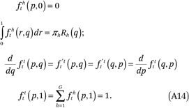
The first of these states that the exposure of any subset of households to the members of another group h with incomes less than or equal to 0, is by definition 0. The second says that, on average, neighborhoods have the same income distribution of each group h as the total population. The third is a symmetry condition that follows from the definition of ftt(p,q).5 The fourth says that the exposure of any subset of households to households with incomes less than or equal to 1, is by definition 1.
We assume the fht(p,q) functions are well approximated as polynomial surfaces of order A in p and B in q:

We estimate these functions by fitting the following regression model to the GK2 points (ftjhk, mj, qk):

where Dth is an indicator that an observation pertains to exposure to group h.6
To ensure that the estimated functions satisfy the conditions in (A14), we impose a set of constraints on the model:
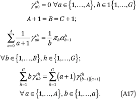
Together, these constraints ensure that the conditions in (A14) are met. The first constraint in (A17) implies the first condition of (A14) is met:

Note that the constraint that  = 0 for all h and a implies that the
  terms can be omitted from (A16) going forward.
Second, the constraints in (A17), along with (A12) imply the second condition in (A14):

Third, the constraints in (A17) imply the third condition in (A14):
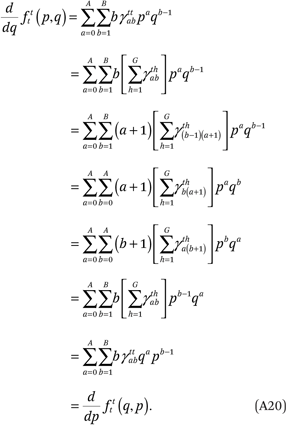
Finally, the constraints in (A17), in conjunction with (A8), ensure that the fourth condition in (A14) is met:
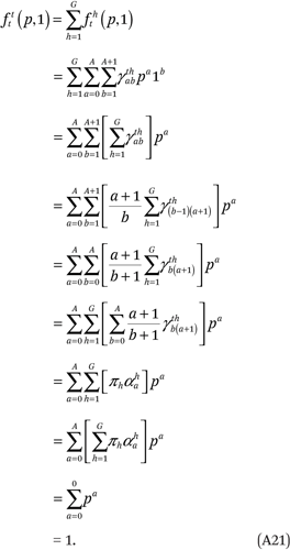
Thus, the constraints in (A17) and (A10) are sufficient to ensure the conditions in (A14) are satisfied. We satisfy the first set of constraints in (A17) by setting  = 0 for all a and g. After we set A + 1 = B = C+ 1, the last two conditions in (A17) contain an additional GB + AB/2 constraints that are required to estimate fht(p,q). Because fht(p,q) has GB2 total parameters, there are a total of
  free parameters in the model. With G = 5 and A + 1 = B = 4, fht(p,q) has 80 parameters, subject to 26 constraints, for a total of 54 freely estimated parameters.
Once we have estimated fht(p,q), it is straightforward to estimate

Estimating fhg(p,q) and ftg(p,q)
Estimating the functions fhg(p,q) and ftg(p,q) follows the same logic, with some modifications. Recall that we require that A + 1 = B = C + 1. As before, we assume the functions fhg(p,q) can be well approximated as polynomial surfaces of order A in p and B = A + 1 in q:

The fhg(p,q) and ftg(p,q) functions must satisfy several conditions:
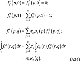
These are satisfied with the following constraints:

and

where γthab = 0 for all a ∈ {A + 1, . . . ,2A}. The second and third lines of (A25) contain a total of G(A + 1)(2A + 2) = 2GB2 constraints (160 constraints in our example with G= 5 and B= 4 ).
The first condition in (A24) follows from the constraint that  = 0 for all a, g, and h:

As earlier, this implies we can omit the  terms from the model. The second condition follows from second constraint:

The third condition follows from the third constraint:
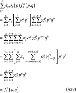
The fourth condition follows from (A28) and (A19):

Although the constraints in (A25) are sufficient to satisfy the conditions in (A24), in practice, we use a subset of constraints implied by those in (A25) for computational ease. Specifically, we use the first and second sets of constraints from (A25) and an additional set of GB constraints implied by those in the third line of (A25) and the third line of (A17):

Once we have constrained  = 0 for all a, g, h, the second line of (A25) implies GB constraints. One of the GB constraints in (A30) is redundant, so we invoke a set of 2GB – 1 total constraints in fitting the fhg(p,q) functions.
We estimate the fhg(p,q) functions by simultaneously fitting a set of G2 separate polynomial surfaces of order A in p and order A+ 1 in q through the G2K2 points (fgjhk, mj, qk), subject to the constraints described:

where Dgh is an indicator variable taking the value 1 if an observation pertains to the exposure of group g to group h, and 0 otherwise.7 Given G = 5 and A + 1 = B = 4, the functions have a total of 400 parameters, which are subject to 39 linear constraints (159 if we use the full set of constraints in (A25)).
Once we have estimated fhg(p,q), it is straightforward to estimate

which implies that

APPENDIX B: ESTIMATING A NONLINEAR ASSOCIATION WHEN THE REGRESSOR IS MEASURED ORDINALLY
This appendix describes one solution to the following general problem: we want to estimate a nonlinear polynomial function describing the conditional mean (given X) of a variable Y when X is measured in a set of ordered categories rather than continuously.
Some notation
Suppose income, a continuous variable denoted by X, is categorized into K categories, defined by K – 1 ordered thresholds c1, c2, . . . , cK–1. Instead of observing X, we instead observe c ∈ {1, . . . , K} where c = j i f f cj–1 < X ≤ cj, where c0 = –∞ and cK = +∞. In addition, let p denote income in percentile ranks, scaled from 0 to 1 (so that p = CDF(x) and pj = CDF(cj) for j ∈ {0, . . . , K}, where CDF(x) is the cumulative income distribution function in the population of interest). Let mj = ½(pj–1 + pj) be the percentile that falls in the middle of category j. Let wj = ½(pj – pj–1) be half the width of income category j. Note that since p measures income percentile ranks in the population of interest, p is uniformly distributed on the interval [0,1] and its density function is ρ(p) = 1, by definition.
Let Y measure some characteristic of an individual, where Y may be binary or continuous. Our goal is to estimate the function f(p) = E[Y|p] describing the conditional expectation of Y given p, despite the fact that we only observe c and Y. Our approach is the following: first, estimate the mean value of Y (and its sampling variance) among individuals in each income category j; denote these  and v̂j, respectively; second, assign income category j a value of p equal to mj = ½(pj–1 + pj), the midpoint of the interval (pj–1, pj); and, third, regress
  on a polynomial function of mj using weighted least squares regression, weighting the observations by 1/v̂j.
One complication that arises is that, if the function f(p) is nonlinear, then E[Y|c = j] ≠ E[Y|p = mj]. That is, the mean value of Y within an income category will not necessarily equal the mean value of Y among those with incomes at the exact midpoint of the income category. If the curvature of f(p) is substantial or the income categories are wide, simply regressing  on m may lead to bias in the estimated βa’s. To remedy this potential bias, we make an adjustment to the mja’s.
Suppose that f(p) is well approximated by a polynomial of order A:

We can express the average value of Y in category j as

Because ρ(p) = 1, this is
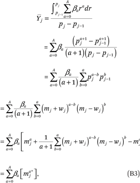
where maj* = maj + zaj and

Note that the zaj’s in (B4) can be simplified. For example, for a ∈ (0,1,2,3,4), we get
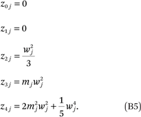
(B3) implies that  = E[Y|c = j] is not a simple polynomial function of mj unless A = 0 or A = 1 (that is, unless f(p) is a linear function). If f(p) is nonlinear,
  is a linear combination of mj0*, mj1*, . . . mjA*. As a result, we can estimate f(p) by regressing
  on the mja*’s rather than on the mja’s:

In (A9),  = πgj, the proportion of households in income category j who are members of group g. In (A16) and (A33)
  = ftjhk, the average proportion one’s neighbors who are members of group h and who have incomes at or below some category k. The sampling variance of
  in either case will be proportional to the width of the income category (because this is proportional to the number of households in that category in the population) and
  (the variance of a proportion). Because the estimates of WLS are invariant under a linear scaling of the weights, we set
  .
.
APPENDIX C: OTHER QUANTITIES OF INTEREST
Given fhg(p,q) for all groups g and h, we can derive a number of additional useful quantities. Several of these are described in the text. Here, we describe two additional quantities of interest.
Standard exposure measures. We can obtain additional exposure measures, such as the exposure of members of group g with incomes between pmin and pmax to members of group h with incomes between some qmin and qmax, by computing

A useful special case of this is the exposure of those in group g with income less than or equal to p to those in group h with income less than or equal to q. Denoted Fhg(p,q), this is

For example, the exposure of group g to poor neighbors would be Ftg(1, qpoverty), where qpoverty is the income value that corresponds to the poverty line. Thus, measures of “exposure to poverty” used in much of the segregation literature (Logan 2011; Timberlake 2002) are special cases of the measurement approach we describe here. Note that in the special case where p = q = 1, Fhg(1,1) is a standard exposure measure of racial segregation, the exposure of group g to group h (usually denoted gP*h). In our notation, this standard exposure measure can be written

Standardized measures of between-group differences in neighborhood income distributions, conditional on household income. We might want to measure the difference between the average neighborhood income density functions for two groups g1 and g2, conditional on p; that is, for any given value of p, we want to measure the difference between the distributions ρtg1(p,q) and ρtg2(p,q). We could do this by measuring, for example, the difference in their medians (that is, by comparing ftg1–1(p,.50) and ftg2–1(p,.50)), but this would not provide a summary measure of the overall difference in the distributions. A useful summary measure of the degree of overlap of two distributions is the probability that a randomly chosen value from one distribution is larger than a randomly chosen value from the other. In our case here, this is the probability that a randomly chosen member of the neighborhood of the typical group g1 household with income p has an income higher than that of a randomly chosen member of the neighborhood of the typical group g2 household with income p. This probability is equal to

This probability can be converted to the V statistic, a nonparametric measure of the difference between two distributions:

where Φ–1(∙) is the probit function. Here Vg1g2(p) is a function of p that describes the extent of overlap between the typical neighborhood income distributions. V can be interpreted as the standardized difference between the means of two normal distributions with the same degree of overlap as the distributions of interest, so it is interpretable as a “pseudo effect size” (Ho and Haertel 2006; Ho and Reardon 2012; Holland 2002).
FOOTNOTES
↵1. Although the exposure measures themselves are calculated in percentiles, the axes need not be presented in percentiles. The axes can be rescaled and shown in dollars, or even log dollars. The dollar figures here, as well as in all following figures, are 2012 dollars and correspond directly to the thresholds of the sixteen income categories in the ACS data. For convenience, here and elsewhere, the axes are labeled in terms of both income percentiles and dollars.
↵2. We define metropolitan areas using the 2003 Office of Management and Budget metropolitan division codes and rank these areas based on their total population in 2010.
↵3. One approach to estimating fhg(p,q) is to estimate ρgi(p) in each neighborhood i and to estimate ρg(p). Then Rgi(p) can be estimated as
 . We then estimate fhg(p,q) by substituting
  , and the observed group counts and proportions into Equation (1). The potential drawback of this approach is that it requires us to estimate ρgi from small samples in each neighborhood i and group g. Instead, we adopt an alternative approach, which we describe in detail in this appendix.
↵4. In practice, when we fit (A9), we replace the midpoint mcj with mcj* = mcj + zcj, where zcj is defined as in appendix B. In addition, we fit (A9) using weighted least squares regression, with weights as detailed in appendix B.
↵5. To see this, note that
 is the exposure of individuals with income of exactly p to those with income of exactly
↵6. Again, in fitting this model, we replace the midpoints mcj with mcj + zcj and use a weighted least squares regression as detailed in appendix B.
↵7. In fitting this model, we replace the midpoints mcj with mcj + zcj and use a weighted least squares regression as detailed in appendix B.
- © 2017 Russell Sage Foundation. Reardon, Sean F., Joseph Townsend, and Lindsay Fox. 2017. “A Continuous Measure of the Joint Distribution of Race and Income Among Neighborhoods.” RSF: The Russell Sage Foundation Journal of the Social Sciences 3(3): 34–62. DOI: 10.7758/RSF.2017.3.2.02. An earlier version of this paper was presented at the Russell Sage Foundation conference “The Spatial Foundations of Inequality” on February 11–12, 2015. We thank George Galster, Patrick Sharkey, two anonymous reviewers, and the conference participants for helpful feedback. Direct correspondence to: Sean F. Reardon at sean.reardon{at}stanford.edu, Graduate School of Education, Stanford University, 520 Galvez Mall, #526, Stanford, CA 94305, 650-736-8517; Joseph Townsend at jtownsen{at}stanford.edu, Graduate School of Education, Stanford University, 520 Galvez Mall, #407, Stanford, CA 94305; and Lindsay Fox at lfox{at}mathematica-mpr.com, Mathematica Policy Research, 505 14th Street, Suite 800, Oakland, CA 94612.
Open Access Policy: RSF: The Russell Sage Foundation Journal of the Social Sciences is an open access journal. This article is published under a Creative Commons Attribution-NonCommercial-NoDerivs 3.0 Unported License.


