
Abstract
This article examines the most recent trends on neighborhood racial integration in New York—the country’s largest metropolitan area in 2019 with a total population of 19.2 million. We ask how the suburbanization of both immigration and poverty have transformed suburbs over the last two decades. We highlight four findings. First, ethnoracial diversification has led to a significant decline in nonintegrated neighborhoods and a sharp rise in integrated neighborhoods, but such a decline is more dramatic in suburbs than in cities. Second, White-integrated neighborhoods remain the most prevalent form of neighborhood integration in both cities and suburbs. Third, immigrant neighborhoods are more likely to be integrated in both suburbs and cities, but immigration’s impact on neighborhood integration in suburbs was stronger in 2000 than in 2019. Finally, the impacts of concentrated immigration, affluence, and disadvantage on neighborhood integration are consistent across suburbs and cities, pointing to convergent processes over time.
In 2016, 55 percent of the U.S. population—175 million people—lived in suburban counties, relative to about ninety-eight million in the urban core. Among the country’s major metropolitan areas with population above one million, annual growth rates in suburbs also surpassed the cities for the first time in 2016, signaling the resurgence of suburbs (Frey 2021). Beyond population growth, two major demographic trends have reshaped the ethnoracial composition of suburbs from New York to Los Angeles—the suburbanization of immigration and of poverty (Allard 2009; Lacy 2016; Brettell, Hardwick, and Singer 2008). The influx of immigrants and minorities into the suburbs since the mid-1990s have not only intensified racial diversification, but also generated social inequality in formerly homogenous communities (Frey 2021). In the suburbs, everything old is new again—residential segregation, spatial integration, neighborhood inequality, White flight, and ethnic invasion and succession. This renewed interest has informed a burgeoning research literature focusing on the recent transformations of suburbs (Clergé 2019; Parisi, Lichter, and Taquino 2019; Kye 2018; Farrell and Firebaugh 2016).
This article examines recent patterns of neighborhood racial integration in New York—the country’s largest metropolitan area, home to a total population of 19.2 million in 2019. A historic immigrant gateway, New York was the destination of immigrants from southeastern Europe at the turn of the twentieth century, when millions of German, Irish, Italian, and Jewish immigrants arrived in search of better opportunities for themselves and their children (Foner 2000). A global city with diverse thriving neighborhoods and dense ethnic communities, New York has received millions of Chinese, Dominican, Jamaican, and Mexican immigrants since 1965 (Foner 2013; Hum et al. 2021). A multiethnic metropolitan area, New York provides a unique case study for the process of neighborhood diversification and residential integration in the suburbs.
This work contributes to research on neighborhood racial integration in four ways.1 First, we document key patterns of racial integration in the suburbs over two decades using data from the 2000 U.S. Census and 2015–2019 American Community Survey.2 By comparing residential patterns in the suburbs and principal cities in one metropolitan area, the analysis considers how recent demographic transformations in suburbs might differ from those in cities. Second, we develop a new typology of neighborhood integration to summarize these patterns over time and to classify neighborhoods by level of racial integration. Third, in analyzing change over time, we highlight diverse pathways of neighborhood transition, providing a contrast among rapid diversification, stable integration, and persistent segregation. Fourth, we use five mutually exclusive ethnoracial groups (hereafter racial groups): non-Hispanic Whites, non-Hispanic Blacks, Hispanics, non-Hispanic Asians, and non-Hispanic Others.3 Moving beyond the Black-White dichotomy, the analysis also includes integration patterns for Asians and Hispanics.
The article addresses the following research questions: First, how do ethnoracial groups sort themselves across the spatial landscape of New York and how have these patterns changed from 2000 to 2019? Second, what do demographic shifts reveal about pathways of neighborhood integration in suburbs and in cities? Third, which neighborhood characteristics are associated with declining segregation and increasing integration? Fourth, what implications do these trends hold for the future of residential integration? In addressing these questions, we compare spatial patterns for four of our racial groups—Asians, Blacks, Hispanics, and Whites—between cities and suburbs over the last two decades.
SUBURBS AS NEW FRONTIERS OF INTEGRATION
Historically, most immigrants first arrived in immigrant gateways—major urban centers. The 1990s saw a steep increase in the number of new immigrants who settled in the suburbs upon arriving in the United States (Brettell, Hardwick, and Singer 2008), fueling the rise of ethnoburbs—affluent, suburban ethnic clusters (Wen, Lauderdale, and Kandula 2009). This rise coincided with a growth in the suburbanization of poverty, as suburban counties experienced a sharp rise in poverty during the 1990s (Allard 2009). That the suburbanization of immigration has occurred alongside the suburbanization of poverty positions suburbs as the next frontiers of residential integration and neighborhood inequality (Lacy 2016).
Although many suburbs remain predominantly White, minority populations accounted for 32 percent of suburban residents in 2016 (Parker et al. 2018). Immigration has been a key driver of suburban growth. From 2000 to 2014, both international and domestic migration added 11.7 million residents to suburban counties, each source accounting for about half of this growth. By contrast, urban counties added more than seven million residents from international migration while losing 5.4 million to domestic migration, resulting in a net gain of 1.6 million residents in the same period (Parker et al. 2018). During the COVID-19 pandemic, U.S. population growth has shifted farther away from urban centers to suburban destinations and small cities as a result of “the great reshuffling” and the rise of remote work arrangements (Frey 2021; Forman 2021).
In addition to new immigrant arrivals, spatial assimilation—the movement of immigrant groups from cities to suburbs over time—played a major role in diversifying suburbs beginning in the 1990s (Alba, Logan, and Stults 2000; Logan, Zhang, and Alba 2002). Focusing on immigrant gateways, prior research documents shifting patterns of residential integration—movements away from cities to surrounding suburbs in metropolitan areas from New York to Los Angeles (Alba, Logan, and Stults 2000; Logan, Zhang, and Alba 2002). Research on spatial assimilation shows that immigrants and their children have been relatively more successful in translating their socioeconomic gains into residential mobility in more advantaged neighborhoods in close proximity to Whites (Alba et al. 1999; Alba, Logan, and Crowder 1997; Farrell 2016; Tran 2020). Over the last decade, the coming of age of the post-1965 second generation—12 percent of the total U.S. population—has intensified existing patterns of spatial assimilation with sizable numbers reaching young and middle adulthood (Tran 2020; Brown 2007; Kasinitz et al. 2008).
Beyond quantitative and spatial analyses, many qualitative case studies have improved our understanding of suburban inequality by focusing on specific immigrant or minority groups in suburbs: East Asians (Lung-Amam 2017; Matsumoto 2018), Mexicans (Agius Vallejo 2012), West Indians (Clergé 2019), and African Americans (Lacy 2007; Haynes 2001). Alongside this general trend of increased residential integration for many ethnoracial groups, including Blacks, significant neighborhood inequality remains between U.S.-born Whites and immigrant groups in suburbs (Farrell and Firebaugh 2016). In addition, differences in suburbanization rates across immigrant groups are large—for example, Europeans and Asians (other than Chinese) reported the highest rates (Farrell 2016). Relative to coethnics in cities, immigrants in suburbs (except Caribbeans) also report lower levels of segregation from the majority group (Farrell 2016). Moreover, recent diversification has also led to suburban shifts in school compositions and occupational structures, redistributing opportunities and generating tensions over suburban resources between established residents and recent immigrants (Warikoo 2020; Zapatka, Mollenkopf, and Romalewski 2021). Although neighborhoods have become diversified and integrated over time (Logan and Zhang 2010; Parisi, Lichter, and Taquino 2019; Kim and White 2010; Hwang 2015; Ellen 2000; Maly 2005; Iceland 2009), such geographical proximity does not necessarily lead to social integration.4
CONVERGENT PATHWAYS OF NEIGHBORHOOD INTEGRATION
By focusing on the last two decades, our analyses update earlier work by tracing residential integration over time with a focus on suburban transformation. Cities are characterized by social mixing and diversity, whereas suburbs are characterized by ethnoracial homogeneity. As a result, ethnoracial diversification in suburbs could trigger more dramatic transformations of previously White neighborhoods. Three decades of research in neighborhood racial integration has focused on cities, yielding important insights into the processes and mechanisms of neighborhood change (Logan and Zhang 2010; Kim and White 2010; Ellen 2000; Iceland 2009). These core conceptual frameworks—theories of neighborhood racial integration—have amply documented the process of ethnic influx in which immigrant groups arrived in formerly White areas. Specifically, ethnic neighborhood succession occurred as declining White ethnics population was replaced by rapidly growing non-White immigrant populations. Moreover, that White flights often follow minority replacements also leads to the resegregation of former integrated neighborhoods, except in stably integrated neighborhoods where sizable Asian and Hispanic population serve as a racial buffer between Blacks and Whites. John Logan and Charles Zhang refer to these “global neighborhoods” as areas where “Hispanics and Asians are the pioneer integrators of previously all-white zones, later followed by blacks” (2010, 1069). Yet stably integrated multiethnic neighborhoods remain rare, and social buffering can also be temporary, many such integrated areas transitioning into ethnic enclaves, immigrant communities, or resegregated neighborhoods (Ellen 2000; Maly 2005).
Diverse metropolitan areas see five “pathways of neighborhood change” over time (Logan and Zhang 2010). The classic one of neighborhood invasion and succession—where aging White ethnics are replaced by minority populations—often leads to resegregation. Neighborhood revitalization presents an alternative, whereby new immigrant groups move into formerly minority neighborhoods, investing resources and starting businesses to generate “global immigrant neighborhoods” (Hum et al. 2021; Hum 2014). Neighborhood gentrification is a third possibility, in which educated White professionals move into disinvested minority (Freeman 2006) or recently revitalized immigrant neighborhoods (Hwang 2015). Neighborhood integration is a fourth, in which minority populations—especially second-and-higher-generation Asians and Hispanics—move into predominantly White neighborhoods, generating stably integrated areas. The buffering effect of Hispanics and Asians derives in part from these more assimilated individuals serving as “initial integrators of white neighborhoods” (Logan and Zhang 2010, 1072). A fifth common pathway in more distressed inner-ring suburbs involves the arrival of minority or immigrant populations that could result in stably segregated, high-poverty suburban communities (Kneebone 2017).
HYPOTHESES
The suburbanization of immigration has intensified as new immigrants began to settle directly in suburbs and the second generation became more spatially assimilated over the last two decades. Alongside the increasing influx into suburbs, immigration into cities continued unabated in the New York region until the onset of the COVID-19 pandemic in March 2020 (Hum et al. 2021). We expect ethnoracial diversification to have divergent impacts on neighborhood integration in suburbs and cities. These trends point to two major sets of hypotheses. The first set examines how the process of neighborhood integration differs in suburbs and cities. The second examines how three key neighborhood indicators—concentrated immigration, concentrated advantage, and concentrated affluence—are associated with different types of neighborhood racial integration. Our focus on immigration and disadvantage as predictors of neighborhood integration follows a long tradition of research that documented how immigrant neighborhoods in cities are ethnic enclaves with dense networks of coethnics (Foner 2013; Hum 2014; Kasinitz et al. 2008) and how many disadvantaged areas in cities are hypersegregated, minority neighborhoods with high levels of concentrated poverty (Freeman 2019; Sampson, Raudenbush, and Earls 1997). Finally, our attention to affluence as a predictor of neighborhood integration follows research on the rise of ethnoburbs and the persistence of affluent White suburbs (Kye 2018; Lung-Amam 2017).
Hypothesis 1a. The rise in racial diversification would lead to a decline in nonintegrated neighborhoods and an increase in integrated neighborhoods. This decline is more drastic in suburbs than in cities given higher levels of existing racial diversity in cities.
Hypothesis 1b. In suburbs, nonintegrated neighborhoods are more likely to be White because of racial homogeneity. In inner cities, by contrast, nonintegrated neighborhoods are more likely to be predominantly minority, specifically Black and Hispanic.
Hypothesis 1c. In suburbs, racial integration is more likely to result in White-integrated or fully integrated neighborhoods, whereas in cities minority-integrated neighborhoods are more prevalent.
Hypothesis 2a. Concentrated immigration is associated with higher levels of integration in suburbs and cities; however, the impact of immigration on neighborhood integration in suburbs is stronger in 2000 than in 2019, given the timing of immigrant suburbanization.
Hypothesis 2b. Concentrated disadvantage is associated with higher levels of minority integration (resulting in minority-integrated neighborhoods) in suburbs and cities because such neighborhoods often have higher concentrations of minority populations.
Hypothesis 2c. Concentrated affluence is associated with higher levels of nonintegration in suburbs and with higher levels of White integration in cities.
DATA AND METHODS
Data for our spatial and individual-level analyses come from two sources. The spatial analysis uses census tract-level data from the 2000 Census and the 2015–2019 American Community Survey (ACS) 5-year estimates.5 Our primary unit of analysis is the census tract—a proxy for neighborhood. Census tracts average between four thousand and five thousand people and are the smallest geographical unit for which reliable estimates can be obtained. We use 2000 Census data (U.S. Census Bureau 2003) and 2015–2019 ACS data (U.S. Census Bureau 2020),6 which were obtained using R’s tidycensus package (Walker and Herman 2021). The individual-level analysis relies on census micro-data for the same years and comes from the University of Minnesota’s IPUMS USA database (Ruggles et al. 2021), which provides variable harmonization and associated weights across surveys.
We limit the spatial scope for this project to the New York–Newark–Jersey City, New York–New Jersey–Pennsylvania Metropolitan Statistical Area (referred to as New York metropolitan area), given its centrality to immigration, its ethnoracial composition, and its diverse urban-suburban mix. To do this, we obtained a list of all core-based statistical areas (CBSAs) from the U.S. Census Bureau (2021b) and merged by state-county identifiers. We then filtered our data by metropolitan statistical areas. Because metropolitan areas change over time, we apply 2020 metro boundaries to both the 2000 decennial and the 2015–2019 ACS estimates.
To distinguish between central city and suburban neighborhoods, we rely on the Census Bureau’s definition of principal cities that identify “the largest incorporated place or census designated place” within a CBSA, along with all other incorporated or census designated places that meet various population and worker thresholds (for more information, see OMB 2010). The six principal cities in the New York metropolitan area include New York City, Jersey City, Newark, New Brunswick, White Plains, and Lakewood. We spatially join geographic data on principal cities (Van Leuven 2020) with census tract data to assign each tract a suburb or city status. Following Richard Alba and his colleagues (1995), we limit our analysis to tracts with a population greater than five hundred.7 We use census tracts and neighborhoods interchangeably throughout the article. In the final sample for 2019, 49 percent of all tracts were in suburbs (N = 2,162) and 51 percent of tracts were in cities (N = 2,289).
Dependent Variables
Neighborhood integration is measured as a categorical variable with four categories from our classification schema: nonintegrated, White-integrated, fully integrated, and minority-integrated. We use the nonintegrated category as the reference group to compare to the other three forms of neighborhood integration since the nonintegrated group is the least integrated among the four categories. To classify neighborhoods, we adapt a classification typology that categorizes each neighborhood based on the proportion of group members who live there relative to each group’s aggregate population share in the metro area (Logan and Zhang 2010). In other words, we empirically specify “how ‘white’ is an all-white tract” and “what representation of a group in a tract is enough to count the group as ‘present’” (1079).8
This classification schema requires two steps. The first is to calculate the aggregate population shares for five mutually exclusive and exhaustive ethnoracial groups (Whites, Blacks, Hispanics, Asians, and Others), separately by year and by suburb-city status. By allowing the reference point to shift over time, this schema not only accounts for differential growth rates among the five racial groups over the study period but also benchmarks such growth as relative rather than absolute. We further differentiated between suburbs and cities, given different geographic distributions of racial groups (Logan and Zhang 2010). For instance, in 2019, 59.4 percent the total suburban population in the New York metro area was White, 9.4 percent Black, 20.5 percent was Hispanic, and 8.6 percent was Asian.
Second, we use the aggregate population shares by year and suburb-city status to classify each census tract based on the “specific combination of groups that are present in them” (Logan and Zhang 2010, 1082). Whereas Logan and Zhang (2010) rely on a 25 percent threshold to determine a population’s presence, we adopt a more restrictive 50 percent threshold.9 Given our threshold, whenever a tract registers at least 50 percent of their respective suburb or city share, a given ethnoracial group’s population is characterized as present in that tract. So, for example, if the 2019 suburban share of Whites is 59.4 percent and a suburban tract is 32.1 percent White, that tract is classified as Whites being present because 32.1 percent is greater than the 50 percent threshold—29.7 percent.10 Because more than one group can simultaneously exceed its respective 50 percent threshold, a tract can be characterized as containing more than one group.11
Table 1 presents the full classification schema and the distribution of tracts by integration type, separately for suburbs and cities in 2000 and 2019. Because this classification schema results in fifteen possible neighborhood classification types, we collapse them into four categories:
Expanded Neighborhood Classification Typology in Metropolitan New York, 2000–2019
nonintegrated tracts in which only one racial group is present (W, B, A, or H)
White-integrated tracts where White is present along with one or more other groups (for example, WA, WH or WAH)12
minority-integrated tracts where more than one non-White group is present, without White presence (such as BH [Black-Hispanic] or BAH [Black-Asian-Hispanic])
fully integrated tracts where all four racial groups are present (WBAH).
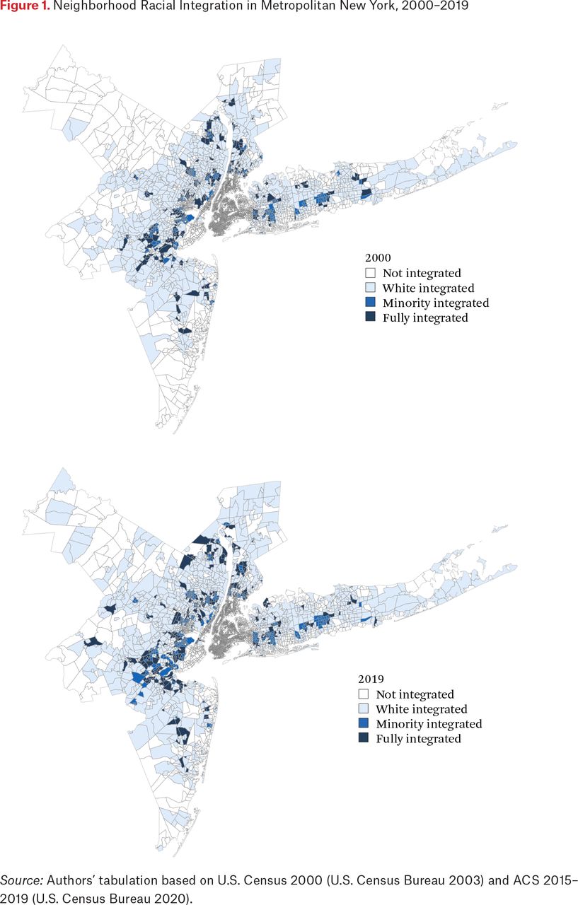
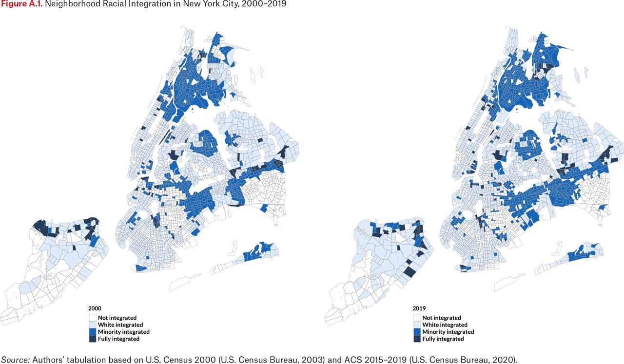
In figure 1, we provide a visualization of the four neighborhood integration types for suburban tracts (for a visualization for New York City tracts, see figure A.1).
Independent Variables
The multinomial regressions use three sets of independent variables, measured at the tract level. First are three demographic control variables: total population, (logged) population density, and median age. Second are four variables on socioeconomic composition: concentrated disadvantaged, concentrated affluence, income inequality, and share of owner-occupied housing units. Third, three immigration-related variables are concentrated immigration, share of multigenerational households, and share of immigrants who arrived before 1990.
Our explanatory variables are three indices of concentrated immigration, concentrated disadvantage, and concentrated affluence, which capture different neighborhood dynamics. We construct these indices using principal component analyses separately for 2000 and 2019.13 The concentrated immigration index is based on two tract-level measures: share of individuals who speak English at home and share of foreign-born residents.14 Tracts with lower shares of English-speaking populations and higher rates of foreign-born residents are more likely to be immigrant neighborhoods. The index for concentrated disadvantage is based on three tract-level measures: share of individuals below 1.5 times the poverty line, share of households receiving public assistance, and share of households headed by single mothers with children under the age of eighteen.15 Concentrated affluence index is based on three tract-level measures: share of residents with at least a college degree, share of residents in professional or managerial occupations, and share of households with annual earnings of more than $150,000.16 This measure captures the consolidation of opportunities and advantages generally enjoyed by residents of more affluent tracts. All three indices are standardized to facilitate comparisons and we focus on them to examine how immigration, disadvantage, and affluence correlate with neighborhood integration.
The remainder are control variables. We include measures of total tract population, tract population density, and median age as neighborhood demographic controls. Tract population serves as an exposure offset to counter unequal influence of larger tracts; population density accounts for any undue weight of tracts with larger land areas; and median age controls for unequal concentration of neighborhood residents by age. We take the natural log of population density to induce normality. Homeownership rate varies significantly between the suburbs and cities in our sample—71 percent in suburbs and 38 percent in cities, and we control for homeownership rate because it functions as a marker of status attainment as well as relative neighborhood wealth and affluence across the New York metro (Agius Vallejo and Keister 2020). We use neighborhood Gini coefficients to control for inequality between tracts. Because Gini coefficients are not included in 2000 Census data, we create consistent Gini coefficient estimates from binned income data available in the U.S. Census using the mean-constrained integration over bracket command in Stata (Jargowsky and Wheeler 2018). We control for immigrant cohorts using a measure of the neighborhood share of residents who immigrated before 1990 because immigrant outcomes and demographics can vary dramatically by cohort of entry (Alba et al. 1999). Because immigrants are more likely to be in multigenerational households, we control for the share of households in a tract with either grandchildren or parents living with them (Kasinitz et al. 2008). All monetary values were inflation-adjusted to 2019 dollars using the consumer price index (CPI) for New York–Newark–Jersey City, NY–NJ–PA (BLS 2019a). We also use inflation-adjusted housing-related variables using all items less shelter CPI to not control away variation in housing costs across years (BLS 2019b).
Modeling Strategies
Our analyses proceed in four stages. First, for the individual-level analyses, we compare demographic and socioeconomic profiles for the four ethnoracial groups to provide a snapshot of their relative distribution in suburbs and cities for 2000 and 2019. We focus on seven indicators: education, household income, home ownership, employment, language proficiency, and housing affordability.17 Second, we examine patterns of neighborhood racial integration based on the four neighborhood integration categories, focusing on how neighborhoods transitioned between 2000 and 2019. In addition to descriptive statistics, we use spatial visualization to highlight key trends. Third, we use multinomial logistic regressions to examine how key neighborhood characteristics are associated with neighborhood integration. Fourth, we use predicted probabilities to illustrate the key findings in both suburbs and cities.
Because the dependent variables are categorical, we use a series of multinomial logistic regressions with robust standard errors and report the relative risk ratios for all the coefficients. We use nonintegrated as the baseline category because we are interested in identifying major correlates that differentiate three forms of integrated neighborhoods from the nonintegrated one where only one racial group dominates. By design, multinomial logistic regressions estimate three distinct sets of coefficients. The first set compares the White-integrated and the nonintegrated neighborhoods, whereas the second and third sets contrast the fully integrated and minority-integrated neighborhoods with the reference category. The multinomial logistic regressions for these three paired comparisons are as follows:
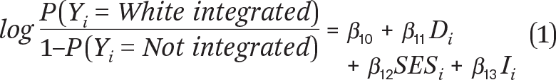
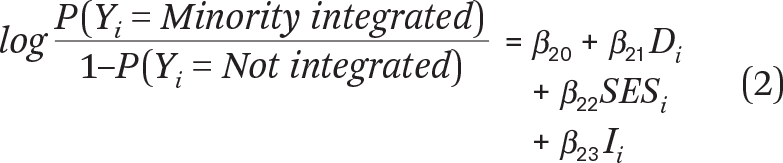
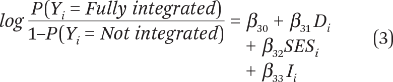
where P(Yi = Not integrated), P(Yi = White integrated), P(Yi = Minority integrated), and P(Yi = Fully integrated) respectively denote the log odds of the probability of tract i being classified as one of the four neighborhood types (Y). Di indicates the demographic control variables. SESi denotes the socioeconomic variables and Ii immigration-related variables. The socioeconomic variables include the concentrated disadvantaged and concentrated affluence indices whereas the immigration-related variables include the concentrated immigration index.
Equation (1) estimates differences between White-integrated and nonintegrated tracts. Equation (2) estimates differences between minority-integrated and nonintegrated tracts. Equation (3) estimates differences between fully integrated and nonintegrated tracts. We fit a series of three nested models, separately for 2000 and 2019. The first model adjusts for demographic controls. The second model introduces socioeconomic variables. The third model further adjusts for three immigration-related variables. For brevity, we only present the final models for 2000 and 2019.
Our analyses have a few limitations. First, the cross-sectional nature of our datasets limits our ability to make any causal claims on the strong associations between selected neighborhood characteristics and neighborhood racial integration. Although we can document change over time by identifying broad patterns of neighborhood racial integration, we cannot test the mechanisms underlying specific pathways of neighborhood transition. Second, our findings are limited to one multiethnic metropolitan area—New York. Although these patterns are not generalizable to other metropolitan areas, similar processes of neighborhood transitions are likely unfolding in diverse gateways across the country (such as Los Angeles, Chicago, Dallas, Houston, and others). Third, to focus on broad transformations in a major metropolis, we only examine integration by the four major categories—Asian, Black, Hispanic, and White—but do not document spatial patterns of ethnic or panethnic neighborhoods. Finally, our typology does not distinguish those tracts that have changed due to the influx of a new group (such as the transition of W tracts into WA tracts) versus the outflow of a current group (such as the transition of WAH tracts into WA tracts).
ETHNORACIAL DIVERSIFICATION IN SUBURBAN NEW YORK
Table 2 provides the demographic trends and socioeconomic profiles by racial groups, separately for suburbs and for cities. The suburban population grew modestly from 9.2 million in 2000 to 9.6 million in 2019. In 2019, Whites remain the largest racial group in the suburbs and accounted for 59 percent of the total population, followed by Hispanics (20.5 percent), Blacks (9.4 percent), and Asians (8.6 percent). From 2000 to 2019, the diversification of suburbs was driven by the substantial growth of Hispanic and Asian populations, alongside a decline in the White population, but the share of Blacks has remained virtually unchanged during the same period. Asians in the suburbs report the highest levels of socioeconomic outcomes, not only surpassing Whites, but also twice higher than Blacks and Hispanics in median household income and educational attainment. On home ownership, a majority from all four ethnoracial groups reported owning a home in 2019, including Blacks (53.6 percent) and Hispanics (54.7 percent).
Socioeconomic Profiles by Ethnoracial Background in Metropolitan New York
Relative to suburbs, the city population grew from 9.1 million in 2000 to 9.6 million in 2019, but the demographic profiles vary dramatically. On racial composition, population growth is highest among Asians, followed by Hispanics, alongside modest declines for Blacks and Whites. In 2019, cities were 13.7 percent Asian, 22.3 percent Black, 28.8 percent Hispanic, and 32.2 percent White. Between suburbs and cities, the gap in socioeconomic profiles in highest among Asians and lowest among Whites. Across socioeconomic indicators, Asians are more advantaged than Blacks and Hispanics, but Whites remain the most advantaged group in cities.
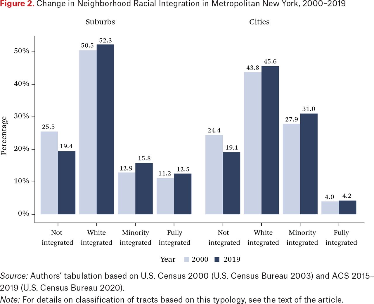
Figure 2 presents shares of neighborhood by level of racial integration for 2000 and 2019. Suburbs saw a decline of nonintegrated neighborhoods and an increase in all three types of integrated ones. In 2019, 19.4 percent of suburban tracts remain nonintegrated (that is, predominantly White) versus White-integrated (52.3 percent), minority-integrated (15.8 percent), and fully integrated (12.5 percent). Cities saws a similar decline of nonintegrated neighborhoods and a rise in integrated neighborhoods save in the fully integrated category. In 2019, 19.1 percent of city tracts remain nonintegrated (that is, predominantly Black or predominantly White) versus White-integrated (45.6 percent), minority-integrated (31 precent), and fully integrated (4.2 percent).

Change in Neighborhood Racial Integration in Metropolitan New York, 2000–2019
Source: Authors’ tabulation based on U.S. Census 2000 (U.S. Census Bureau 2003) and ACS 2015–2019 (U.S. Census Bureau 2020).
Note: For details on classification of tracts based on this typology, see the text of the article.
Relative to suburbs, cities are as likely to remain nonintegrated, with one in five tracts classified as such across both settings (19.4 percent versus 19.1 percent in figure 2). Whereas 83 percent of suburban tracts are predominantly White and only 5 percent are predominantly Black, 52 percent of city tracts are predominantly Black and 35 percent are predominantly White. This reflects the segregated nature of cities, especially for Black neighborhoods. Moreover, that White-integrated neighborhoods are the most prevalent in both cities and suburbs suggests that racial diversification over the last two decades has transformed suburbs, rendering suburbs more similar to cities. In 2019, the share of minority-integrated tracts is twice as high in cities (31 percent versus 15.8 percent), whereas the share of fully integrated tracts is three times higher in suburbs (12.5 percent versus 4.2 percent).
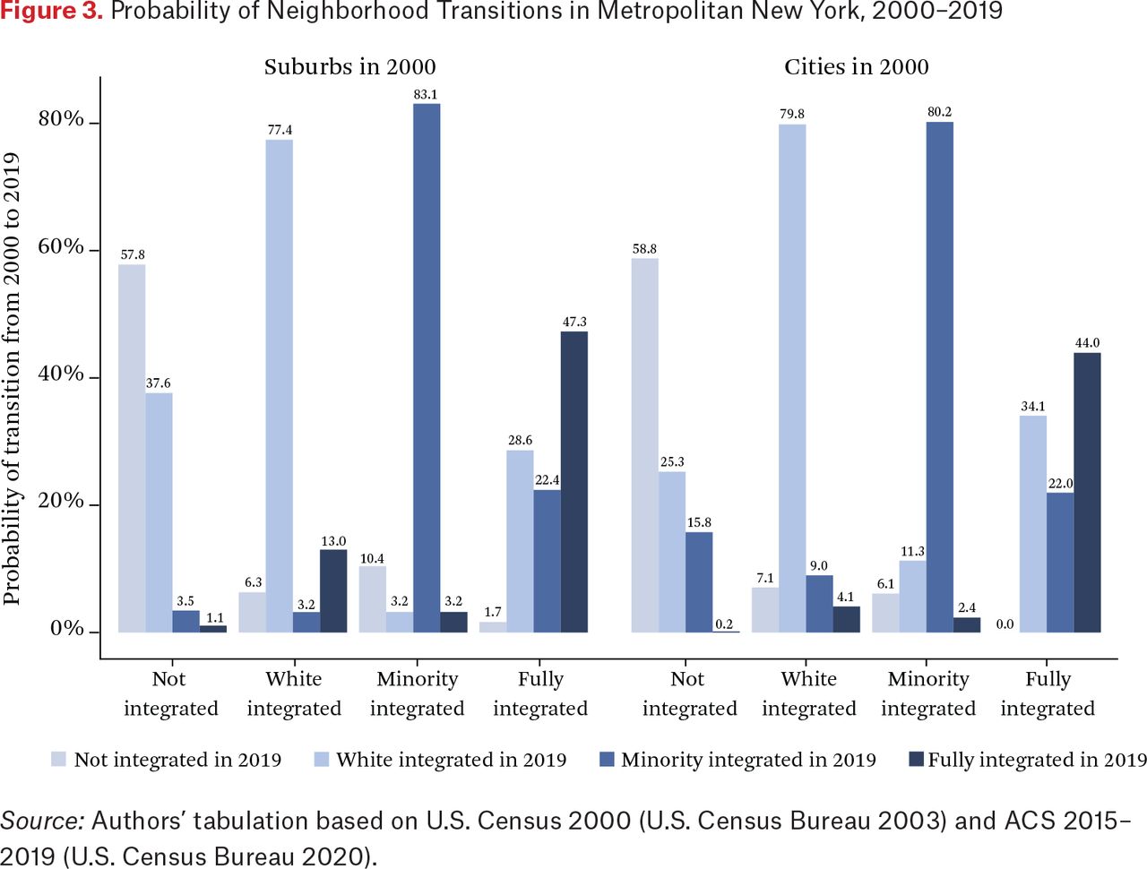
What are the major pathways of neighborhood racial integration in suburbs and cities? Figure 3 addresses this question by presenting the transition probabilities by integration types from 2000 to 2019. Among nonintegrated suburban tracts in 2000, the majority remained nonintegrated (57.8 percent) in 2019, but a third transitioned to White-integrated (37.6 percent). Among White-integrated tracts in 2000, 77.4 percent remained in the category in 2019, 13 percent diversifying into fully integrated neighborhoods, and another 6.3 percent transitioning back into nonintegrated—more homogeneous—neighborhoods. Among minority-integrated tracts in 2000, the overwhelming majority (83.1 percent) remained in this category in 2019 and another 10.4 percent transitioned into nonintegrated neighborhoods. Among fully integrated suburban tracts in 2000, about half remained in the category in 2019, 28.6 percent transitioned into White-integrated tracts, and 22.4 percent into minority-integrated tracts. Overall, minority-integrated suburban areas are most resistant to demographic change, whereas fully integrated neighborhoods are also most unstable, half transitioning into another category over the last two decades.

Among nonintegrated city tracts in 2000, the majority remained nonintegrated (58.8 percent) in 2019, with 25.3 percent transitioning into White-integrated and 15.8 percent transitioning into minority-integrated neighborhoods. Among White-integrated tracts in 2000, 79.8 percent remained in the same category in 2019, with 9 percent of these tracts diversifying into minority-integrated neighborhoods and 7.1 percent transitioning into nonintegrated neighborhoods. Among minority-integrated tracts in 2000, the overwhelming majority (80.2 percent) remained in this category in 2019, and 11.3 percent transitioning into White-integrated neighborhoods and 6.1 percent into nonintegrated—predominantly Hispanic or Black—neighborhoods. Among fully integrated tracts in 2000, 44 percent remained in this category in 2019, 34.1 percent transitioned into White-integrated tracts and another 22 percent into minority-integrated tracts.18
These findings yield surprising insights. First, pathways of neighborhood integration are remarkably similar in both cities and suburbs. Overall, the most important shifts occurred at the two ends of the continuum—nonintegrated and fully integrated areas. When these two forms of neighborhoods shift, they are most likely to become White integrated. Second, White- and minority-integrated neighborhoods are quite durable and resistant to change, more than 75 percent remaining in the same category in both cities and suburbs over time. In the suburbs, White-integrated tracts are likely to transition into fully integrated areas, but in cities they are more likely to transition into minority-integrated neighborhoods. This distinction points to the lower likelihood of White flight in the context of a minority influx in the suburbs, resulting in fully integrated neighborhoods. By contrast, Whites are less likely to remain in the same neighborhoods in the aftermath of minority population increases in cities, which contributed to the transitioning of White-integrated areas into minority-integrated ones. Third, fully integrated neighborhoods are the least stable form of integration. Such tracts tend to end up losing one or more of the four racial groups, resulting in White-integrated or minority-integrated neighborhoods—the two most stable forms of neighborhood integration.
Figure 4 provides a snapshot of neighborhood composition by types for 2000 and 2019. We calculate average racial composition by neighborhood types for categories with a minimum of 100 tracts in 2019. In 2000, the share of the White population in nonintegrated White tracts was 93.5 percent in suburbs, versus 88.3 percent in cities. In 2019, these proportions were reduced: 90.5 percent for suburban tracts and 85.4 percent for city. This points to a roughly equal decline in the White share in such tracts for cities and suburbs. By contrast, the Black share in nonintegrated Black tracts in cities slightly decreased from 86.8 percent in 2000 to 84.9 percent in 2019. Among White-integrated areas in suburbs (WA, WH, WHA, and WBH), the share of White population over time declined dramatically, but Whites still accounted for the majority of population in these tracts in 2019, from a high of 75.9 percent in WA tracts to a low of 55.5 percent in WBH tracts. In cities, the decline of White population in White-integrated tracts was less dramatic, and Whites accounted for the majority of population in only WA and WH tracts in 2000 and 2019. Among other neighborhood categories, Whites accounted for a minority share of the population—42.2 percent in WHA tracts and 28.6 percent in WBH tracts in 2019.
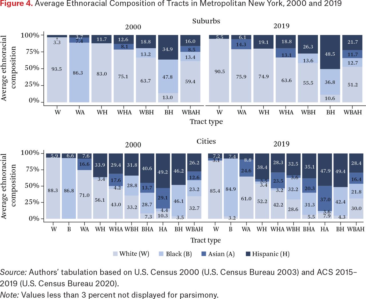
In 2000 and 2019, minority-integrated neighborhoods (BH) in suburbs are predominantly Black and Hispanic, both groups accounting for 82.7 percent of the tract population in 2000 and for 85.3 percent in 2019. Notable here is the shift in composition, Hispanics averaging a higher share of the total in these tracts than Blacks in 2019 but not in 2000. In cities, minority-integrated tracts are not only more prevalent but also more diverse in racial composition, including various combinations of Black-Hispanic, Asian-Hispanic, or Asian-Black-Hispanic. The share of Asian population in minority-integrated tracts sharply increased from 2000 to 2019, reflecting Asians’ rapid growth.
Finally, fully integrated areas further diversified over the same period in suburbs. White population share, however, remains the majority in such tracts in 2019, and the most significant growth was driven by Hispanic influx. By contrast, Whites accounted for only one-third of the population in fully integrated tracts in cities, the overall racial composition of such tracts remaining relatively stable over time.
HOW NEIGHBORHOOD CHARACTERISTICS MATTER FOR RACIAL INTEGRATION
How are neighborhood characteristics associated with racial integration types? We turn to multivariate analyses with neighborhood integration types as the independent variable, focusing on demographic, socioeconomic, and immigration-related drivers of neighborhood integration. Table 3 presents results for the three sets of paired comparisons for suburban tracts for 2000 and 2019. We focus on the coefficients for the three indices: immigration, disadvantage, and affluence. In 2000, neighborhood immigration and affluence are both positively correlated with integration. By contrast, neighborhood disadvantage is negatively associated with both White-integrated and fully integrated areas. Relative to nonintegrated tracts, a one standard deviation increase in concentrated immigration at the tract level in 2000 increases the likelihood of a neighborhood classified as White integrated by a factor of 8.1, as minority integrated by a factor of 18.3, and as fully integrated by a factor of 9.3 (see model 1). Similarly, a one standard deviation increase in concentrated affluence at the tract level in 2000 also increases the likelihood of a neighborhood classified as White integrated or fully integrated by a factor of 1.3, and classified as minority integrated by a factor of 2.0 (see model 1). A one standard deviation increase in concentrated disadvantage at the tract level in 2000 decreases the likelihood of a neighborhood classified as White integrated or fully integrated by a factor of 0.1; however, concentrated disadvantage is not a significant predictor of minority integrated (see model 1).
Multinomial Logistic Regressions of Suburban Neighborhood Integration Types in Metropolitan New York, 2000–2019
The patterns for these coefficients remain statistically significant and substantially similar in 2019 with two caveats (see model 2). First, disadvantage is now positively and significantly associated with minority-integrated neighborhoods but remains negatively associated with White-integrated neighborhoods. That concentrated disadvantage is no longer statistically associated with fully integrated neighborhoods and negatively associated with White-integrated neighborhoods in 2019 confirms that minority-integrated neighborhoods in suburbs are uniquely more disadvantaged. Second, affluence is no longer a significant predictor of minority-integrated areas, suggesting that minority-integrated neighborhoods have emerged as a distinctive category because they are not only more disadvantaged but also less affluent than the reference group.
That immigration is the strongest predictor of racial integration is significant. That this effect is positive and significant across all columns in table 3 points to its persistence. In both 2000 and 2019, immigrant neighborhoods are twice as likely to be classified as minority integrated than White or fully integrated. Moreover, coefficients for the concentrated immigration index are three to four times larger in 2000 (model 1) than in 2019 (model 2). This is consistent with the intensification of immigration in suburbs in the 1990s, setting the stage for ethnoracial transition at the neighborhood level, the most rapid shift being captured in 2000. That concentrated affluence is associated with integration in the suburbs suggests that suburban integrated neighborhoods are more affluent than nonintegrated ones except in the minority-integrated category. Finally, that concentrated disadvantage is positively associated with minority integration in 2019 but not in 2000 confirms that the presence and concentration of minority population in suburbs in more disadvantaged areas have solidified over time.
Table 4 presents results for tracts in cities for 2000 and for 2019. For 2000, concentrated immigration is positively correlated with neighborhood integration and this relationship remains substantially similar for 2019, albeit attenuated. Relative to nonintegrated neighborhoods, each one standard deviation increase in concentrated immigration at the tract level increases the likelihood of a neighborhood classified as integrated by factors of 2.5 to 4.0 in 2000 (model 1) and by factors of 2.2 to 3.0 in 2019 (model 2). Relative to nonintegrated neighborhoods, each one standard deviation increase in concentrated affluence at the tract level in 2000 and 2019 decreases the likelihood of a neighborhood classified as minority integrated by a factor of 0.4 in 2000 (model 1) and by a factor of 0.3 in 2019 (model 2). Moreover, affluence is not significantly correlated with White-integrated neighborhoods in 2000 but increases the likelihood of an area classified as White integrated by a factor of 3.0 in 2019. Disadvantaged neighborhoods were at a lower risk of being classified as White-integrated areas in 2000 and 2019 but at a higher risk of being classified as minority integrated during the same period.
Multinomial Logistic Regressions of City Neighborhood Integration Types in Metropolitan New York, 2000–2019
To underscore, immigration plays a similar role in fostering neighborhood integration in cities as it does in suburbs. That this effect is positive and significant in both models in table 4 points to a convergence between cities and suburbs. Concentrated disadvantage is consistently associated with minority integration in the city in both 2000 and 2019. This would suggest that the presence of minority populations in cities is concentrated in more disadvantaged and racially segregated neighborhoods. By contrast, the association between concentrated disadvantage and minority integration is a more recent development in the suburbs, where such an association was not significant in 2000. Moreover, that concentrated affluence is increasingly associated with neighborhood integration in cities over time, except for minority-integrated neighborhoods, points to the heterogeneity in the reference category—nonintegrated neighborhoods. Minority-integrated neighborhoods are less affluent than predominantly White neighborhoods, but more affluent than predominantly minority (Black) neighborhoods.
Predicted Probabilities by Concentrated Immigration, Disadvantage, and Affluence
Predicted probabilities by levels of concentrated immigration provide an intuitive way to interpret the magnitude of the difference in immigration’s impact on neighborhood integration types in cities and suburbs and how this might change from 2000 to 2019. Figure 5 visualizes the predicted probabilities for concentrated immigration from tables 3 and 4, holding other covariates constant at their mean. It highlights the exceptional role that immigration plays in ethnoracial integration in New York. In both cities and suburbs, the predicted probabilities of neighborhoods classified as nonintegrated dramatically decline at higher levels of immigration. At the mean level of concentrated immigration, suburban neighborhoods were most likely to be White integrated (60 percent) and least likely to be minority integrated (6 percent) in 2019. City neighborhoods at the mean level were also most likely to be White integrated (44 percent) but least likely to be fully integrated (6 percent) in 2019.
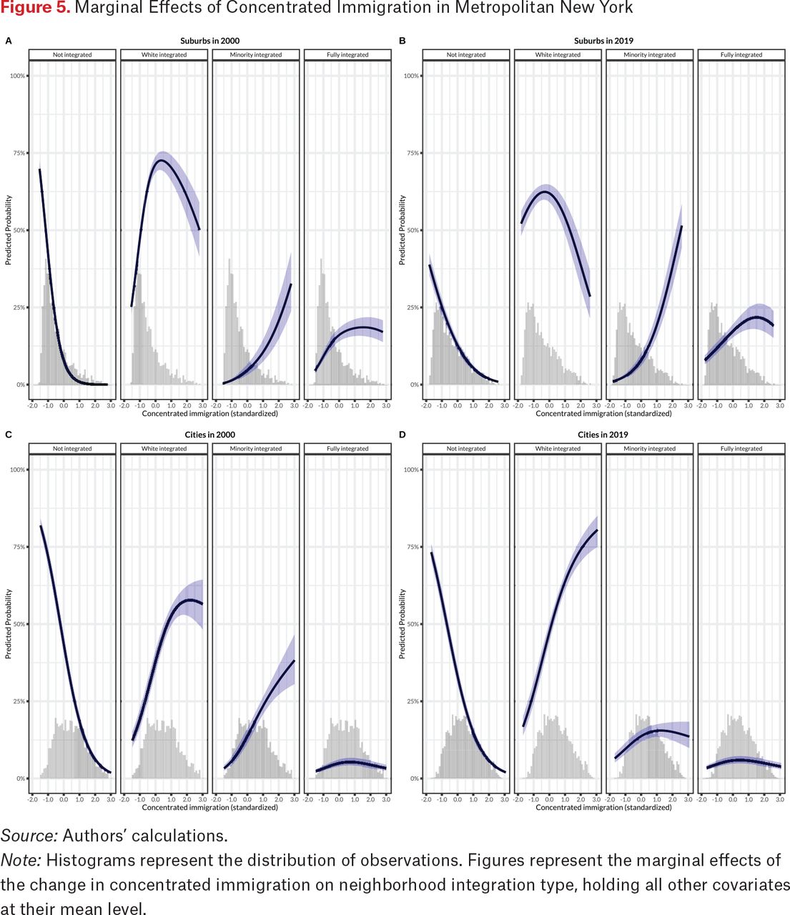
Marginal Effects of Concentrated Immigration in Metropolitan New York
Source: Authors’ calculations.
Note: Histograms represent the distribution of observations. Figures represent the marginal effects of the change in concentrated immigration on neighborhood integration type, holding all other covariates at their mean level.
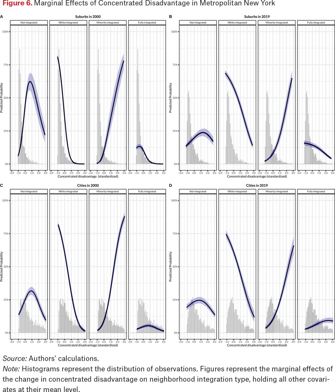
Figures 6 and 7 present predicted probabilities based on tables 3 and 4 for concentrated disadvantage and affluence indices, holding other covariates constant at their mean. At the same level of disadvantage, neighborhoods are more likely to be integrated in 2019 than in 2000. This highlights neighborhood disadvantage’s declining role in shaping segregation over time. At mean level of concentrated disadvantage, neighborhoods in suburbs were most likely to be White integrated (60 percent) and least likely to be minority integrated (7 percent) in 2019. At this mean level, city neighborhoods became most likely to be White integrated (60 percent) and least likely to be fully integrated (6 percent) in 2019. These patterns also point to a convergence in the role of neighborhood disadvantage in shaping racial integration in suburbs and cities. At higher levels of neighborhood disadvantage, however, neighborhoods are most likely to be minority integrated and least likely to be White integrated in both cities and suburbs. Put differently, the most disadvantaged neighborhoods are often the most segregated by race, regardless of suburban and city locations.

Marginal Effects of Concentrated Disadvantage in Metropolitan New York
Source: Authors’ calculations.
Note: Histograms represent the distribution of observations. Figures represent the marginal effects of the change in concentrated disadvantage on neighborhood integration type, holding all other covariates at their mean level.
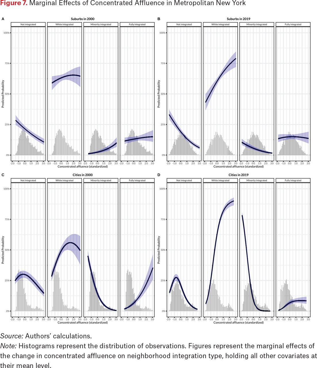
Marginal Effects of Concentrated Affluence in Metropolitan New York
Source: Authors’ calculations.
Note: Histograms represent the distribution of observations. Figures represent the marginal effects of the change in concentrated affluence on neighborhood integration type, holding all other covariates at their mean level.
At a given level of affluence, neighborhood affluence’s role in shaping racial integration is more consistent for city and suburban tracts in 2019 than in 2000. At a mean level of concentrated affluence, suburban neighborhoods were most likely to be White integrated (60 percent) and least likely to be minority integrated (5 percent) in 2019. At the same mean level, neighborhoods in cities were most likely to be White integrated (60 percent) and least likely to be fully integrated (6 percent) in 2019. These patterns once again point to a broad convergence over time. At higher levels of neighborhood affluence, neighborhoods are most likely to be White integrated and least likely to be minority integrated in cities and suburbs. Put differently, the most affluent neighborhoods are often ones with significant shares of Whites, regardless of suburban and city locations.
ROBUSTNESS CHECKS
Because the ACS 5-year estimates use a smaller sample than the decennial census, the margins of error (MOEs) can be substantially larger for some selected variables. Specifically, an MOE is a measure of the possible variation of the estimate around the population value. This is especially true for variables such as income, race, and ethnicity (Spielman and Singleton 2015). The standard practice for evaluating the reliability of ACS estimates is to calculate coefficients of variation (CVs),19 which standardize the errors across variables before dropping observations with CVs larger than a specific threshold, such as 10 or 12 percent (Spielman and Singleton 2015; Citro and Kalton 2007).
To test the reliability of the ACS estimates used in our project, we calculated CVs for the race-ethnicity variables—percent White, percent Black, percent Asian, and percent Hispanic. Consistent with earlier work, we find many tracts with CVs above reliable thresholds. However, excluding such tracts with from analysis results in too few observations to create a meaningful neighborhood typology and estimate regression models.
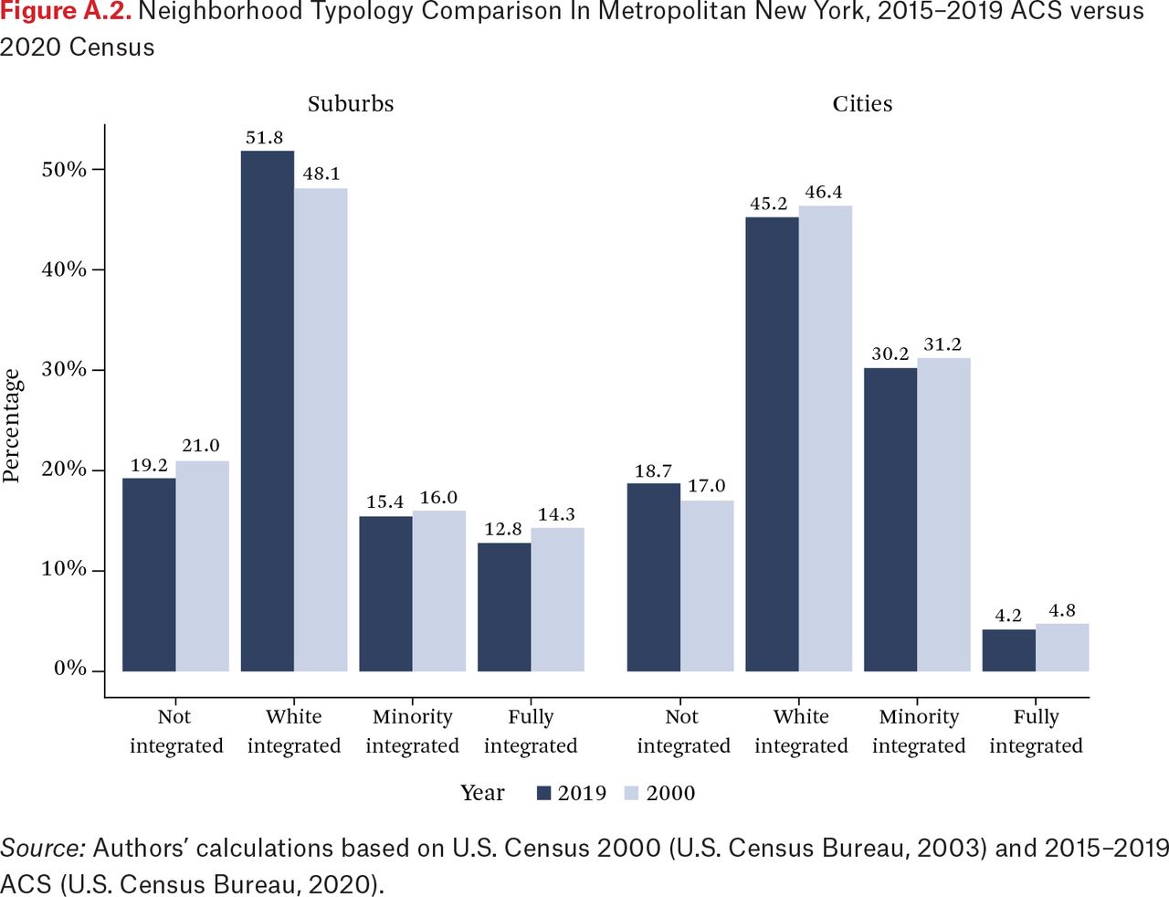
As a robustness check, we run two additional analyses. First, we use the preliminary 2020 Census estimates to calculate race-ethnicity variables at the census tract level for the neighborhood typology. The distribution of neighborhood racial integration types based on data from the 2020 Census is presented in figure A.2. Relative to figure 2, based on data the 2015–2019 ACS, some minor differences are apparent but the two distributions are virtually identical, suggesting that findings from our classification typology are robust.20 Second, we estimate our multinomial models using the neighborhood typology based on 2020 Census rather than the 2015–2019 ACS (see table A.3). This replicates our main findings in table 3, with two differences. Concentrated disadvantage is not significantly associated with White-integrated suburban neighborhoods but is positively associated with fully integrated areas in the suburbs in 2020 (see the boldface coefficients in table A.3). However, the differences are both minor and the findings are substantively similar.
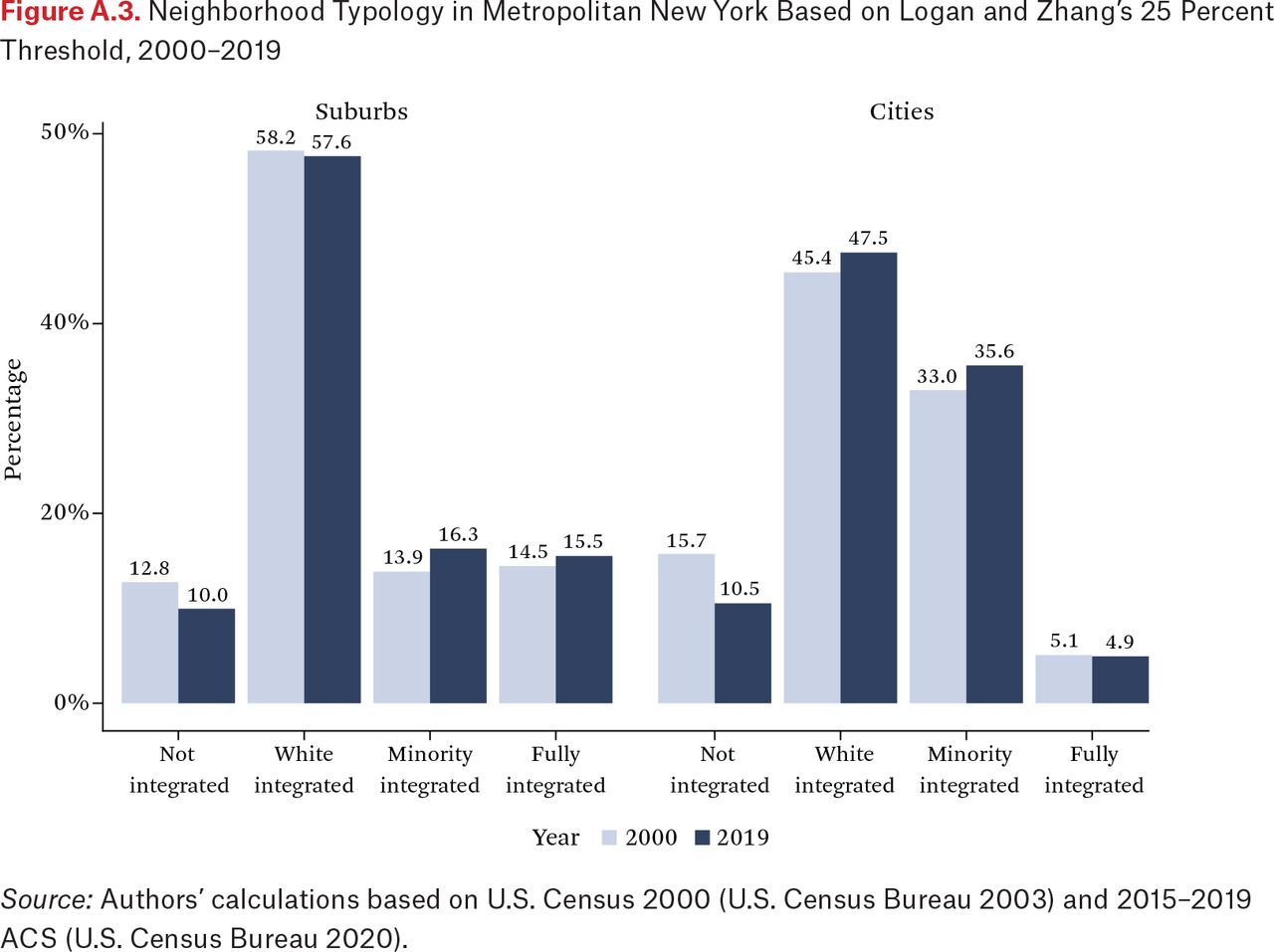
Results may differ based on the relative threshold for neighborhood classification. According to Logan and Zhang, the 50 percent threshold is the “most demanding” and the “strictest” (2010, 1105–6). This is precisely why we use this higher threshold: it is a more conservative estimate of neighborhood integration. With a lower threshold, a census tract can be classified as integrated (White integrated, minority integrated, or fully integrated) despite having a lower share of a given ethnoracial group defined as being present. How robust are the findings in regard to the specification of this threshold? To address this concern, we calculate the neighborhood typology distribution based on Logan and Zhang’s (2010) 25 percent threshold. We present these findings in figure A.3. Relative to figure 2, which is based on the 50 percent threshold, we see a high share of integrated neighborhoods—especially fully integrated tracts—and a lower share of nonintegrated ones for cities and suburbs in 2000 and 2019. Specifically, the 25 percent threshold results in more neighborhoods being classified as integrated, overstating the extent of neighborhood integration.
DISCUSSION AND CONCLUSION
This article examines recent trends in immigrant suburbanization emphasizing the spatial concentration of major ethnoracial groups in New York metropolis. Our contributions are both conceptual and empirical. First, we develop a neighborhood typology to capture racial integration and suburban diversification. Second, we document recent spatial trends in a major immigrant gateway metropolis in a period that witnessed significant immigrant suburbanization.
To be sure, the suburbs were never as homogenous as popular imaginations have made them out to be. As L’Heureux Lewis-McCoy and his colleagues (2023, this issue) convincingly argue, suburban nostalgia has contributed to this perception of suburbs as idyllic, and suburban erasure has rendered invisible the experiences of minority residents in the suburbs. Yet we find that ethnoracial diversification has intensified and spread across metropolitan New York, reshaping and reshuffling ethnoracial composition in both cities and suburbs. From 2000 to 2019, the number of nonintegrated tracts decreased dramatically, but this decline is similar in magnitude in suburbs and in cities in New York. This lends support for the first part of hypothesis 1a (overall decline of nonintegrated tracts), but not the second prediction—that such a decline would be more dramatic in suburban tracts. In 2000, one in four tracts in cities and suburbs were nonintegrated; by 2019, one in five tracts were.
In 2019, 83 percent of all nonintegrated suburban tracts were predominantly White. In contrast, nonintegrated city tracts were essentially split between Black (52 percent) and White (35 percent). These findings lend support for the first part of hypothesis 1b, but not the second part—that nonintegrated neighborhood in cities are more likely to be Black and Hispanic. Only 8 percent of nonintegrated tracts in cities are predominantly Hispanic. This is in fact surprising given the perceptions that cities are more integrated and that nonintegrated White neighborhoods have been on the decline for half a century. This might be true for many parts of New York City, but not for other principal cities in the New York metropolitan area.
In 2019, the majority of integrated suburban tracts were White integrated and one in eight integrated were fully integrated, lending support to the first part of hypothesis 1c, that integration in suburbs is more likely to result in White-integrated or fully integrated neighborhoods. In fact, the share of fully integrated suburban tracts is three times higher than that of fully integrated city tracts in 2019. However, we find mixed evidence for the second part of hypothesis 1c, that minority-integrated neighborhoods are prevalent in cities. Although the share of minority-integrated city tracts (31 percent) is twice as high as that of minority-integrated suburban tracts (15.8 percent), the surprise is the prevalence of White-integrated city tracts (46 percent)—the most prevalent type of integrated neighborhoods in cities.
The impacts of concentrated immigration, affluence, and disadvantage on neighborhood racial integration are broadly consistent across suburbs and cities. This consistency suggests that mechanisms for neighborhood sorting, segregation, and integration are more similar across urban and suburb areas. Instead of divergent trajectories in cities and suburbs, we document significant convergences in neighborhood racial integration over time. Moreover, our findings point to three broad patterns.
First, the role of immigration is the most consistent in both cities and suburbs. Beyond an initial surge of immigrants into suburbs that triggered significant demographic shifts there in the 1990s and early 2000s, cities and suburbs have seen similar declines in nonintegrated neighborhoods and increases in White-integrated neighborhoods over time. This lends support for hypothesis 2a—that concentrated immigration is associated with higher levels of racial integration in suburbs and cities, and that the impact of immigration on suburban neighborhood integration is stronger in 2000 than in 2019. Moreover, White-integrated areas in both cities and suburbs are the dominant form of neighborhood integration, neighborhoods being most likely to be White-integrated at mean levels of immigration, disadvantage, and affluence in 2019.
Second, neighborhood disadvantage and affluence reshape racial integration in opposite directions. At the highest levels of neighborhood disadvantage, neighborhoods are most likely to be minority integrated and least likely to be White integrated in cities and suburbs. The urban poverty literature has established that this pattern holds in cities, given the highly segregated nature of disadvantaged urban neighborhoods. That this pattern applies to suburbs confirms the recent spread of poverty and growth of disadvantaged areas from the more distressed suburbs to traditionally affluent suburban areas (Kneebone 2017). These findings support hypothesis 2b—that disadvantaged neighborhoods are often minority integrated in suburbs and cities, given higher concentrations of minority populations in such neighborhoods.
Third, the most affluent neighborhoods are often ones with significant shares of Whites, regardless of suburban and city locations. This lends support to the second but not the first part of hypothesis 2c, that affluent neighborhoods are more likely to be nonintegrated in suburbs whereas affluent neighborhoods are more likely to be White integrated in cities. Quite the contrary, we find that at the mean level of concentrated affluence, the probability of a given neighborhood classified as White integrated is very high in both suburbs (60 percent) and cities (60 percent).
We end with suggestions for future research. Our typology for classifying neighborhoods by integration level is broadly applicable to other analyses of neighborhood change. A modified version of Logan and Zhang (2010), our typology is more parsimonious and helps identify spatial trends without missing the forest for the trees. Future research applying our neighborhood classification typology to other metropolitan areas with similar immigration patterns (such as Los Angeles, Chicago, and Houston) might compare trajectories of neighborhood integration over time given the distinctive history of immigration and composition of immigrant flows in each region of the country (Lichter, Thiede, and Brooks 2023, this issue). As scholarship on suburbs increases, research could differentiate among types of suburbs—inner, outer, and fringe (Lichter, Thiede, and Brooks 2023, this issue) and examine differences in integration patterns between and within suburbs (Owens and Rich 2023). Finally, heterogeneity is significant in residential patterns by ethnicity within a given U.S. racial category. Future research on the concentrations of ethnic groups from specific origins among Asians, Blacks, or Hispanics could yield new insights into the overlapping and overlaying nature of ethnic, panethnic, and racial spatial integration in an increasingly multiethnic U.S. society.
Appendices
Transition Matrix for Tract Racial-Ethnic Composition for Suburban Tracts in Metropolitan New York, 2000–2019
Transition Matrix for Tract Racial-Ethnic Composition for City Tracts in Metropolitan New York, 2000–2019
Multinomial Logistic Regressions of Neighborhood Integration Types in Suburbs in Metropolitan New York, 2000–2019


FOOTNOTES
↵1. We use racial integration over ethnoracial integration for brevity.
↵2. Although the 2020 Census has been released, many socioeconomic and demographic variables on tract-level characteristics are available only in ACS. Given documented data quality concerns about ACS 2020 due to the COVID-19 pandemic, we prefer 2015–2019 ACS 5-year estimates over 2016–2020 ACS 5-year estimates.
↵3. Hereafter referred to as Asians, Blacks, Hispanics, Whites, and Others for brevity.
↵4. Social integration as a process refers to how newcomers to a neighborhood become integrated into formal social and cultural institutions and informal networks within the local community over time.
↵5. Although data from the 2020 U.S. Census has been released, its use is limited here because it does not provide key socioeconomic variables on tract-level characteristics. Although ACS estimates can have larger margins of error, we replicated our analysis using the 2020 Census and found similar results.
↵6. Because census tracts change over time, we obtained Social Explorer pre-harmonized census tract data (U.S. Census Bureau 2021a) that was harmonized using the Longitudinal Tract Database (Logan, Xu, and Stults 2014).
↵7. As a result of this criterion, we exclude ninety-four tracts from Census 2000 and eighty-two from ACS 2015–19.
↵8. Prior research adopts two approaches to creating neighborhood typologies to capture varying levels of ethnoracial mixing—relative and absolute (see Farrell and Lee 2011). Most work follows the “absolute” approach by defining the presence or absence of a racial group using a specific population threshold (Crowder, Pais, and South 2012; Ellen 2000). Following Logan and Zhang (2010), our analysis adopts the “relative” approach, which better captures relative change over time. Our work is consistent with that of others who have adopted or modified a version of this typology (Parisi, Lichter, and Taquino 2015; Kye 2018).
↵9. Neighborhood classification is sensitive to the adopted thresholds. We find fewer nonintegrated neighborhoods using the 25 percent criterion and more nonintegrated ones using the 75 percent criterion. When we run models using the less restrictive threshold of 25 percent that overclassifies integration, we find minor differences between those and results using the 50 percent threshold. However, models using the even more restrictive threshold of 75 percent report substantively similar results as models using a 50 percent threshold. For this reason, we use the 50 percent threshold because it is more robust than the 25 percent threshold Logan and Zhang use (2010).
↵10. 59.42*0.5 = 29.71.
↵11. For parsimony, we use abbreviations to represent neighborhood types: W identifies a White-only tract, whereas WAB denotes a tract where Whites, Asians, and Blacks are all defined as present.
↵12. Although it is possible that neighborhoods classified as nonintegrated White could have higher aggregate minority populations than White-integrated neighborhoods, such a comparison misses that nonintegrated White neighborhoods do not include enough minorities to be classified as integrated neighborhoods and therefore are not classified as such using the relative threshold approach. Moreover, we find that the average nonintegrated White neighborhoods have larger White populations than the average White-integrated neighborhoods.
↵13. These indices are well established in neighborhood research (see Sampson, Raudenbush, and Earls 1997).
↵14. The concentrated immigration components have factor loading scores above 0.71 (2000) and 0.71 (2019), eigenvalues of 1.79 (2000) and 1.78 (2019), and standardized Cronbach’s alphas of 0.88 (2000) and 0.88 (2019).
↵15. The concentrated disadvantage components have factor loading scores above 0.57 (2000) and 0.57 (2019), eigenvalues of 2.66 (2000) and 2.27 (2019), and standardized Cronbach’s alphas of 0.94 (2000) and 0.84 (2019).
↵16. The concentrated affluence components have factor loading scores above 0.55 (2000) and 0.56 (2019), eigenvalues of 2.64 (2000) and 2.67 (2019), and standardized Cronbach’s alphas of 0.93 (2000) and 0.94 (2019).
↵17. For renters, we measure the share of rent-burdened households, whereas for owners we measure the share of mortgage-burdened households.
↵18. For detailed transition matrices, see tables A.1 and A.2.
↵19. The formula for calculating CVs is defined as CV = [MOE/1.645] / Estimate.
↵20. Despite 2020 Census tract boundaries changes, we were able to match 92 percent of 2020 tracts to 2019 tracts in the New York metro area. The 2020 Census regression models show about four hundred fewer tracts than the sample based on the 2015–2019 ACS. This resulted in slight percentage distribution changes between figure 2 and figure A.2.
- © 2023 Russell Sage Foundation. Zapatka, Kasey, and Van C. Tran. 2023. “New Frontiers of Integration: Convergent Pathways of Neighborhood Diversification in Metropolitan New York.” RSF: The Russell Sage Foundation Journal of the Social Sciences 9(1): 52–83. DOI: 10.7758/RSF.2023.9.1.03. Support for this project was provided by a PSC-CUNY Award, jointly funded by The Professional Staff Congress and The City University of New York. Direct correspondence to: Kasey Zapatka, at kzapatka{at}gradcenter.cuny.edu, Department of Sociology, City University of New York, The Graduate Center, 365 Fifth Avenue, 6th floor, New York, NY 10016.
Open Access Policy: RSF: The Russell Sage Foundation Journal of the Social Sciences is an open access journal. This article is published under a Creative Commons Attribution-NonCommercial-NoDerivs 3.0 Unported License.
REFERENCES
In this issue


Jump to section
- Article
- Abstract
- SUBURBS AS NEW FRONTIERS OF INTEGRATION
- CONVERGENT PATHWAYS OF NEIGHBORHOOD INTEGRATION
- HYPOTHESES
- DATA AND METHODS
- ETHNORACIAL DIVERSIFICATION IN SUBURBAN NEW YORK
- HOW NEIGHBORHOOD CHARACTERISTICS MATTER FOR RACIAL INTEGRATION
- ROBUSTNESS CHECKS
- DISCUSSION AND CONCLUSION
- Appendices
- FOOTNOTES
- REFERENCES
- Figures & Data
- Info & Metrics
- References
Related Articles
Cited By...
- No citing articles found.