Abstract
The years since the 2009 end of the Great Recession have been disastrous for many workers, particularly those with low human capital or other disadvantages. One explanation attributes this to deficient aggregate labor demand, to which marginal workers are more sensitive. A second attributes it to structural changes. Cyclical explanations imply that if aggregate labor demand is increased then many of the post-2009 patterns will revert to their pre-recession trends. Structural explanations suggest recent experience is the “new normal.” This paper reviews data since 2007 for evidence. I examine wage trends to measure the relative importance of supply and demand. I find little wage pressure before 2015, pointing to demand as the binding constraint. The most recent data show some signs of tightness, but still substantial slack.
Between the fourth quarter of 2007 and the second quarter of 2009, real U.S. GDP fell by over 5 percent. The unemployment rate rose from a low of 4.4 percent in May 2007 to a high of 10.0 percent in October 2009, for a twenty-nine-month increase of 5.6 percentage points. This far exceeded the largest previous postwar increase over a similar duration, 3.9 percentage points in 1973–1975.
The National Bureau of Economic Research (NBER) dated the business cycle trough in June 2009. But neither the real economy nor, especially, the labor market recovered quickly after that point. Real output recovered its pre-recession peak in the third quarter of 2011, but remains well below the pre-recession trajectory. Payroll employment took nearly seven years, until May of 2014, to reach its December 2007 level. The unemployment rate remained above 8 percent for forty-three consecutive months (until August of 2012) and above 7 percent for sixty months (until November 2013), each the longest such period since World War II.
As of this writing, the unemployment rate is down to 4.9 percent, only slightly above its level on the eve of the recession. But most of the decline came from reduced labor force participation rather than increased employment: The employment-to-population ratio, which fell by an unprecedented 4.9 percentage points between December 2006 and December 2009, hovered around 58.6 percent for more than four years thereafter and has recovered just one point since then. It remains about 3.5 percentage points below the pre-recession level.
By essentially every measure, low-skilled workers have fared even worse than these already dismal statistics suggest. For workers with high school diplomas but no college (aged twenty-five and up), for example, the employment-to-population ratio fell not by 4.9 but by 6.1 percentage points from the peak to December 2009, fell another 0.5 percentage point over the next year, and has shown no sign of improving since.
Early in the recovery, some observers diagnosed structural problems as impediments to an otherwise quick cyclical recovery. In a 2010 speech, for example, Narayana Kocherlakota, president of the Federal Reserve Bank of Minneapolis, stated, “Firms have jobs, but can’t find appropriate workers. The workers want to work, but can’t find appropriate jobs. There are many possible sources of mismatch—geography, skills, demography—and they are probably all at work” (Kocherlakota 2010).1 In this view, poor outcomes for low-skill workers are due to their failure to supply the skills demanded by the market.
The mismatch theory was eventually discredited by the evidence, as it became clear that—at least in 2010—labor market slack was high in nearly all sizable labor markets.2 But as the weak recovery dragged on, now for the better part of a decade, it has become harder to resist the view that this is the “new normal,” and that we are destined for a future of low employment rates and a substantial class of individuals—disproportionately low-skilled—who are more or less permanently detached from the labor market.
This paper reviews data on labor market outcomes over the period since the recession’s official end, focusing on the experience of less-skilled workers. I argue that there is no basis for concluding that the recent past represents “the new normal” or that labor demand has tilted more rapidly away from low-skilled workers than at other times in recent decades. Rather, the evidence indicates that labor demand remains very weak for nearly all workers. Policies or events that raise aggregate demand thus promise to do a great deal to return our labor market to one resembling the pre-2007 period.3
Less-skilled workers’ outcomes have always been disproportionately sensitive to the business cycle, worsening by far more in downturns than do those of more skilled workers and then improving by more when the economy recovers. Thus, if the economy remains in a demand trough, it is not surprising that less-skilled workers have suffered disproportionately, and it is reasonable to expect that this suffering will ease substantially if and when aggregate labor demand recovers.
An important possibility is that cyclical labor demand shortfalls that extend for many years may create structural problems, as idle workers’ human capital gradually depreciates and they become increasingly disconnected from the labor market such that they are unable or unwilling to return to work when jobs finally become available. This idea has gained currency as an explanation for our current situation. For example, Alan B. Krueger, Judd Cramer, and David Cho (2014) argue that the long-term unemployed exert little or no pressure on the labor market, and conclude that extra-market measures such as expanded social welfare programs will be needed to support those who remain in this state.
This hypothesis has an important implication: if true, it means that even a labor market that appears to be quite slack from the perspective of workers can be tight from the perspective of employers, who see relatively few qualified, available workers to hire (see, for example, Hall 2014). Employers facing tight labor markets should bid up the wage in order to attract workers. Labor demand shortfalls, by contrast, would have an opposite effect, as unemployed workers bid down equilibrium wages as they compete for the few available jobs.4 I thus emphasize the examination of wage trends, both in the aggregate and in particular labor markets, for evidence about the appropriate diagnosis of the current situation.
I distinguish between three periods: the recession, ending in mid-2009; the initial recovery, from 2009 through the end of 2014; and the period since the end of 2014. There is more evidence of tightness in the most recent data than in the five preceding recovery years, and the end of 2014 represents a useful dividing point. I focus on the period before that, but discuss how the conclusions are modified by more recent data. Together, the evidence indicates the following:
The downturn hit less-skilled groups harder than more-skilled groups, and men harder than women.
The groups that were hit hardest in the downturn rebounded the most in the recovery, so that by 2014 every demographic group had somewhat higher unemployment than before the recession, but much less than at the recession’s peak.
The groups hit hardest were, in general, those that suffer more in every downturn, such as less-skilled men. If anything, non-college-educated men did better in this cycle than one would have expected on the basis of past experience.
Mean real wages stagnated or declined from 2010 through 2014, a conclusion that is not modified by adjusting for changes in the composition of employment or by focusing on new jobs whose wages are presumably more sensitive to prevailing economic conditions. Real wages have risen at an average annual rate of about 2 percent since the beginning of 2015, not enough to make up for years of no increases.
There is little sign of faster wage growth for any identifiable subgroup of workers, including those in industries with dramatic increases in job openings, those in low-unemployment metropolitan areas, or those with higher skills.
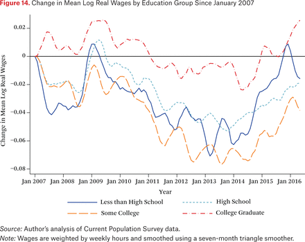
All education groups saw falling real wages from 2009 to 2014, and have seen increases since then. Mean real wages remain below their 2007 levels for all education groups except those with college degrees, whose wages have risen by a cumulative 2 percent (that is, about 0.2 percent per year) over a nearly ten-year period.
These facts are more consistent with a story of slack labor demand than with one where supply shortfalls are a binding constraint. In a concluding analysis, I explore evidence regarding the implications of prolonged demand shortfalls for future performance. Both reemployment hazards and idleness rates offer some basis for optimism that the overhang will be limited. Although there are some “lost” workers in their late middle ages, the data appear consistent with a labor force ready to take advantage of strong labor demand, if it ever returns.
THE STATE OF THE AGGREGATE LABOR MARKET
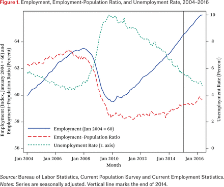
In this section I review the main aggregate labor market series over the last decade as a way of framing the later investigation. Figure 1 shows the time paths of aggregate employment, the unemployment rate, and the employment-population ratio from 2004 forward. The figure makes clear that the sharpest downturn was in late 2008 and early 2009, when the economy lost 4.5 million jobs over a six-month period. Job losses continued until February 2010, but employment has grown consistently since then at an average rate of about 191,000 new jobs per month. This is only a bit faster than is needed to keep up with population growth, however, and as a result the employment-population ratio, which fell from 62.9 percent in January 2008 to 58.2 percent in December 2009, remains well below its pre-recession level. There was no sign of improvement in this series for the first four years after the recession ended. It has trended slowly upward since the end of 2013, gaining one percentage point, or less than one-quarter of the recession-period loss. Thus, although the unemployment rate has fallen from its peak of 10.0 percent in October 2009 to 4.9 percent in June 2016, the bulk of this decline has been due to falling labor force participation among the non-employed.
Employment, Employment-Population Ratio, and Unemployment Rate, 2004–2016
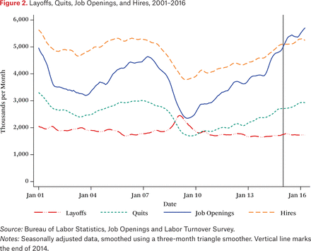
Figure 2 shows hires, involuntary displacements, layoffs, and quits, as measured in the Job Openings and Labor Turnover Survey (JOLTS). Layoffs rose by nearly 50 percent during the 2008–2009 crisis. At the same time, the usually more volatile hires and quits series fell by about 25 percent and 40 percent, respectively.5 Layoffs peaked in early 2009 and returned to their pre-recession levels by early 2010. Hires and quits bottomed out somewhat later, in the middle months of 2009, and recovered very slowly thereafter, not approaching their pre-recession peaks until 2016. By contrast, job openings, which fell by fully 50 percent during the crisis, recovered more quickly and exceeded their pre-recession peak in June 2014. They have continued to grow since, and in April 2015 they passed their historical record, set in the second ever JOLTS survey in January 2001.
Layoffs, Quits, Job Openings, and Hires, 2001–2016
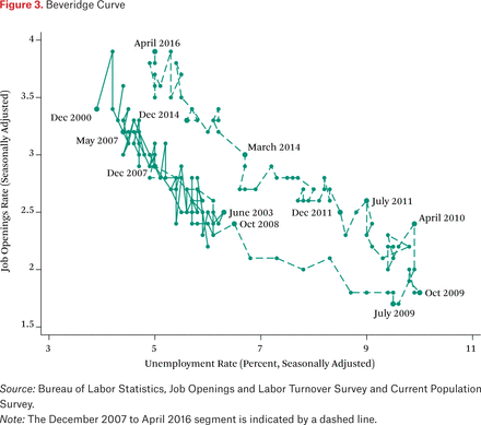
Figure 3 shows the Beveridge Curve, relating job openings, expressed as a share of employment, to the unemployment rate. One expects these measures to be inversely related: in tight labor markets with low unemployment, jobs are filled slowly and the job openings rate is therefore high, whereas when unemployment is high vacancies are filled quickly and there are few jobs open at any given time. In search models of the labor market, shifts in the relationship between the two series can indicate changes in the efficiency of the labor market matching process (Blanchard and Diamond 1989).
Beveridge Curve
As figure 3 illustrates, in 2008 and early 2009 the job openings rate fell steadily as unemployment rose, tracing out a curve consistent with—though well beyond the support of—that seen in the prior business cycle. In later 2009 and the first quarter of 2010, however, job openings rose substantially, with no change in unemployment; then, when unemployment began falling in mid-2010, the job openings rate continued to rise, tracing out a curve parallel to the pre-2009 curve but shifted substantially upward: a given unemployment rate now supports a job openings rate about 0.75 points higher than it would have before the crisis.
A number of commentators have interpreted this apparent shift in the Beveridge Curve as diagnostic of increases in structural unemployment. In this view, an increase in labor demand can be inferred from rising job openings, and the failure of the unemployment rate to fall faster than it has indicates that the currently unemployed are unable or unwilling to fill the newly created positions. This inference is supported by Krueger and his colleagues’ (2014) analysis of the duration of unemployment, which argues that a Beveridge Curve that uses the short-term unemployment rate—the share of the labor force that has been unemployed for six months or less—does not appear to have shifted in the same way (see also Ghayad and Dickens 2012).
Although the shift in the Beveridge Curve is certainly consistent with a structural change, it is important to be cautious. There is at least some reason to think that part or all of the shift reflects changes in the meaning of a job opening rather than increases in the difficulty of finding qualified workers.
Job openings are well defined if hiring is a binary firm decision, as in many search models: once a decision is made to hire another worker, a job opening is posted and the first applicant who arrives (perhaps subject to some well-defined, fixed minimum qualifications) is hired. This, of course, is an extreme oversimplification. In reality, both the wage and the qualifications are choice variables that can influence the rate at which openings are filled.6
Consider a firm with labor demand curve LD = f(w), with fʹ<0. So long as wages are set exogenously, job openings are well defined as the difference between f(w*)—where w* is the externally determined wage—and the firm’s current employment. But if wages are not fixed there is no unique number of openings.7 A firm might decide to offer wage wlow< w* for an additional f(wlow) – f(w*) positions, knowing that these jobs are likely to remain open for longer than would a position offering w*. Similarly, the firm might hold out for better-qualified workers, extending its search, or might be less choosy in order to hire more quickly (Diamond 2010). Either decision affects the number of measured job openings and the job-filling rate, but neither reflects changes in labor market matching efficiency.
These definitional issues may have become more important since the Great Recession. In previous business cycles, employers seem to have been unwilling to take advantage of labor market weakness by offering lower wages to new hires than they had in the past, or by substantially increasing their required qualifications. The reasons for this are not well understood, but may include concerns about the morale of newly hired and incumbent workers and worries that workers who accept low wages when conditions are weak are unlikely to remain with the firm once business improves (Bewley 1999). These concerns appear to be less salient today. There is anecdotal evidence that two-tier wage structures that distinguish between incumbent and new workers have become increasingly common (Vlasic 2011). Moreover, at least some employers seem to have taken advantage of their strong bargaining positions to be much choosier among job applicants, raising qualifications and drawing out the hiring process with multiple rounds of interviews (Davis, Faberman, and Haltiwanger 2010). All of this could be raising the measured rate of job openings relative to the strength of underlying labor demand. This would be consistent with the divergent behavior of job openings and quits since mid-2009—where the former appears to indicate the tightest market since the JOLTS survey began in 2000, the latter has recovered much more slowly and until quite recently remained well below its 2006 peak. It is thus important to look beyond the Beveridge Curve for evidence that could confirm or disprove the indication that there have been structural changes in the labor market.
HETEROGENEITY ACROSS INDUSTRY, GEOGRAPHY, AND DEMOGRAPHY
Where the unemployment rate and the job openings rate appear to indicate a tight labor market, other measures, particularly quits and the employment-population ratio, indicate rather more weakness. In this section I move beyond the aggregates by examining heterogeneity across different groups of workers. I focus on unemployment as it is the primary measure pointing toward near-full recovery. If demand has recovered in some labor markets but not in others, employers in the former markets will experience the market as tight even as workers in the latter experience it as slack, and worker shortages can coexist with substantial slack. For example, skill-biased technical change might lead to increased demand for high-skill workers, creating simultaneous tightness in the high-skill market and underutilization in the low-skill market. This could rationalize low quit rates with high job openings, as the former reflect the tightness of the markets where existing workers are located and the latter, the tightness of markets where employers would like to expand.
To test this mismatch hypothesis, we need a theory of the boundaries of labor markets. Unfortunately, the available data do not permit precise characterizations. I consider three dimensions that represent important labor market divisions: industry, geography, and demography.
Industry
Everyone knows that the financial services and real estate industries led us into the recession. However, these sectors did not see disproportionate job losses: the employment contractions in these industries in 2007–2009—5.6 percent in finance and 9.1 percent in real estate—were comparable to the economy-wide average.8 In both absolute numbers and percentage terms, job losses were much larger in construction and durable goods manufacturing, which contracted by one-quarter and one-fifth, respectively.
Since the trough, employment has grown in every major private sector industrial category (though not in federal or state and local government). Mining and logging is a clear outlier. It surpassed its pre-recession peak by mid-2011 and over the longer run saw net growth of 60 percent between early 2003 and the end of 2014 (before shrinking by over 8 percent in 2015, likely because of low energy prices). This is clearly a structural change, and there is compelling evidence of important mismatch-based impediments to the growth of this sector (for example, in North Dakota during the extraction boom there). But mining and logging accounts for only about 0.5 percent of national employment. There are only a few other sectors where employment growth between 2007 and 2014 kept up with the growth of the working-age population: professional and business services, education, health and social assistance, arts and recreation, and food and lodging. Notably, one sector where anecdotal stories about labor supply shortages have been common—information—has recovered only one-third of the jobs lost in the downturn.
Thus, insofar as there is mismatch across industrial groups, the tight markets would need to be made up mostly of low- and middle-skill sectors such as lodging and food services and arts and recreation. (There has also been job growth in professional and business services, education, and health, each of which has substantial numbers of higher-skill jobs.) This is unlikely to account for the poor outcomes of low- and middle-skill workers.
Geography
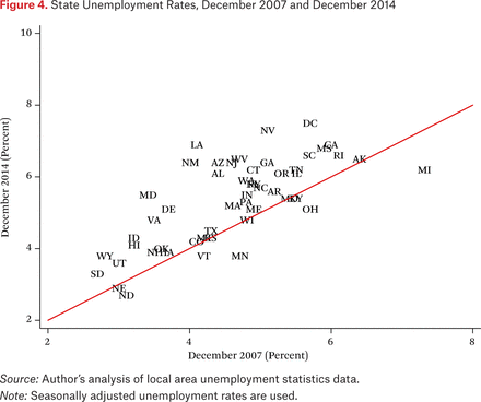
A second important source of heterogeneity is geographic. The recession hit some areas—most famously, Sun Belt cities such as Las Vegas where the housing boom was most pronounced—harder than others, and the recovery has also been uneven. Mobility rates have fallen in recent decades (Kaplan and Schulhofer-Wohl 2015), so geographically uneven labor demand growth might lead to mismatch. But while the evidence suggests that demand growth has been somewhat uneven, it also indicates that there are few places where demand has been robust enough to make up for the recessionary collapse. Figure 4 shows unemployment rates by state in December 2007 and December 2014. Across the fifty-one states plus Washington, D.C., only seven had an unemployment rate in 2014 that was below its 2007 level. Moreover, these seven include Michigan and Ohio, where the unemployment rates remain reasonably high. Only Minnesota, Nebraska, North Dakota, and Vermont (which total only 3 percent of national employment) also had 2014 unemployment rates lower than 5 percent. At a finer geographic level, unemployment at the end of 2014 remained higher than it was before the recession in 361 of 394 metropolitan statistical areas (MSAs); even today, less than one-third of areas have fully recovered. There is not enough scope for geographic mismatch to have made a meaningful contribution to current woes.
State Unemployment Rates, December 2007 and December 2014
Demography
A third dimension of heterogeneity is demographic, based on gender and education. Construction and manufacturing employment is heavily male and largely non-college-educated, so one might expect that low-skill men would have suffered disproportionately in the recession. Figure 5 shows the unemployment rate by gender and education in 2007, 2009, and 2014.9 Consistent with the industrial composition of the cyclical collapse, we see that unemployment rates of less-educated men rose more from 2007 to 2009 than did those of more-educated men or of women of any education level. However, it is notable that low-skill workers had much higher unemployment rates than high-skill workers even in 2007, and that unemployment rates rose by similar proportions for college graduates as for other groups.
Unemployment Rates in 2007, 2009, and 2014, by Gender and Education
In all eight groups, unemployment in 2014 was lower than in 2009 but notably higher than in 2007. The relative recovery was somewhat stronger for men than for women at each education level, and stronger for non-college-educated workers than for those who are more educated, but the general pattern is one of declines proportional to the recessionary increase. This appears more consistent with broad-based swings down and then part of the way back up than with tilts favoring some workers; insofar as there have been tilts, they evidently are toward low-skill men.
ACCOUNTING FOR HETEROGENEITY IN CYCLICAL SENSITIVITY
As noted, the construction and manufacturing industries suffered dramatic employment declines in the downturn. This is not surprising; these sectors have always been more cyclically sensitive than the economy as a whole. Because they disproportionately employ less-skilled men, such workers suffer more than others in every downturn and see better improvements in every recovery. Similarly, youth unemployment has always been highly sensitive to economic conditions (Clark and Summers 1982). This differential sensitivity can account for most of the heterogeneity in outcomes across groups seen in figure 5.
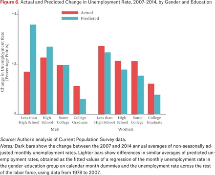
Figures 6 through 8 illustrate this for several different labor market groupings. For each demographic group, I compute the change in unemployment that would have been predicted between 2007 and 2014 given the past cyclical sensitivity of that group’s unemployment and the magnitude of the cycle. To form this prediction, for each group g I estimate a time series regression of the form:
Actual and Predicted Change in Unemployment Rate, 2007–2014, by Gender and Education
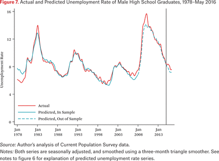
Actual and Predicted Unemployment Rate of Male High School Graduates, 1978–May 2016
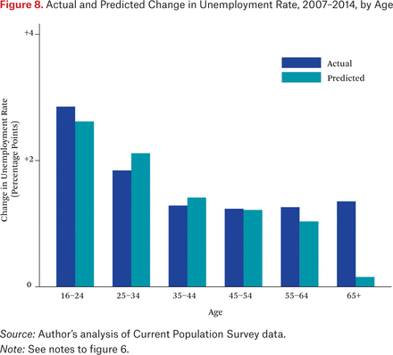
Actual and Predicted Change in Unemployment Rate, 2007–2014, by Age

where ugt is the unemployment rate for group g in month t and u(-g)t is the average unemployment rate in that month across all groups other than g.10 The βg coefficient is analogous to an equity price’s beta, and measures the extent to which group g moves with the market: A value of βg greater than 1 indicates that group g is more cyclically sensitive than others; less than 1 indicates relative insensitivity. I estimate αg and βg using monthly observations from 1978 through 2007, then use these coefficients and the observed path of u(-g)t to forecast ugt through 2014.
Figure 6 shows the actual change in unemployment and the change in average forecast values from 2007 to 2014, by gender and education.11 The figure shows that most of the across-group differences in unemployment growth between 2007 and 2014 are attributable to differences in cyclical sensitivity rather than to unique features of this business cycle. In particular, more-educated workers are always less sensitive than less-educated workers, and that has been true in this period as well. However, the cyclical predictions are not perfect. The most important deviation from the prediction is men without high school diplomas: on the basis of past performance, we would expect their unemployment rate to have been nearly two percentage points higher in 2014 than was actually observed. By contrast, men with college degrees have an unemployment rate a full percentage point higher than before the recession, roughly double the increase that would have been expected based on past patterns. Women of all skill groups have also seen larger increases than past patterns would suggest. These comparisons again suggest that any shifts in demand have been toward low-skill men, away from men with college degrees and from women.
Figure 7 provides another look at the experience of male high school graduates. Here I show the time series of the actual unemployment rate along with predictions from equation (1). (Both series are smoothed; the dashed segment of the latter indicates the out-of-sample portion.) The predicted and actual rates track each other extremely closely, through past business cycles and the current one. The actual experience for this group was worse than the prediction in the depths of the Great Recession, and even for about a year preceding the collapse, but the discrepancy was small relative to the predictable component and closed quickly during the recovery. (An even smaller gap has reopened since 2014.) While other work has documented long-run declines in demand for this group of low-skilled workers, this has evidently not shown up in the unemployment rate, which has been dominated by cyclical factors.
Figure 8 repeats the exercise from figure 6, this time looking at age groups. Unemployment rates rose much more for young people between 2007 and 2014 than for those aged thirty-five and over. But this is always the case in weak labor markets; the unemployment rate for those twenty-five to thirty-four actually rose slightly less than one would have expected, and in any case the difference is small. The only meaningful deviation from predictions is for those aged sixty-five and over: this group’s unemployment rate is ordinarily not very cyclically sensitive, but between 2007 and 2014 it rose as much as those for prime-age workers.
One sees similar patterns when looking across industries (not shown). Insofar as there have been structural shifts, they have apparently been toward the goods-producing industries and away from the high-skill services. Unemployment rates remained higher in 2014 than in 2007 for essentially all ages, education levels, genders, and industries. Sectors that have been more cyclically sensitive in the past saw larger increases, but there is remarkably little heterogeneity beyond this. This pattern appears consistent with a shortfall in aggregate labor demand, and less so with a gradual adjustment to a technological or demand-driven shock that changed the composition of labor demand.
EVIDENCE FROM WAGES
The evidence presented thus far suggests that differential unemployment outcomes over the last several years across education, gender, and age have been largely consistent with what past cyclical patterns would have implied, given the overall state of the labor market. But the unemployment rate is at last now reasonably low, whereas other indicators—the employment-to-population ratio in particular—remain quite depressed. We thus face the important question of whether the economy has fully recovered, with recent outcomes being “the new normal,” or whether there remains substantial slack, either in the aggregate or in particular labor markets. There is some disagreement among indicators here, with the job openings rate indicating that (at least some) labor markets are tight and with other indicators—the employment-population ratio or the quits series, for example—indicating that (possibly other) markets are slack.
To adjudicate this issue, we need to look beyond quantities data to prices. If employers are facing shortages of suitable, interested workers—either throughout the economy or in particular labor markets—they should be responding by bidding up the wages of those workers who can be found, presumably above where they were at the last cyclical peak. By contrast, if the large number of people who have moved out of the labor force in the last few years are still relevant to the labor market, then there are in fact a great many workers per job opening, and there is no reason for employers to increase wages. Thus, in this section I examine wage trends for evidence of tightness. I examine the aggregate labor market first, then turn to distinctions across sub-markets.
Aggregate Wages
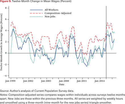
The solid line in figure 9 graphs the twelve-month change in real mean log hourly wages from 1999 through May 2016. These wages are calculated from the Current Population Survey Outgoing Rotation Groups (CPS ORG), with imputed wages excluded; see the appendix for further details.12 The figure shows that the last sustained period of mean real wage growth ended in 2002. Average wages were largely stable between 2003 and late 2014, except for a period in late 2008 and 2009 when they rose at an annual rate of about 3 percent and a shorter period in 2011 when they fell at a –2 percent annual rate.13 Outside of these periods there was little movement. The most recent data, however, show some signs of strength, with growth at around a 3 percent annual rate in 2015, falling to a 2 percent rate in the first part of 2016.
Twelve-Month Change in Mean Wages (Percent)
One concern about aggregate wage trends is composition changes: if the least-skilled workers are the most likely to have lost their jobs in the Great Recession, changes in average wages will overstate what was experienced by individual workers. To address this concern, I use the longitudinal structure of the CPS to match observations on the same individual from month m and month m+12, excluding observations that cannot be matched or where the wage is unavailable in either.14 The dashed line in figure 9, labeled “composition-adjusted,” shows the mean year-on-year change in mean wages for those who were employed in both periods. Note that this overstates the growth for workers with constant characteristics, as in this sample the year-on-year change incorporates the effect of aging by one year. In part for this reason, this series is consistently about two points higher than the “all workers” series, and shows average growth of about 3 percent per year between 1999 and 2009. The anomaly in 2008–2009 is reduced here and is plausibly consistent with sampling error. Average growth fell to near zero in 2009, not to reappear until late 2011; it remained around 2 percent for the next several years, only rising above that in 2015.
Workers rarely accept—or perhaps employers rarely demand—reductions in their nominal wages within existing jobs. This rigidity may have masked trends in the wages offered to new hires. To zero in on the latter, I take advantage of the fact that the CPS makes it possible to identify workers in the ORG sample who have started new jobs within the previous three months. The dotted line in figure 9 shows the trend in mean wages for such workers. This series closely resembles the “all workers” series, with a similar pattern of rising real wages in 2008–2009, falling real wages starting in early 2010, and moderate growth in the most recent data.
Thus, aggregate data suggest that the labor market remained weak, with too little demand to generate even modest wage growth, at least until late 2014. Wages have begun growing since then. This is perhaps consistent with the long-delayed arrival of labor market tightness that is forcing employers to offer higher wages in order to attract and retain workers. Even in the recent data, however, the growth rate is modest, and the recent trend would need to continue for some time to make up for the roughly zero average growth over the previous decade.
Individual Labor Markets
As discussed earlier, aggregate data can mask differences across individual labor markets. It is possible that particular labor markets are tighter and showing more dramatic wage growth than is apparent in figure 9, or that some markets tightened earlier than 2015 even while others remained slack. To examine this, I examine changes in employment, hours, and wages of newly hired workers by education, gender, age, and industry between 2007–2008 and 2013–2014. Note that this window ends before the most recent run-up.
Columns 1 and 2 of table 1 show estimated changes (and standard errors) in mean wages of newly hired workers in different submarkets. Note that these are cumulative changes over six years, not annual rates of increase. To limit confounding due to changes in the composition of workers—as would occur, say, if manufacturing hires shifted from unskilled laborers to skilled machine operators—I use a regression to adjust for changes in workers’ observed characteristics. Specifically, I regress log real hourly wages for new hires in the period 2004–2006 on a quadratic in age; indicators for education-by-gender, state, and industry-by-education; and separate linear age terms for each gender-education group. I then use the coefficients to form predicted log wages for new hires in 2007 and later, and compare these to the observed wages. Table 1 shows the change in the mean log wage residual in each cell and the standard error for this change.
Change in Employment Rates, Working Hours, and Mean Real Wages Adjusted for Observables of New Hires, 2007–2008 to 2013–2014
Across education-by-gender and age cells, only over-sixty-five workers (and, to a much lesser extent, those aged fifty-five to sixty-four) saw nontrivial real wage increases over this period, amounting to a bit over 1 percent per year. Across industries, nontrivial wage changes are seen in mining and logging and in finance and insurance, though only the second is statistically significant and each is less than 1 percent per year over the period. There is thus no sign of mean wages being bid up at the level of education groups, age, or broad industrial sectors.
Columns 3 to 6 of table 1 present other indicators of labor market tightness: the change in total employment and the change in the average number of hours worked. (Employment changes are measured in percentage points on the employment-population ratio for education-by-gender and age groups, and as percentages for industry groups. Neither is adjusted for observables as in columns 1 and 2.) A few industries did see substantial employment growth over this period, but this is not in general matched by substantial wage growth. The mining and logging sector, as noted earlier, is the exception that proves the rule; among other industries, only education and lodging and food services saw increases in both employment and wages, and in each case the wage increases were trivial. Across demographic groups, only the 65-plus age category saw an increase in the employment rate.15 The story is similar for hours. Two sectors—finance and insurance and education—show small increases in average hours, but of these only finance shows any tightness on other margins. Taken as a whole there is little sign of tightness.
This analysis thus suggests that essentially none of the identified markets have tightened to the point where demand began to outstrip supply, at least by the end of 2014. It nevertheless remains possible that these market definitions are too coarse and that employers in more tightly defined submarkets have had trouble finding workers with suitable skills. Falling demand in other submarkets might make it impossible to detect rising wages for workers in short supply via examinations of highly aggregated averages.
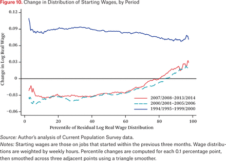
One way to assess this is to examine points in the wage distribution other than the mean. If some markets are tight, it might be possible to see this manifested as a rightward shift in the relevant portion of the wage distribution. I compared the 2007–2008 and 2013–2014 distributions of starting wages, adjusted for observable characteristics as in columns 1 and 2 of table 1. The solid line in figure 10 shows the change in wages at different percentiles in the new-hires adjusted wage distribution between the two periods.16 Thus, for example, it indicates that the 75th percentile of this distribution was roughly unchanged; that the upper quartile of the distribution shifted right by as much as three percentage points, and that everywhere below the 75th percentile the distribution shifted left by a similar magnitude. This figure thus shows that any wage increases were concentrated in the upper quartile of workers, and that even here real wages increased by less than half a percentage point per year.
Change in Distribution of Starting Wages, by Period
For comparison, figure 10 also shows comparable measures of the changes in real wage distributions between 2000–2001 and 2005–2006 and between 1994–1995 and 1999–2000. The former closely resembles the pattern in the recent data, consistent with the widespread view that the labor market was never very tight during the post-2001 expansion. The latter series is quite different, with real growth of about 9 percent (nearly 2 percent per year) throughout the distribution. Evidently, in a truly tight labor market, such as was seen during the late 1990s, real wages can grow substantially throughout the distribution.
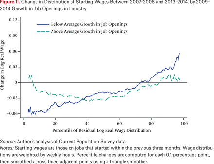
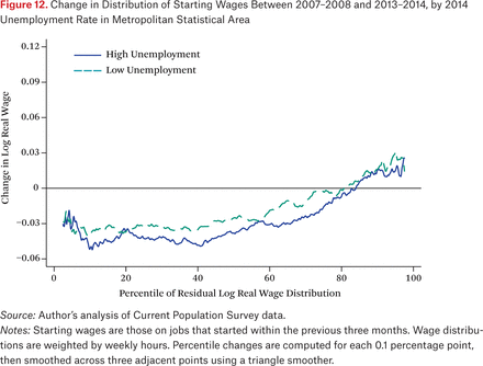
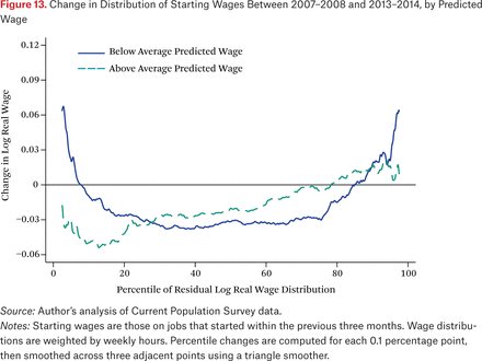
Figures 11, 12, and 13 explore potential heterogeneity in the 2007–2008 to 2013–2014 distributional change. I do not track individual workers over time, so the analysis here can only examine changes in the (conditional) distribution, not changes for workers at particular points in the distribution. This could lead me to miss tightness in particular markets. For example, increases in wages in a low-wage submarket combined with decreases in a second, slightly higher-wage submarket could offset each other with little effect on the overall distribution. (Note, however, that this is more plausible for unconditional wages; because I examine wages after adjusting for observables, heterogeneous shifts across different submarkets are unlikely to balance out in this way.)
Change in Distribution of Starting Wages Between 2007–2008 and 2013–2014, by 2009–2014 Growth in Job Openings in Industry
Change in Distribution of Starting Wages Between 2007–2008 and 2013–2014, by 2014 Unemployment Rate in Metropolitan Statistical Area
Change in Distribution of Starting Wages Between 2007–2008 and 2013–2014, by Predicted Wage
The Current Population Survey sample is not large enough to permit detailed analysis of wage distribution changes within individual industries or geographic groups. As an alternative, I divide the sample into subgroups based on proxies for potential labor market tightness. In figure 11, I divide industrial sectors based on the increase in job openings between 2009 and 2014. The solid line shows the sectors with below-average increases in openings and the dashed line those with above-average increases. Wage declines at the bottom of the distribution are smaller in the latter sectors, consistent with their labor markets’ being relatively tight. But even in these industries there is no sign of meaningful wage growth through the bulk of the distribution. Moreover, what growth there is at the top of the conditional wage distribution is coming from industries that have not seen large increases in job openings.
Figure 12 focuses on geography. Here, I divide MSAs into two groups by their 2014 unemployment rates; the solid line shows the change in the distribution of starting wages for areas with unemployment rates above 6.1 percent, the median in 2014, while the dashed line shows areas with rates at or below that point. There is no sign that wage growth was stronger in MSAs with lower unemployment rates.
Figure 13 examines skill levels. Using the same flexible wage regression used to predict wages for table 1, I predict a wage level for each newly hired worker in the CPS. I divide workers in half based on this predicted wage, plotting the change in the distribution of starting wages for the less-skilled group with a solid line and the more-skilled group with a dashed line. Insofar as the market for more-skilled workers has tightened more than that for less-skilled workers, we should see the dashed line systematically above the solid line. This is not at all apparent in the figure. Through the middle of the distribution the dashed line is somewhat above the solid line, though not by much, and through most of this range is still negative. In the tails, lower-skill workers seem to have done a bit better than have higher-skill workers.17
Figure 14 takes another approach to examining skill differences. Here I compute the cumulative change in mean log real wages from January 2007 forward, separately for four education groups. Wages for the three sub-baccalaureate groups move together throughout the period, with falling wages in early 2007; stagnation in late 2007 and early 2008; recovery in 2008–2009; sustained declines, cumulating to roughly 6 percent, from mid-2009 through 2013; and recovery beginning in late 2014. Mean wages in each group in early 2016 remained 2 to 4 percent below their level nine years before. The college graduates series is the only divergence from this pattern: this group did not see declines in 2007–2008, and although wages did decline between 2009 and 2014, the change was much shallower. College graduates have seen the same growth since 2014 as other groups, but because they began in a better position their wages are now 2 percent above their 2007 level. This is, to be mild, an anemic performance, only 0.2 percent per year.
Change in Mean Log Real Wages by Education Group Since January 2007
Across all of the breakdowns in figures 10 through 14 there is no sign of any quantitatively important segment of the labor market where demand has meaningfully outstripped supply in recent years. Wage increases are modest throughout the distribution and are no stronger in submarkets that might plausibly be tight (such as industries with large increases in job openings, or MSAs with low unemployment rates) than in those that clearly are not. Wage pressures appear to have been modest, at least through the end of 2014, throughout the economy. Since then there is some sign of modest growth, but this has a long way to go to catch up to any plausible estimate of productivity growth since 2007.
IMPLICATIONS FOR THE FUTURE
The results thus far demonstrate that supply-side explanations cannot account for the anemic performance of the labor market since the Great Recession, and that demand remained quite slack through at least the end of 2014 and, by most indications, beyond. An important question is whether this sustained demand shortfall will leave an overhang when demand eventually recovers, due to atrophied job skills or other sources of hysteresis.
Forecasting the future is of course hazardous—we have no direct measures of the employability of those out of work. In this section, I investigate two indicators that may be informative about this: transitions out of long-term unemployment, and trends in labor force participation and school enrollment by age.
Reemployment Flows
Much commentary about the labor market during and after the Great Recession has focused on the long-term unemployed. The share of the unemployed who have been out of work for twenty-six weeks or more rose from approximately 17 or 18 percent on the eve of the Great Recession to 45 percent in mid-2010, far higher than had ever been seen before. It has fallen slowly since then, but remains only slightly below the pre-2007 series record, set in 1983.
Hysteresis effects would likely be concentrated among the long-term unemployed. Indeed, Kory Kroft, Fabian Lange, and Matthew J. Notowidigdo (2013) find that employers discriminate against the long-term unemployed in hiring (but see Farber, Silverman, and von Wachter, this volume), and Krueger, Cramer, and Cho (2014; see also Hall 2014) conclude that these workers are largely disconnected from the labor market, exerting little supply pressure.
Table 2 shows unemployment rates and long-term unemployment shares across various demographic categories in 2006 and 2014. The long-term unemployment share does not vary nearly as much across gender and education as does the unemployment rate. More-educated workers, whose unemployment rates are very low, tend to have somewhat higher long-term unemployment shares than do those with less education. Across ages, long-term unemployment is somewhat more prevalent among older workers, but the differences are relatively small except in the sixteen-to-twenty-four-year-old group (many of whom have not been in the labor force for long enough to reach long-term unemployment). The general pattern of differences is similar in 2014 as in 2006, again suggesting that there has not been some new technological change in recent years that has left particular groups of workers permanently out of the workforce.
Unemployment Rates and Long-Term Unemployment Shares by Demographic Group, 2006 and 2014
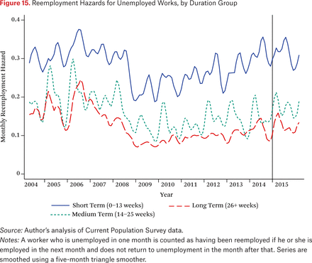
Figure 15 shows the probability that a worker who is unemployed in one month is reemployed in the following month.18 I show estimates for three categories of unemployed workers: those who have been unemployed thirteen weeks or less in the initial month; those who have been out of work for fourteen to twenty-five weeks; and the long-term unemployed whose durations of unemployment exceed twenty-six weeks. The figure shows that reemployment rates decline with unemployment duration, primarily when comparing short-term to medium-term unemployed. This might reflect hysteresis, employer discrimination among the unemployed, declines in search effort with unemployment duration (Krueger and Mueller 2011), or heterogeneity in reemployment probabilities. Interestingly, however, the gap in exit rates between the short- and long-term unemployed did not widen dramatically even as the level of the exit rate fell during the recession—all three groups’ exit rates fell sharply in 2008, and have recovered slowly since then.19 The recovery has been perhaps a bit faster for the short-term unemployed; the medium- and long-term unemployed groups have tracked each other quite closely on a slightly shallower trajectory.
Reemployment Hazards for Unemployed Works, by Duration Group
Even the depressed reemployment rate seen in recent years, around 10 percent per month, means that half of the long-term unemployed will find new jobs within six months. (The half-life would be three months if the reemployment rate were 20 percent, as it was before the downturn.) This is not consistent with a long overhang from the stock of long-term unemployed.
One might worry nevertheless that this average rate masks important heterogeneity, and that a subgroup of the long-term unemployed are essentially unemployable. But the similarity of the exit rates for the medium- and long-term unemployed counsels against this view, as with plausible heterogeneity these groups would have quite different compositions (Heckman and Singer 1984). For example, suppose that four-fifths of the newly jobless were highly employable, with monthly reemployment rates of 40 percent, while the remaining fifth were hard to employ, with exit rates of only 5 percent. In this case, the average exit rate for the short-term unemployed would be around 30 percent and that for the medium-term group would be around 16 percent, both consistent with the recent data. But very few of the first group would wind up in long-term unemployment, so the reemployment rate for those who do last that long would be well under 10 percent. That we do not see this divergence does not appear consistent with a heterogeneity model.
Together, then, the evidence on flows from long-term employment into jobs does not seem to be consistent with the existence of a large group of unemployed workers who will remain hard to employ even when the labor market recovers. Although there is no guarantee that the pattern of generally parallel movements seen in figure 15 will persist in the future, it appears likely in light of recent history. If so, then we might expect that a robust labor market—if one ever arrives—will pull the long-term unemployed back from the margins of the market and into higher levels of attachment. Note, moreover, that there is no inconsistency between this optimistic view and the evidence (see, for example, Kroft et al. 2013 and Krueger et al. 2014) that the long-term unemployed do not compete effectively with the short-term unemployed for work; under this story, those who have been out of work for many months are at the margins of the labor market, but if employer demand is robust enough to exhaust other sources of labor, firms will figure out ways to employ even them (Bernstein and Baker 2003).
Labor Market Participation and School Enrollment
The evidence just discussed concerns the long-term unemployed. The other group of great concern going forward is those who have left the labor force entirely. If they have become harder to employ because of extended periods of idleness, this does not bode well for their likelihood of returning to work in the future. On the other hand, insofar as the nonparticipants have taken advantage of their time out of the labor force to build skills, one might expect them to be even stronger candidates for new job openings than they would have been had they remained in unemployment.
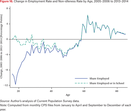
The solid line in figure 16 shows how the employment rate has changed for workers of different ages. To avoid spurious changes coming from vagaries of the academic calendar, I use only data from the academic year, the January–April and September–December surveys, in this figure. Note also that the figure does not compare the same worker over time—the employment rate of, say, twenty-five-year-olds in 2005 is compared to that of twenty-five-year-olds in 2013, born eight years later, not to that of the original cohort of workers, who would be thirty-three in 2013.
Change in Employment Rate and Non-idleness Rate by Age, 2005–2006 to 2013–2014
Overall, the figure shows increases in participation for those in their sixties and seventies, declines of about four percentage points in the employment rates of prime-age workers, and much sharper declines for the youngest workers (those below thirty). The increase among older workers is almost certainly a labor supply effect, perhaps reflecting declining retirement balances that force people to work longer or generational differences in labor force attachment as baby boomers replace earlier cohorts among those in their sixties. Recall from earlier that this group’s unemployment rate has gone up as well. (One plausible explanation turns out not to hold up, however: the increase does not reflect rising female labor force attachment in later-born cohorts, as it is similar for men as for women.)
The dramatic decline in the employment rate of the youngest cohorts is a big cause for concern: if young people never get a toehold in the formal economy early in their careers it may be difficult to integrate them later. Past evidence indicates that people who enter the labor market in bad economic times see reduced earnings for many years thereafter (Kahn 2010; Oreopoulos, von Wachter, and Heisz 2012). Moreover, changes in labor force participation (not shown) are similar to those in employment—the share of the youngest age groups who are out of the labor force has grown dramatically.
But the dashed line in the figure suggests a much more optimistic story. This line shows the change in an expanded concept of “non-idleness” that includes employment or enrollment in school but not unemployment or nonparticipation among nonstudents. There is no decline here for young workers. Evidently, all of the young people who would have been employed in 2005–2006 but were not in 2013–2014 were instead enrolled in school. Pooling all ages, the non-idleness rate fell by only 2.5 percentage points between 2005–2006 and 2013–2014, much less than the 3.9 percentage-point decline in the employment rate.
It is not clear whether this is a labor supply effect (as would arise if it is taking longer for students to finish school or if full-time students are less interested in working while in school than in the past) or a demand effect, reflecting young people remaining in school as a way of waiting out the weak labor market. But concerning the question of whether the lower employment rate reflects a permanent, structural decline in our economy’s capacity, the evidence in figure 16 is quite encouraging. It suggests, first, that the supply side of the market is responding to labor market weakness in a way likely to ameliorate any mismatch between changing skill demands and the fixed stock of skills supplied by existing workers and, second, that scarring effects from prolonged weakness are likely to be smaller than they would be if young people were truly remaining idle for years on end.
Additional analyses, not reported here, show that the educational attainment of recent cohorts has risen dramatically, as the additional school enrollment is translating to additional college degrees. This is likely to translate into improved earnings capacity and prosperity in the years to come, although the question remains unresolved whether the additional human capital earned in school will be enough to offset the reduced experience and increased difficulty in getting a toehold on the job ladder experienced by cohorts coming of age in recent years.
DISCUSSION
The performance of the U.S. labor market since 2006 can fairly be described as catastrophic: the unemployment rate was above 8 percent for over three straight years; although it has since come down, the employment-population ratio, which fell by nearly four percentage points after 2007, remains extremely depressed. As in past downturns, this has hit traditionally disadvantaged groups—the less-educated, the young, and members of racial and ethnic minorities—particularly hard.
Many models that economists have used to understand business cycles have difficulty accounting for demand shortfalls that last for many years. In such models, sustained high unemployment can arise only if there are structural impediments to labor market clearing—the unemployed are not looking very hard for work, have raised their reservation wages (the wage level they demand in order to take a job) due to increased implicit taxes on work (including actual taxes as well as benefits foregone), or are in some sense unsuitable for the jobs that are available, perhaps because they lack the appropriate skills or are unwilling to move to where the jobs are.
Drawing in part on these models, many observers have concluded that structural impediments to recovery must have been an important component of the situation from 2010 to 2014. My review of the evidence offers no support for this diagnosis, however. The poor labor market outcomes for low-skill workers are entirely consistent with cyclical explanations, as these workers have always been more sensitive to the business cycle. The most plausible sources of structural problems—labor supply disincentives caused by conditional transfers such as unemployment insurance or geographic immobility caused by housing market frictions—do not appear to be quantitatively important.20 Moreover, the Beveridge Curve provides at best weakly suggestive evidence regarding the state of the matching function.
Indirect evidence also fails to support the claim. Structural explanations for inadequate recovery, whether due to supply reductions or to mismatch, imply that the labor market has actually been much tighter than it has appeared, at least as viewed from the perspective of potential employers. There is no sign in the data that employers with jobs to fill have had trouble filling them, except perhaps in a few isolated and small submarkets such as resource extraction. Wages have fallen or been stagnant nearly across the board; in the few subgroups where wages have increased (for example, for college graduates), the increase has been anemic and much slower than even the slow rate of recent productivity growth.
We can thus conclude that labor demand shortfalls continued to be an important feature of the labor market and the primary determinant of labor market performance, at least through the end of 2014. While there is some sign of wage growth in 2015 and 2016, it remains modest and has only begun to make up the shortfalls from previous years. There is no support for the view that the anemic recovery to date has been driven by supply shortfalls due to changes in labor supply behavior or mismatch between employer needs and the available pool of labor.
With that said, several caveats are in order. First, although my results point to the importance of aggregate labor demand in understanding recent trends, this is not the place to address the question of how policy might stimulate additional demand. The results here speak to the importance of accomplishing that goal, but not to the best way to do so.
Second, I have not discussed longer-run structural changes, such as deindustrialization or skill-biased technical change, which may have proceeded smoothly previous to, during, and after the recession. Rather, I have focused exclusively on the very short run, looking for signs of structural explanations for changes between 2007 and the present. My analysis speaks to the question of whether increases in aggregate demand might return our labor market to something resembling its 2007 state, but not to whether further increases could reverse longer-run trends toward reduced male employment-population ratios and higher inequality. Some policy responses—education and training programs and increased income support for low earners in particular—may make sense as a response to long-term trends, even if they cannot be expected to contribute meaningfully in the short run so long as the market is demand constrained.
Third, it is possible that structural changes did occur on the supply side of the market but that these were masked for many years by low aggregate demand. This could help to explain the real wage increases that we have seen at long last in 2015 and 2016. To date, these have not proceeded far enough to signify serious tightness—most workers’ wages remain lower than in 2007. But if they persist, there will likely be room for policies aimed at improving job matching, such as search and mobility assistance, and thereby at expanding effective supply.
Finally, and most important: an extremely long downturn is likely to cast a long shadow over our future prosperity, even if this shadow falls more on wages than on employment rates. Productivity has been low in recent years, so even if wages had kept up with productivity the growth would have been unimpressive. Workers displaced in the recession of the early 1980s faced large declines in future earnings, amounting to 20 percent losses even fifteen to twenty years after their initial displacement (von Wachter, Song, and Manchester 2011), and also saw substantial declines in their life expectancy (Sullivan and von Wachter 2009). Other research indicates that young people who enter the labor market during recessions see long-run negative earnings effects (Oreopoulos, von Wachter, and Heisz 2012; Kahn 2010) and that parental job loss hurts children’s schooling and labor market outcomes (Oreopoulos, Page and Stevens 2008; Stevens and Schaller 2011; Ananat, Gassman-Pines, and Gibson-Davis 2011). This evidence implies that the extended period of weakness and slow recovery following the Great Recession has produced negative repercussions that will last for decades to come.
DATA APPENDIX
This appendix describes the data used for the wage analyses in the “Evidence from Wages” section. The basis for these analyses is a sample constructed by pooling CPS ORGs from May 2004 through May 2016.
For hourly workers who do not report that they usually receive overtime pay or who report that their weekly hours vary, I use the self-reported hourly wage. For other workers I use weekly earnings divided by weekly hours. Hours are constructed as usual hours on the primary job if that is available. If not, I use actual hours in the previous week if the individual had only one job and if these hours are consistent with the self-reported part-time or full-time status. Otherwise, hours are set to missing (as are wages if the hourly wage is not reported directly).
To protect respondents’ confidentiality, those whose weekly earnings are above $2,884 are reported at that level (known as the “topcode”) in the CPS data. I inflate topcoded earnings by 40 percent. For the distributional analyses in figures 10 through 13, I impose a new topcode equal to the lowest real value of the topcode over the relevant period—2007 to 2014 for most analyses, but 1994 to 2000 or 2000 to 2006 for others—but do not inflate this to avoid creating holes in the wage distribution. I adjust for inflation using the monthly CPI-U (Consumer Price Index for Urban Consumers) series, and trim at $1 and $200 (in January 2001 dollars). Observations with allocated hourly wages (or weekly earnings, if those are used) are excluded.
Many of the analyses focus on newly started jobs. These are identified by merging the ORG observation to the regular CPS observations in each of the three previous months. This produces a panel of up to four months. An individual is coded as starting a new job if he or she reported in any but the first of these months that she was in a different job than the month before or that her duties or occupation had changed, or if she moved from non-employed (and not on layoff) to employed during the panel.
Acknowledgments
This paper extends and expands on the results in Rothstein (2012; 2014). I thank Darian Woods, Peter Jones, and Audrey Tiew for excellent research assistance, and participants in the Russell Sage conference “The U.S. Labor Market During and After the Great Recession” for helpful comments. I am grateful to the Smith-Richardson and Russell Sage foundations for financial support. Copies of the data and computer programs used to generate the results presented in this article are available from the author.
FOOTNOTES
↵1. See also Ayşegül Şahin, Joseph Song, Giorgio Topa, and Giovanni L. Violante (2011).
↵2. See Peter Diamond (2010); Lawrence Mishel, Heidi Shierholz, and Kathryn Edwards (2010); Mishel (2011); Rothstein (2012); and Edward Lazear and James R. Spletzer (2012). The Congressional Budget Office (2012) was more favorable toward structural hypotheses but nevertheless concluded that aggregate demand shortfalls were the primary source of the high unemployment rate.
↵3. Some have argued that the market, left to its own, will no longer yield sufficient aggregate demand (for example, Summers 2016). Even in these “secular stagnation” models, however, aggressive fiscal and monetary policy can produce full employment. Modeling the determinants of aggregate demand is beyond the scope of this paper, which focuses on diagnosing the current state of the labor market.
↵4. Of course, the failure of wages to fall quickly in response to labor demand shortfalls is a longstanding and still unresolved puzzle; see, for example, Truman Bewley (1999).
↵5. These are counted from December 2007 to the respective series trough in 2009.
↵6. Even when the offered wage is not posted with the job advertisement the employer must decide on a bargaining stance once an otherwise suitable candidate is identified. Similarly, the employer sets both minimum qualifications to list with the position and its choosiness among workers meeting those minimum qualifications. Finally, a firm planning to hire may do so without ever posting an official opening (Diamond 2010).
↵7. This is of course the exact analogue to the somewhat more common claim that unemployment is always voluntary: unemployment simply means that one’s reservation wage has been set above the market price. In search models, there can be frictional unemployment and frictional job openings. But even in these models one might observe a range of reservation wages and wage offers, with frictional unemployment rising in the former and frictional vacancies declining in the latter.
↵8. This of course does not rule out the idea that a shock that began in the financial sector was an important source of the general collapse in demand.
↵9. Patterns across groups and over time are similar for employment rates.
↵10. I compute u(-g)t using fixed weights for each group h≠g over time, proportional to the group’s average labor force share over the 1978 to 2015 period. I focus on unemployment rather than employment here because the prediction model for employment would need to accommodate secular trends in labor force participation; unemployment has been closer to stationary.
↵11. Results are similar if I instead predict the change as the difference between the predicted 2014 rate and the actual 2007 rate. In either case I focus on annual averages to avoid seasonality concerns, although the prediction is conducted at the monthly level.
↵12. The CPS is not the only source for information on wage trends, and measures based on employer surveys offer larger samples. But the CPS is the best option for adjusting wages for worker observables or for focusing on newly hired workers. Other series show similar patterns for the “all workers” series depicted by the solid line in figure 9.
↵13. The price level was falling during much of the 2008–2009 period of real wage growth; nominal wage growth actually slowed in the second half of 2008 and early 2009, from around 4 percent per year to under 2 percent. Similarly, the slowdown in real wage growth in late 2009 and early 2010 reflects stable nominal growth (at an annual rate of about 1.5 percent) and the return of mild inflation.
↵14. Roughly 40 percent of initial observations lack one-year-ahead wages, about two-thirds of the time because the individual cannot be matched to a year-ahead observation (due to having moved from the original home, to survey nonresponse, or to errors in the CPS identifiers) and the remainder because the person is surveyed in the follow-up but is no longer employed or lacks a valid wage. Attrition among the continuously employed may be correlated with wage growth. The reweighting exercise described in the text partially addresses this possibility.
↵15. Recall from figure 8 that the older workers’ unemployment rate also rose. As figure 16 shows, labor force participation rose substantially for those sixty-five and over.
↵16. To eliminate spurious changes due to changes in the real value of the CPS topcodes, I censor weekly earnings at the real value of the 2015 topcode.
↵17. At the lower end of the distribution, the increase for below-average predicted wage workers may reflect increases in the real value of the minimum wage.
↵18. I compute reemployment rates following the procedure used by Rothstein (2011) and Henry Farber and Robert G. Valletta (2013), counting individuals who transit from unemployment to employment, then immediately back to unemployment in the following month, as having remained unemployed throughout. As discussed in the two papers cited, many of these repeated transitions appear to derive from misclassification of labor force status in the middle month (see also Poterba and Summers 1986).
↵19. Krueger et al. (2014) find that the long-term unemployed who transition into jobs are much less likely to remain employed a year later than their short-term unemployed peers. But these rates, too, seem to move in parallel, indicating that little has changed relative to the pre-recession period other than a downward shift in all job searchers’ job-finding and job-keeping rates.
↵20. Unemployment insurance extensions can explain only about 0.3 percentage points of the 2011 unemployment rate (Rothstein 2011). With regard to geographic mobility, declines are concentrated among renters who should not have been directly affected by the decline in home values (Farber 2012), and any “house lock” effect is quantitatively small (Schmitt and Warner 2011). The most likely explanations for the mobility decline are not consistent with mismatch stories (Kaplan and Schulhofer-Wohl 2015).
- © 2017 Russell Sage Foundation. Rothstein, Jesse. 2017. “The Great Recession and Its Aftermath: What Role for Structural Changes?” RSF: The Russell Sage Foundation Journal of the Social Sciences 3(3): 22–49. DOI: 10.7758/RSF.2017.3.3.02. This paper extends and expands on the results in Rothstein (2012; 2014). I thank Darian Woods, Peter Jones, and Audrey Tiew for excellent research assistance, and participants in the Russell Sage conference “The U.S. Labor Market During and After the Great Recession” for helpful comments. I am grateful to the Smith-Richardson and Russell Sage foundations for financial support. Copies of the data and computer programs used to generate the results presented in this article are available from the author. Direct correspondence to: Jesse Rothstein at rothstein{at}berkeley.edu, 2521 Channing Way, Berkeley, CA 94720.
Open Access Policy: RSF: The Russell Sage Foundation Journal of the Social Sciences is an open access journal. This article is published under a Creative Commons Attribution-NonCommercial-NoDerivs 3.0 Unported License.


