Abstract
Data from the Survey of Consumer Finances for 1989 through 2013 reveal five broad findings. First, overall retirement plan participation was stable or rising through 2007, though overall participation fell noticeably in the wake of the Great Recession and has remained lower. Second, cohort-based analysis of life-cycle trajectories shows that participation in retirement plans is strongly correlated with income, and that the recent decline in participation is concentrated among younger and low- to middle-income families. Third, the shift in the type of pension coverage from defined benefit (DB) to defined contribution (DC) occurred within—not just across—income groups. Fourth, retirement wealth is less concentrated than nonretirement wealth, so the growth of retirement wealth relative to nonretirement wealth helped offset the increasing concentration in nonretirement wealth. Fifth, the shift from DB to DC had only a modest effect in the other direction because DC wealth is more concentrated than DB wealth.
The share of wealth owned by top wealth holders in the United States has risen over the past few decades, despite some debate about exactly how concentrated wealth is and how fast those top shares are rising (Saez and Zucman 2016; Bricker et al., forthcoming). One reason for varying estimates is that different types of wealth dominate at various points in the wealth distribution. For example, changes in house values and mortgage borrowing play a key role in determining wealth changes in the middle of the wealth distribution, and corporate equities and directly held businesses disproportionately affect the very top.1 Retirement wealth lies somewhere between those other types of assets, being less concentrated than directly held businesses and corporate equities but more concentrated than widely held balance sheet components such as housing and durable goods.
Understanding the role that retirement wealth plays in rising wealth inequality requires comprehensively measuring and then distributing retirement assets. Retirement wealth in the United States today is increasingly made up of account-type defined contribution (DC) assets, most of which are accumulated in 401(k) or similar employer-sponsored plans, and often rolled over into individual retirement accounts (IRAs) when employees leave their jobs. Retirement wealth also includes the claims to future defined benefit (DB) retirement income streams for both current and future DB beneficiaries. The need to comprehensively account for both types of retirement assets is underscored by the shift from DB to DC that has occurred during the past several decades.
The triennial Survey of Consumer Finances (SCF) is well suited for measuring and distributing retirement wealth and evaluating the impact on overall wealth inequality.2 The SCF covers a long period, includes households headed by all age groups, and combines careful measurement of work-related pensions, personal retirement accounts, and earnings histories with other relevant demographic, income, and balance sheet information. DC and IRA assets are measured directly in the survey. DB payments received by current beneficiaries are also captured; the asset value of those claims is estimated by discounting survival-weighted income streams. The expected value of DB payments (for families holding claims to but not yet receiving DB payments) can be estimated using employment history and other relevant SCF data elements.
Given the baby boom and rapid aging of the U.S. population, any analysis of whether and how retirement wealth is reinforcing or offsetting overall trends in wealth inequality should begin with a life-cycle perspective. In particular, stable aggregate retirement wealth (in levels or relative to income) gives a misleading picture when the population is aging, and the appropriate benchmark is one in which total retirement wealth should be rising. Thus, most of the analysis here is based on constructing synthetic-panel life-cycle trajectories for the outcomes of interest. SCF data for 1989 through 2013 show that retirement plan participation was stable or even increasing through the early 2000s when viewed from a life-cycle perspective. Specifically, younger generations were achieving systematically higher rates of participation than their predecessor cohorts, at any given age. That upward trend stalled after 2000 and ended with the onset of the Great Recession. The 2010 SCF showed a decrease in retirement plan participation that, as of the 2013 survey, has yet to be reversed. The declines after 2007 in participation trajectories, relative to previous cohorts, are widespread, but most pronounced for the youngest families and those in bottom half of income distribution.
The SCF also makes it possible to break down these cohort-level trends and look within birth cohorts to investigate how retirement plan participation is evolving across income groups, which is the first step in thinking about the implications for wealth inequality. It is not surprising, given labor market fundamentals and the structure of Social Security, that participation in employment-related retirement plans is always and everywhere very positively correlated with income. The life-cycle peak for participation in (any form of past, current, or future) retirement plans is now just over 60 percent for the cohort approaching retirement in the bottom half of the income distribution, but over 90 percent for families in the 50th through 95th percentiles, and near 100 percent for those in the top 5 percent.
The conditional distributions of DB versus DC coverage within income groups provide an important input to the discussion about whether the shift from DB to DC might be affecting wealth inequality. Even though overall retirement plan participation is greater for the highest income groups in every year, the mix of coverage by type in any given year does not vary substantially by income. Higher-income families are more likely to have a combination of DB and DC coverage, but the overall rate for DB inclusion (conditional on having any retirement plan coverage) is roughly the same across income groups. Thus, the data confirm that all income groups saw the same dramatic compositional shift from DB to DC.
At the same time, the life-cycle perspective applied to the SCF across income groups shows that the historical differences in retirement plan coverage by income have widened in recent years, and especially since the Great Recession. The relative declines in participation in recent years are widespread but most pronounced for younger cohorts and, within any given cohort, most pronounced for lower-income families, suggesting that the retirement system might be contributing to rising wealth inequality. The divergence in coverage has not (at least not yet) had a substantial impact on the key life-cycle outcome measure—retirement wealth relative to income—but that is in large part because of differential slowdown in income growth across income groups. In that sense, the evidence suggests that systematic retirement saving was sacrificed by many families with diminishing economic resources, especially in the wake of the Great Recession.
The bottom line estimates on how retirement wealth is affecting overall trends in wealth inequality require some perspective. The share of total wealth (including DB wealth) held by the top 1 percent of families (sorted by total wealth) rose 6 percentage points between 1989 and 2013, from 26 percent in 1989 to 32 percent by 2013. The share owned by the top 25 percent of families rose 5 percentage points, from 83 percent in 1989 to 88 percent in 2013. At the same time, the shares of nonretirement wealth held by these same groups were much higher and increased much more, suggesting that the overall effect of retirement wealth was toward reducing overall concentration, both in the levels and growth of wealth shares at the top of the distribution.
On the other hand, the greater concentration of DC assets relative to DB assets for wealth holders at the very top combined with the shift from DB to DC suggests some modest contribution to rising wealth inequality from that dimension, offsetting some of the overall mitigating trend. In particular, the differential in shares of DB versus DC wealth held by the top 1 percent (who own about 5 percent of DB wealth versus about 15 percent of DC wealth) interacted with the shift in retirement asset composition from DB to DC (DB fell from about 70 percent of total retirement assets in 1989 to about 50 percent of the total in 2013) yields a 0.4 to 0.6 percentage point increase in the share of wealth owned by the top 1 percent.
MEASURING RETIREMENT PLAN PARTICIPATION AND RETIREMENT WEALTH
The data used here to study retirement plan participation and wealth accumulation is the series of cross-sections from the triennial Survey of Consumer Finances conducted between 1989 and 2013. The SCF is well suited for analyzing retirement savings from a life-cycle perspective because the survey covers a long period, includes households headed by all age groups, and combines careful measurement of work-related pensions, personal retirement accounts, and earnings with other relevant demographic, income, and balance sheet information. Tracking of tax-preferred retirement resources in the SCF is intended to be comprehensive and includes all forms of past, current, and future claims in both defined benefit and defined contribution pensions, as well as IRAs.
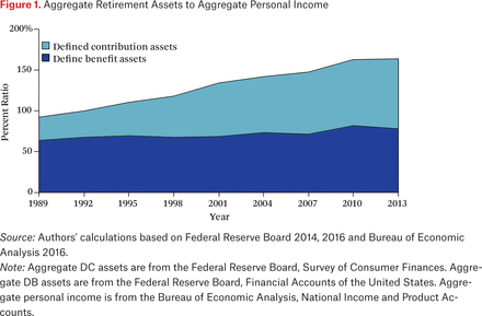
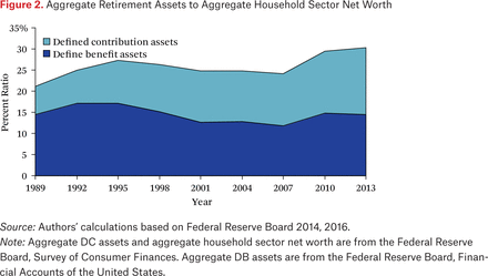
The analysis here begins with the observation that data on aggregate household retirement wealth tells us very little about trends in retirement preparedness and any possible contribution to wealth inequality over time.3 The ratio of aggregate (non–Social Security) retirement claims to aggregate personal income has risen since 1989, with most of that growth occurring in DC assets (figure 1). Whether retirement wealth relative to income should have increased more rapidly because of population aging or decreasing Social Security replacement rates requires developing appropriate counterfactuals, that is, how much should retirement wealth for a given individual have changed given lifetime earnings, retirement age, and life expectancy.4 Potentially relevant for wealth inequality is the observation that the share of retirement assets accounted for by defined benefit plans has fallen slightly on net, and DC has risen substantially, leading to a net increase in the share of retirement wealth in total household sector net worth since 1989 (figure 2). The implications for wealth inequality begin with whether differences in the distribution of DB and DC assets across household types are first order, which in turn begins with employer-sponsored retirement plan participation.
Aggregate Retirement Assets to Aggregate Personal Income
Aggregate Retirement Assets to Aggregate Household Sector Net Worth
The concept of retirement plan participation used here is based on observing any evidence of claim to retirement resources through a current account balance or current income stream, or as an expected income stream to commence in some future year. The financial asset section of the SCF questionnaire captures IRAs; the employment section captures information about DB and DC pensions associated with current employment; and the future pensions section captures claims to future DB pension benefits or DC accounts associated with past jobs and not rolled over (as most are) to an IRA.
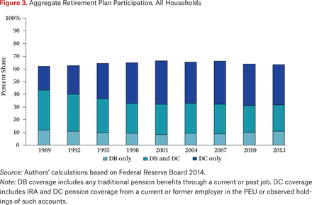
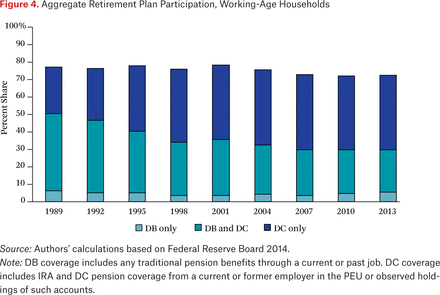
Based on this comprehensive measure, overall retirement plan participation has not evolved much in the past quarter century even though the retirement landscape has gone through substantial changes. The proportion of all families with any retirement plan participation has hovered between 60 and 70 percent (figure 3) and that of working-age families (ages twenty-five to fifty-nine) with coverage between 70 and 80 percent (figure 4). Overall coverage trends for all and working-age families indicate recent overall declines in participation.
Aggregate Retirement Plan Participation, All Households
Aggregate Retirement Plan Participation, Working-Age
The more noteworthy change in retirement plan participation is in the type of pension coverage (see table 1). The shift in employer-sponsored plans from DB to DC was well under way before the 1989 SCF was conducted, and few families (and even fewer working-age families) had only DB coverage even in that base year (fewer than 15 percent). It is important to remember that a family with a DB plan in their current job and any form of DC balance, including the (generally small) IRAs opened during the IRA heyday of the early 1980s or a rolled-over distribution from a previous job DB plan, will show up as having both DB and DC coverage in these tabulations.
Pension Coverage by Income
The trend away from DB plus DC coverage has been toward only DC. The top part of the stacked bars in figures 3 and 4 shows that the fraction of all families with only DC coverage nearly doubled since 1989. The trend for all families includes retirees who are receiving DB pension benefits from a prior job. Thus, the trend for working-age families is a clearer indicator of the trajectory for retirement resources going forward. About 50 percent of working-age families had some form of DB coverage in 1989, and that fell to about 30 percent by 2013.
Sample representativeness and respondent reporting bias are sources of concern when using household surveys, and it is useful to benchmark the survey values before looking at trends in retirement wealth from a distributional perspective. Benchmarking to available evidence suggests the SCF does a good job identifying participation in tax-advantaged retirement accounts (for a comparison of SCF retirement plan participation with information from tax returns, see Argento, Bryant, and Sabelhaus 2015).5 The SCF is also unique among U.S. household surveys in terms of capturing wealthy families and thus provides a comprehensive view of the retirement wealth distribution (for an overview of the SCF sampling strategy, see Bricker et al. 2014, appendix).
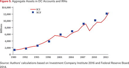
Direct comparison of the SCF with published aggregates confirms that the survey has indeed done a good job capturing the entirety of DC balances over the sample period (figure 5). Some evidence indicates that respondent-reported values for retirement account balances diverge from the estimates based on financial institution and government sources following dramatic swings in asset values, such as in 2001 and 2010. Those deviations seem temporary, however, perhaps due to respondent lags in updating account balances. Even those deviations are never more than a few percentage points, and overall aggregate DC holdings are well captured by the SCF from 1989 to 2013.
Aggregate Assets in DC Accounts and IRAs
The SCF does not attempt to collect the asset value of current and future DB claims from households, though the survey does have comprehensive information on DB benefits currently being received, DB coverage on current jobs, and some details on expected future DB benefits from past jobs. The approach in this paper to distributing DB assets is described in detail in the appendix. The overall idea is to begin with aggregate household sector DB assets from the Financial Accounts of the United States (FA) and to distribute those assets across and between current and future beneficiaries using fixed real discount rates, life tables, benefits currently received for those receiving, wages and years in the plan for those not yet receiving benefits, and the assumption that current beneficiaries have first claim to DB plan assets.6
RETIREMENT PLAN PARTICIPATION ACROSS AND WITHIN BIRTH COHORTS
Overall trends in retirement plan participation are a good starting point for understanding the contribution of retirement-saving behavior on wealth inequality, and the SCF makes it possible to go further and look across and within birth cohorts to investigate how the evolving retirement landscape is affecting different groups in the population. The typical approach in this sort of distributional analysis is to measure retirement plan participation and account balances across age groups and time, but a life-cycle framework provides a more dynamic view of changes across and within generations. This life-cycle view shows dramatic swings in re-tirement plan participation across cohorts between 1989 and 2013 and dramatic differences in participation within cohorts (by income) in every period.
The SCF lacks a long panel component that would make it possible to directly observe changes in retirement plan participation and account balances for a sample of families, but the synthetic-panel approach used here is well suited to studying typical outcomes across types of families at various points in the life cycle.7 Synthetic-panel analysis makes it possible to study outcomes across the population using different cross-sections at different points in time, such as in the SCF. The identifying assumption is that any given cohort is well represented in each of the cross-sections, and the summary statistics observed from one cross-section to another provide useful information about the changes for that group over time. The SCF is an excellent data source for the analysis here across broad birth cohorts and income groups because the sample sizes for generating the summary retirement plan participation and account balance measures are large enough to infer changes over time.8
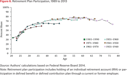
The SCF cross-sections used here span 1989 to 2013, and thus any given birth cohort can be tracked for (at most) twenty-four years. Looking across ten-year birth cohorts born between 1920 and 1990, and using all of the SCF surveys, a predictable life-cycle pattern in retirement plan participation by age (figure 6) is quite evident. The overall pattern is hump shaped, given that retirement plan participation (generally) rises steeply for families as they move from their twenties to their fifties, before stabilizing and then declining (though perhaps only slightly) for families that have crossed over into retirement.9
Retirement Plan Participation, 1989 to 2013
Comparing the life-cycle trajectories across birth cohorts at similar ages tells a more interesting story about evolving retirement coverage, however. The height difference (at a given age) for any two overlapping cohort lines indicates the difference in participation (at that age) between the two cohorts. Figure 6 thus shows two clearly different stories about trends in retirement plan participation between 1989 and 2013. In the early part of the period, before the early 2000s, more recent cohorts showed generally higher rates of plan participation at younger ages. That trend reversed around 2007.
The 1961–1970 birth cohort provides the clearest example of this sharp break in trend. When that cohort was first observed in their early twenties in the 1989 survey, just under 30 percent were participating in retirement plans. A decade later, when they were in their early thirties, some 70 percent of families had coverage, nearly 10 percentage points above the rate for the 1951–1960 cohort when they were in their early thirties (as observed around 1990). However, not only did the 1961–1970 cohort seem to peak in terms of coverage in their early thirties, their participation has now fallen: the last time they were observed, in 2013, when they were approaching age fifty, their participation rate was nearly 10 percentage points below the 1951–1960 cohort’s (as observed in the early 2000s) and even the 1941–1950 cohort’s (as observed in the early 1990s). Although the 1961–1970 cohort is the most extreme example, every cohort shows the pattern of first exceeding and then falling below earlier cohorts at the same age in terms of overall retirement plan participation.
This dramatic takeaway from the life-cycle perspective on cohort-level retirement plan participation provides a sharp contrast with the conclusions arising from the aggregate participation charts (figures 3 and 4). The key to reconciling the two is demographic trends. As baby boomers approached middle age, if life-cycle trajectories had not changed, the overall retirement plan participation would have risen substantially because the baby boom generation has a greater population weight and is at its life-cycle peak in retirement plan participation. The only reason aggregate participation stabilized and then fell slightly was that within-cohort changes dominated the demographic effect.
Acknowledging that participation in retirement plans is down substantially from a life-cycle perspective, especially for younger cohorts, is an important starting point for thinking about the effect of retirement plans on wealth inequality. The more pressing question, though, is who within those birth cohorts is experiencing those changes. The obvious dimension on which to cut the cohort data is income, given that differences in retirement plan offerings and participation across income groups are well known. The SCF makes it possible to look—from the same life-cycle perspective—within birth cohorts across income groups to study both levels and changes in participation over time.
One potential problem in synthetic-panel analysis is the possibility that families in a specific group in a given year are not the same ones (probabilistically) as in that group in a different year. This is obviously not a problem with something mechanical like birth cohorts, but sorting families on income could be problematic, especially if transitory shocks to incomes in a given year are large. When that is the case, for example, (usually) higher-income families who experience large negative shocks will be grouped with (usually) lower-income families, and their accumulated retirement wealth will be averaged with that of (usually) lower-income families.
Since 1995, the SCF has included a set of income questions that make it possible to eliminate most of this sorting bias in the synthetic-panel analysis. The measure used in this paper is derived from the survey questions about the gap between actual and usual income in the SCF. Toward the end of the SCF interview, after detailed income components have been summed, respondents are asked whether that total income is higher than, lower than, or about the same as their income in a usual year. Most respondents say that it is in fact about normal—the median gap between actual and usual income is zero in every survey year. However, sizable minorities of respondents indicate that their income is either unusually high or unusually low, and those proportions vary predictably and systematically with business cycle conditions. Those who say they experienced a shock are then asked what their income would be in a usual year, and that (along with actual income for the majority who say their income is equal to the usual value) is the classifier used here.10
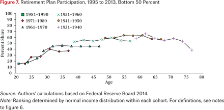
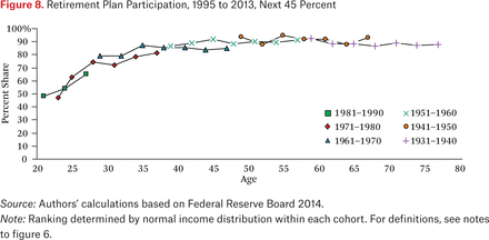
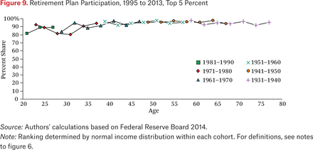
Differences in life-cycle patterns for retirement plan participation across usual income groups are not surprising (figures 7 through 9).11 Retirement plan participation is always and everywhere strongly and positively associated with usual income, and there are very different life-cycle trajectories and peaks across the three usual income groups represented here: the bottom 50 percent of families, the next 45 percent (percentiles 50 through 95), and the top 5 percent.12 Indeed, it really does not make sense to think of retirement plan participation among the top 5 percent as having an age component per se, because participation is nearly universal for that income group at every point in the life cycle.
Retirement Plan Participation, 1995 to 2013, Bottom 50 Percent
Retirement Plan Participation, 1995 to 2013, Next 45 Percent
Retirement Plan Participation, 1995 to 2013, Top 5 Percent
The possible (and perhaps competing) explanations for these differences in retirement plan participation rates by income are well known. Families in the bottom 50 percent of the usual income distribution have not just lower overall compensation, of which retirement plan offerings are a component, but also much more employment volatility, which also affects retirement plan offerings and participation. On the positive side, those lower-income families also receive a much higher replacement rate from Social Security (as shown later in the paper) such that their need to save is greatly diminished relative to higher-income families, for whom Social Security is much less adequate in terms of replacing earned income.13
Although comprehensively explaining the levels of participation by income and age is beyond the scope of this paper, the life-cycle trajectories do make it possible to address the distributional question about changes in participation. The largest decreases in retirement plan participation, relative to the life-cycle trajectories of previous cohorts in the same income groups, have occurred for preretirement families in the bottom 50 percent by usual income, and to some extent for the younger cohorts in the next 45 percent. The only groups that have not seen large changes in retirement coverage are older families across all income groups, and all age groups at the top of the usual income distribution. Again, the 1961–1970 cohort is a useful benchmark: families in the bottom half have only a 50 percent participation rate as they approach age fifty, in 2013, well below the life-cycle peak for lower-income families in the three previous cohorts.
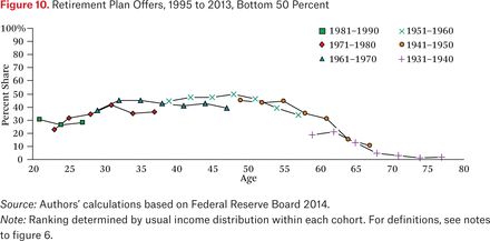
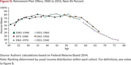
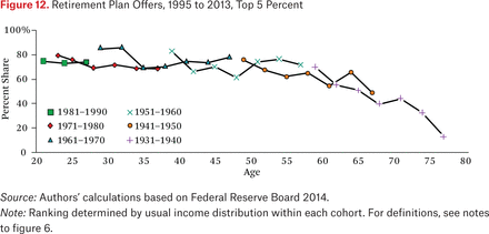
Why did retirement plan participation change, especially after 2007? The life-cycle decline in retirement plan participation across and within cohorts is attributable to either a decline in opportunities to participate or the choice to not participate, given the opportunity. Most tax-preferred retirement participation comes through the workplace. (Although everyone is eligible to participate in IRA saving, if they do not have employer-sponsored coverage, they generally choose not to). Thus participation generally begins with employment itself and then whether employers offer retirement plans and how they set eligibility criteria for those plans. The SCF has questions about whether (nonparticipating) respondents’ employers offered plans, and whether the respondent was eligible (but declined to) participate. Based on that information, declines in offers for the lower half of the income distribution seem to be responsible for most of the divergence in participation across and within cohorts (figures 10 through 12). Participation, conditional on having a pension offer, is fairly constant across and within cohorts.14
Retirement Plan Offers, 1995 to 2013, Bottom 50 Percent
Retirement Plan Offers, 1995 to 2013, Next 45
Retirement Plan Offers, 1995 to 2013, Top 5 Percent
RETIREMENT WEALTH-TO- INCOME RATIOS
The life-cycle perspective on participation in retirement saving plans shows a somewhat dramatic recent decline for many younger and lower-income families, but participation is only the first margin of behavior. It is possible, for example, that the decrease in participation was concentrated among those for whom (conditional) retirement wealth accumulations or entitlements are relatively small, at least relative to their incomes or other resources, leading to little impact on retirement preparedness or overall wealth inequality.15 The same life-cycle framework used earlier for tracking retirement plan participation is used in this section to look at accumulated DB and DC retirement claims by cohort, income, and age. The primary statistics of interest are retirement claims relative to income, first for all retirement wealth, and then for DB and DC plans separately.
There are several ways to (statistically) look across and within cohort groups to evaluate the importance of accumulated retirement wealth at any point in time. The unconditional mean of retirement balances captures both the participation and accumulation dimensions in one statistic, the conditional median gives an indication of importance of accumulated balances for the typical family in the group with any retirement balances, and the conditional mean further shows how skewed balances are (relative to the conditional median) among families in the group who have balances. Although the three measures diverge somewhat in terms of levels, the patterns across and within birth cohorts are generally similar.
The 1961–1970 birth cohort is once again a good example. As of 2013, members of this group were on average forty-eight years old, and their retirement plan participation around 70 percent (figure 6). Differences in participation (figures 7 through 9) and retirement assets across the three usual income groups are large, however. The unconditional mean retirement balances for this group in 2013 (not shown) differ dramatically (though not unexpectedly) from about $38,000 for the bottom half by usual income, to $219,000 for the next 45 percent, and to $769,000 for the top 5 percent.
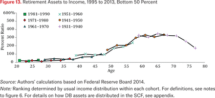
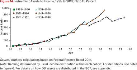
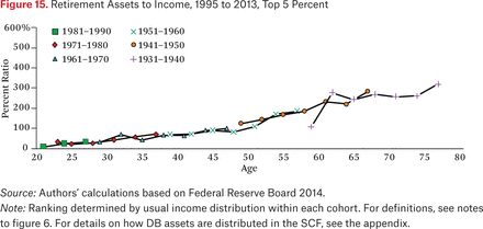
The across- and within-cohort differences in unconditional mean retirement assets at a particular time are not direct evidence about retirement planning and adequacy of resources; normalizing by income is thus an important step in that direction. The static measures also do not indicate anything about changes over time, which (as with participation) is best conveyed using the life-cycle framework that shows within- and across-cohort movements. Thus, the following analysis focuses on the ratio of (unconditional) average retirement assets to average usual income across and within cohorts, 1995 through 2013 (figures 13 through 15).
Retirement Assets to Income, 1995 to 2013, Bottom 50 Percent
Retirement Assets to Income, 1995 to 2013, Next 45 Percent
Retirement Assets to Income, 1995 to 2013, Top 5 Percent
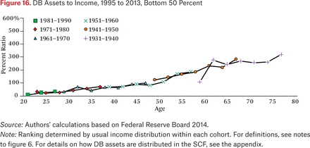
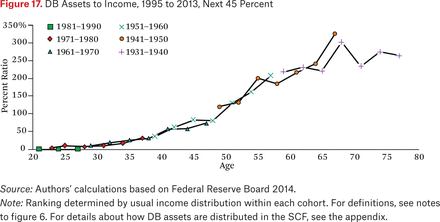
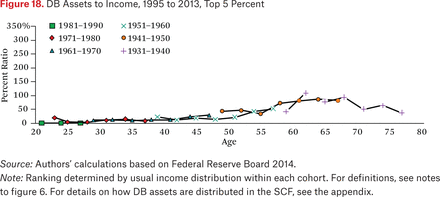
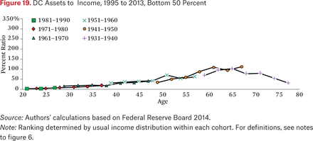
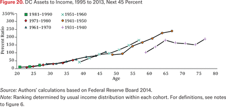
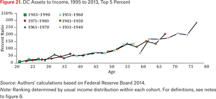
These differences in retirement wealth to income ratios by usual income are much less stark than those in retirement plan participation (figures 7 through 9), because the much higher average incomes at the top offset higher participation and (conditional) retirement balances for those higher-income families. Indeed, average retirement balances for those about sixty years old in 2007 (that is, the 1941–1950 cohort) were all roughly 300 percent of average usual income across all three usual income groups.16 However, especially when viewed from the life-cycle perspective, the patterns by age and the contributions of DC and DB assets to overall retirement wealth accumulation varied widely across the income distribution (see figures 16 through 21).
DB Assets to Income, 1995 to 2013, Bottom 50 Percent
DB Assets to Income, 1995 to 2013, Next 45 Percent
DB Assets to Income, 1995 to 2013, Top 5 Percent
DC Assets to Income, 1995 to 2013, Bottom 50 Percent
DC Assets to Income, 1995 to 2013, Next 45
DC Assets to Income, 1995 to 2013, Top 5 Percent
Retirement wealth accumulation is much slower early in the life cycle for lower-income families than it is for middle- and higher-income families. To some extent, this reflects the participation patterns described earlier, because fewer lower-income families participate in retirement saving at all ages, but especially when young (see figures 7 through 9). However, that pattern is compounded by the differential reliance on DB versus DC wealth accumulation. Young families who do participate in DB plans receive relatively small DB asset allocations based on our algorithm, because of the actuarial discounting principles used to distribute the aggregate DB plan assets across families.17 That same phenomenon causes DB wealth accumulation to accelerate sharply (relative to income) as these families approach retirement (see figures 16 through 18).
The trajectories after retirement age also diverge, and again in a way consistent with changes in retirement plan participation at older ages. The suggestion is, of course, that lower-income families are more likely than others to spend down their DC accounts after retirement (figures 19 through 21) given that DB assets set aside for all individuals decline systematically but slowly as they age (figures 16 through 18). Some of the change in trajectory after retirement is due to the denominator (usual income) because the various usual income groups exhibit different (usual) income trajectories after retirement.
As with participation rates, a key message that emerges from the within-cohort retirement wealth-to-income trajectories involves those for whom retirement balances are failing to grow with income. In a world with declining DB coverage and less generous Social Security (at any given claim age) for all income groups, one would suspect the DC balance to income trajectories would lie always and everywhere above predecessor cohorts (if expected retirement ages are unchanged). That middle-age families generally seem to be just keeping up with the cohorts ahead of them (in terms of DC balances) is therefore somewhat surprising. It is also suggestive that retirement accumulation may indeed (in a relative sense) be slipping for many (again, holding expected retirement ages constant).
The observation that younger cohorts in both the bottom half of the distribution and the next 45 percent are not even keeping up with the cohorts ahead of them in terms of DC balances is even more worrisome. In addition, middle-age families in the bottom half of the income distribution (notably the 1951–1960 cohort) do not seem to be going through the substantial run-up in wealth-to-income ratios as they get close to retirement, as was true for lower-income families in previous cohorts. This takeaway on recent divergence in the trajectories of DC balance to income ratios closely mirrors the findings on participation described.
Still, it is hard to find any evidence (at least not yet) based on the life-cycle analysis of substantial changes in retirement wealth accumulation across usual income groups. That statement is supported by the lack of across-cohort differences in retirement wealth-to-income ratios. In an important sense, this is explained by lower-income families’ having had relatively little retirement wealth (relative to income) in earlier years, which continues to be the case. DB claims for lower-income families in past decades were low, and three decades later remain small. That usual income growth has slowed differentially for lower-income families as well is also a factor contributing to wealth concentration generally. It is not clear, however, whether the retirement system is contributing differentially (relative to business ownership, housing and other real estate, the stock market, or other forms of wealth) to the dynamic relationship between income and wealth.
ROLE OF SOCIAL SECURITY WEALTH
Any analysis of retirement wealth claims across income groups is necessarily incomplete without some mention of Social Security. The Social Security program is both quite large relative to other forms of retirement wealth and quite different from a distributional perspective. The size of the program is often described using measures such as benefit flows relative to total gross domestic product (GDP), but the more striking perspective involves calculating the present value of benefits. The Social Security actuaries estimate that the present value of Old-Age, Survivors, and Disability Insurance (OASDI) benefits for people age fifteen and older in 2013 was about $52 trillion, roughly double in real terms relative to the comparable estimates from two decades prior, due to population aging, increases in lifetime earnings, and increased life expectancy.18 The present value of future Social Security benefits is also now roughly double the size of all DB and DC claims combined. From a distributional perspective, that income is capped for collecting taxes and paying benefits, and the benefit formula itself is progressive, means that claims to Social Security benefits are much more evenly distributed than other forms of retirement wealth.
The SCF does not collect all of the inputs needed to project Social Security benefits for respondent families and, thus, estimates for the entire population would involve strong assumptions about earnings growth and retirement ages. However, it is possible to get a sense of the distributional impact of Social Security (relative to DB and DC wealth) by focusing on one cohort at one point in time, just before retirement. In what follows, the focus is on the 1951 to 1960 birth cohort, as observed in the year 2013. This group ranged from fifty-three to sixty-two years old when the 2013 SCF was conducted. This cohort was close enough to retirement that their current earnings are a reasonable proxy for their lifetime earnings. Benefits are then computed under the (conservative) assumption that everyone retires at age sixty-two.19
The importance of Social Security wealth relative to other forms of retirement wealth is illustrated clearly by this simple calculation using current earnings to proxy lifetime earnings, which is the key input to the Social Security benefit calculation (see table 2).20 The statistics in this table are all medians, in order to focus on representative individuals within each income group, rather than the overall or average retirement wealth for the entire income group. Thus, the very high incomes at the top of the income distribution do not pull down retirement wealth-to-income ratios for that group, and the relatively high DB+DC assets for some families in the bottom half of the income distribution do not distort (upwards) the retirement wealth of the many families in the bottom half with little or no retirement wealth.
Retirement Balances by Income, 2013
The main takeaway from table 2 is that Social Security goes a long way to explaining why differences in DB+DC retirement wealth do not translate into dramatic shocks to living standards as a given cohort crosses over into retirement. Median total retirement wealth (including Social Security) is much lower for the bottom half of the usual income distribution, but relative to median income is roughly the same as for the next 45 percent income group, and more than double that for the top 5 percent. Of course the median family in the top 5 percent owns much more in absolute terms for both DB+DC and Social Security wealth, but, relative to usual income just before retirement, their retirement claims are actually smaller.
EFFECT ON OVERALL WEALTH CONCENTRATION
The synthetic-panel approach to using the SCF to study retirement wealth accumulation in a life-cycle framework provides mixed evidence about the role that pensions and other tax-preferred savings may be playing in rising overall wealth concentration. The earlier analysis shows that retirement plan participation has fallen, and that decrease is concentrated among low- to middle-income families. At the same time, however, average retirement wealth relative to average (usual) income has not shifted across income groups in ways that suggest pensions and tax-preferred savings are a primary factor driving rising wealth inequality.
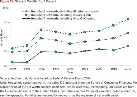
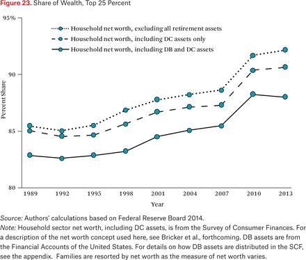
Analyzing the net effect of retirement wealth on overall trends in wealth inequality requires some perspective on the concentration of retirement and nonretirement wealth.21 The share of total wealth (including the distributed DB wealth) held by the top 1 percent of families (sorted by total wealth) rose 6 percentage points between 1989 and 2013, from 26 percent to 32 percent (figure 22, solid line). The share held by the top 25 percent rose 5 percentage points, from 83 percent in 1989 to 88 percent in 2013 (figure 23, solid line). Retirement wealth might affect overall wealth concentration in various ways, but the data suggest the effect has been generally in the direction of mitigating wealth concentration at the very top, with a partial offset because of the shift from DB to DC.
Share of Wealth, Top 1 Percent
Share of Wealth, Top 25 Percent
Retirement wealth is much less concentrated than other forms of wealth.22 The share of total nonretirement wealth held by the top 1 percent of families (sorted by total nonretirement wealth) rose 10 percentage points between 1989 and 2013, from 31 percent to 41 percent (figure 22, dotted line), and the share held by the top 25 percent rose 7 percentage points, from 85 percent in 1989 to 92 percent in 2013 (figure 23, dotted line). Thus, retirement wealth is less concentrated than nonretirement wealth at the very top, but the concentrations are more similar for the top 25 percent.
Retirement wealth is rising as a share of total wealth (figure 2), from about 20 percent in 1989 to about 30 percent as of 2013. Between this rise and the lower concentration, the first takeaway is that the tax-preferred retirement system helped offset rising wealth concentration at the very top. The top 1 percent of wealth holders own something like 7 to 8 percent of retirement wealth in all years, about 31 percent of nonretirement wealth in 1989, and 41 percent by 2013. Whether one weights by the starting or ending shares of wealth owned by the top 1 percent, the effect of changing wealth composition is certainly noticeable, offsetting 2 to 3 percentage points of the 10 point increase in nonretirement wealth and pushing the overall increase in the top wealth shares down to the actual observed 6 point increase in the top wealth share.
Retirement wealth also mitigated rising wealth concentration for the top 25 percent of wealth holders, though the effect is much more modest, because retirement and non-retirement wealth shares are similar. The top 25 percent of wealth holders (sorted by total wealth) own roughly 82 percent of all DC wealth and about 80 percent of DB wealth. These values are below the nonretirement wealth shares for the top 25 percent, but much less dramatically so than for the top 1 percent. Thus, the increase in retirement wealth on the household balance sheet did less to offset the increasing wealth share of the top 25 percent.
In the other direction, DC wealth is more concentrated than DB wealth, and thus the shift from DB to DC increased wealth concentration (again, the shares of DB and DC assets held by the top 1 percent and top 25 percent of wealth holders have remained relatively stable over time). Measures of concentration using only DC assets and nonretirement wealth (basically the published SCF wealth estimates, the dashed lines in figures 22 and 23) are between the total wealth and nonretirement wealth concentration lines, given that DC assets are more concentrated than DB assets.
The different concentrations of DB and DC wealth lead to the following counterfactual calculations meant to address the question of whether the shift from DB to DC is contributing to rising overall wealth concentration. The top 1 percent owns about 5 percent of DB wealth and about 15 percent of DC wealth, and though the trends over time in those shares may be slightly positive, they are second order. Holding the share of wealth accounted for by re-tirement wealth constant at the 1989 value (20 percent), the differences in DC versus DB concentration suggest that the increase in the DC share of retirement assets (from 30 percent in 1989 to 50 percent in 2013, figure 2) raised wealth concentration at the top by about 0.4 percentage points (the 10 percentage point differential in DB versus DC concentration * 20 percentage point shift in composition from DB to DC * 20 percent retirement asset share in 1989). Weighting by the 2013 retirement wealth share (30 percent) would raise that to 0.6 percentage points, but either way the effect is modest relative to the overall 6 percentage point increase in the overall top 1 percent wealth share, or the 10 percentage point increase in the nonretirement wealth share. The results are qualitatively similar for the top 25 percent wealth group, the shift from DB to DC accounting for as much as 1 percentage point of the 5 percentage point increase in the top 25 percent total wealth share.
CONCLUSIONS
Retirement wealth is less concentrated than nonretirement wealth in the United States, and that total wealth concentration is rising more slowly than nonretirement is consistent with the growth of retirement wealth relative to overall household sector net worth in recent decades. Put differently, on net, employer-sponsored pensions and other tax-preferred savings have offset some of the rapidly rising wealth inequality in other parts of the household balance sheet. The shift from DB to DC coverage, and the associated shift in the distribution of wealth because of differences in DB versus DC wealth concentration among top wealth holders, has partially offset the equalizing effect of rising retirement wealth. It has done so because top wealth holders now own a substantial share of DC assets, though they have always owned (and continue to own) a big share of DB assets.
At the same time, the life-cycle perspective suggests that even the modest equalizing effects of retirement saving may wane in the future. Although overall retirement plan participation was relatively stable or even rising through 2007, participation fell noticeably in the wake of the Great Recession and has remained lower. The cohort-based analysis of life-cycle trajectories used here shows that the recent decline in retirement plan participation is concentrated among younger families and low- to middle-income families. In previous cohorts, those groups experienced large increases in retirement wealth (relative to income) in middle age, because of realized (actuarial) increases in the value of DB claims. Given that DC accumulation has not been strong enough to replace the lost DB wealth for low- and middle-income families, retirement wealth (relative to income) will not automatically increase in middle age, as it did for previous cohorts, when their pension fund managers increased saving on their behalf.
Retirement plans are evolving in the United States and many other countries as aging populations pressure public systems and changes in labor market conditions pressure employer-sponsored systems. The SCF data show that the decrease (or lack of expected increase) in retirement wealth has been concentrated among those already disadvantaged by rising earnings inequality and rising nonretirement wealth inequality. At the same time, however, the decrease in the value of DB and DC retirement claims for lower-income families has been fairly modest, especially relative to their (stable or falling) incomes. That, though, is just another way of saying that those families had relatively little in the way of non–Social Security claims in the past and now have even less.
One direction for policy emerging from this analysis might be to strengthen and broaden access to voluntary retirement savings plans, though history shows (barring some fundamental design innovation) that such an approach implemented independently of changes to Social Security is unlikely to achieve the goal for many families. One can imagine mandated employer retirement plan coverage or stricter opt-outs, such as in other countries. However, in a philosophical sense, employer mandates are just a particular extension or reform of Social Security, at best giving employers and workers a bit more flexibility in terms of actual implementation. Any serious reform to the private retirement system should take as a starting point that a sound Social Security system is the key to retirement preparedness for most low- and moderate-income families, and that considering the role of both public and private systems in providing retirement security across the entire population is critical.
Acknowledgments
The analysis and conclusions are those of the authors and do not indicate concurrence by other members of the research staff or the Board of Governors. This paper was prepared for the Russell Sage Foundation conference, “Wealth Inequality: Sources, Consequences, and Responses,” October 30, 2015. We thank our colleagues at the Federal Reserve Board, Wojciech Kopczuk, Russell Sage, NTA, and SOLE conference participants, and the volume editors for many helpful comments.
Appendix
Distributing Aggregate DB Pension Assets and Allocating Social Security Wealth to Birth Year Cohort, 1951 to 1960
The Survey of Consumer Finances does not ask respondents about the present value of expected future defined benefit pensions but does collect information about current DB payments of retirees and the expected future claims of workers currently enrolled in DB pension plans. Various papers have used the SCF to estimate household-level DB wealth for distributional and other purposes, and a number of methodological issues need to be addressed to generate these distributional estimates using the data elements available in the survey.
The first decision involves micro-aggregation versus using control totals for aggregate DB pension assets. In this paper, the aggregate value of DB assets by year is taken from the Federal Reserve Board’s Financial Accounts (FA) of the United States.23 DB pension wealth is the portion of Total Pension Entitlements (B.101 line 28) not found in defined contribution pension assets (table L.116, line 26) and annuities held in IRAs at life insurance companies (table L.115, line 24). In the first quarter of 2013, this amounted to $10.9 trillion, or roughly one-sixth of total FA household sector net worth.24
In this paper, aggregate DB wealth is distributed across households in a series of steps. We build on the approach of Jesse Bricker and his colleagues (forthcoming), which in turn is largely based on an approach by Emmanuel Saez and Gabriel Zucman (2016). The algorithm we use is still quite rough and does not make use of all of the available information in the SCF. However, that simplicity is also useful because it minimizes the number of behavioral assumptions one needs in order to implement the micro-level allocations.
The first phase of the micro-allocation involves splitting aggregate pension wealth between SCF respondents already receiving benefits, and those who are or were covered by DB plans but not yet receiving benefits. We effectively assume that current beneficiaries have a first claim to plan assets, solve for the present value of promised benefits for those currently receiving benefits, and subtract that amount from total plan assets to solve for the share to be distributed to those not yet receiving benefits. The present value of benefits for those already receiving is based on the respondent-reported values for those benefits, life tables from the Social Security Administration, and an assumed 3 percent real discount factor.
The number of SCF households currently receiving DB benefits increases between 1989 and 2013 (table A1, column 2) and the number of households with promised future benefits decreases (table A1, column 3). The first trend is clearly a function of demographics, in that the aging of the baby boom and increase in life expectancy has led to systematically more DB recipients. The second trend reflects the shift from DB to DC, because fewer current workers are in the queue to receive DB benefits after they retire.
DB Wealth
The top-level allocation of assets between current and future beneficiaries is not as obvious, however, because the level of DB assets (table A1, column 1) has grown fast enough that the share of aggregate plan assets we assign to current beneficiaries is actually slightly lower now than at the beginning of the sample period (table A1, column 4). That is, if we assume current beneficiaries have first claim to plan assets, and measure those claims using observed benefits, life tables, and an assumed 3 percent real return, a rising level of plan assets is still left over to be distributed among those who have not yet begun to receive benefits.
Some of the increase in aggregate DB plan assets may be attributable to changes in DB funding principles, but again a key demographic component is also in play, and that underlies how we allocate the remaining DB assets among those not yet receiving benefits. The algorithm we use assigns each future recipient a share of the residual DB plan assets (the amount left over after current beneficiaries claim their share) based on their earnings and the number of years they have been in the plan (to reflect how DB plans generally work) and then discounts those claims relative to a typical benefit commencement age (we use age sixty). The approach is meant to roughly capture how pension actuaries would compute the present value of the obligation. For example, given two observationally equivalent people (in terms of salary and number of years in plan) the actuaries would hold much more in assets for (say) a sixty-year-old than they would for a forty-year-old. Indeed, using the same 3 percent discount rate, those differences in asset holdings are quite large. In acknowledging that the age distribution of those who are expecting but not yet receiving benefits has shifted toward retirement as baby boomers have aged and new labor force entrants are less likely to be covered by DB plans, it becomes clear why (even without a change in funding principles) DB plans are holding much more in assets per future recipient than they did in the past.
The algorithm we use for distributing DB assets among those not yet receiving benefits is not based on SCF respondent-reported expected DB benefits. More elaborate approaches to estimating the asset value of future DB promises have been proposed and implemented by James Poterba (2014), Edward Wolff (2015), and Arthur Kennickell and Annika Sunden (1997). Those papers all discuss the sequence of assumptions about workers’ continued participation in their current plans, retirement or claim ages, and life expectancy that one needs to make to bring to bear all of the relevant information in the SCF. In addition to the behavioral assumptions, one also needs to assume that workers have a good understanding of their plan parameters. Based on a match of SCF survey data to participants’ actual pension plan details, Martha Starr-McCluer and Sunden (1999) show that assumption is often violated. In addition, there appears to be substantial confusion about certain types of expected payouts, especially in the early years of the SCF (through the late 1990s) before question wording was improved. For example, it may be the case that some of the expected DB benefits are actually payouts of stock options or other compensation that are likely to be of short duration. Including those limited expected payouts in expected DB wealth would greatly distort the time series. Future work should focus on sorting this out, and ideally, one would construct micro-level expected DB benefits that (appropriately discounted) track well with aggregate plan assets in the FA.
The SCF asks several questions about Social Security payments currently being received, and extensive questions about the employment history of both the respondent and spouse or partner. We compute current and future benefits separately and for this paper focus specifically on those households interviewed in 2013 and born between 1951 and 1960. Because of differences in mortality between respondents and their spouses, most of these calculations are first done on the individual level before we create a household total.
Starting with current beneficiaries, we take reported Social Security annual benefits for both the respondent and the spouse and then calculate a survival adjusted net present value for each future benefit stream. We use the same life tables and 3 percent discount rate as described in the DB pension process. We then sum these amounts to produce a household-level value for Social Security wealth for those currently receiving benefits.
The calculation for those not currently receiving benefits is more complicated and motivates our approach in this paper of only presenting values for a particular birth year cohort. Household heads in the 1951 to 1960 cohort are between fifty-three and sixty-two, meaning that we have to make a minimum number of assumptions about their work history and current earnings. To simplify the allocation process, we restrict our sample to those households for which the respondent is currently employed. Next, we create a monthly total for all wages and salaries earned by both the respondent and the spouse or partner. We use this monthly wage-salary earnings number as a simplified version of the average indexed monthly earnings (AIME) that we can then input into a “bend point” formula similar to the one the Social Security Administration (SSA) uses to determine monthly benefits. According to SSA data, the monthly bend points in 2013 were $791 and $4,768 and the taxable maximum (at the monthly level) was $9,475. We use these thresholds to compute something similar to the primary insurance amount (PIA) by assigning 90 percent of wages up to the first bend point, 32 percent of earnings between the first and second bend points, and 15 percent of earnings between the second bend point and the taxable maximum. Next, we apply benefit rules associated with each individual’s birth year as set by Social Security. Finally, we apply a survival-adjusted discount factor determined by the probability of survival from age sixty-two forward and the number of years before the individual turns sixty-two. This allows us to compute overall retirement wealth for this group of the population.
FOOTNOTES
↵1. Elsewhere in this issue, Alexandra Killewald and Brielle Bryan show that homeownership is a positive contributor to wealth accumulation in the middle of the wealth distribution, even after controlling for selection effects, though there is some heterogeneity in the effects of homeownership by race, with the returns to home-owning for white families more than double that for African American families.
↵2. Studies by Edward Wolff (this issue) and Jesse Bricker and colleagues (2014) use the SCF to describe the levels and trends in the distribution of total wealth across the population.
↵3. The focus of this paper is on overall retirement plan participation and the distribution of non–Social Security retirement assets across income and cohort groups. Other questions in the SCF about earnings histories can be used to estimate Social Security (for examples of more comprehensive estimates of retirement wealth using the SCF, see Poterba 2014; Wolff 2015).
↵4. The analysis here is closely related to retirement preparedness across and within generations in the United States. James Poterba provides an excellent overview of the literature (2014). John Scholz, Ananth Seshadri, and Surachai Khitatrakun argue that most households have retirement resources that are largely consistent with the predictions of a life-cycle planning model (2006). Both Alicia Munnell, Anthony Webb, and Francesca Golub-Sass (2012) and Wolff (2015) argue that retirement preparedness is deteriorating for many. Douglas Bernheim, Jonathan Skinner, and Steven Weinberg argue that standard life-cycle determinants of retirement preparedness do not explain substantial differences between households nearing retirement (2001).
↵5. Evidence of participation using tax returns is based on the same principles, because form W2 indicates current job coverage, and forms 5498 and 1099-R indicate account balances or flows for accounts.
↵6. One piece of information not used here is the respondent-reported value for future DB benefits, if those benefit payments have not yet begun. Some evidence indicates substantial respondent errors in these estimates (see, for example, Starr-McCluer and Sunden 1999) as well as indications that (especially in the early SCFs) expected payouts from (say) stock options are intermingled with DB benefits.
↵7. The Health and Retirement Study (HRS) is a good resource for studying retirement wealth trajectories for U.S. families approaching or in retirement, and the HRS has a panel structure (see, in particular, Gustman, Steinmeier, and Tabatabai 2010, 2011, 2014; Poterba et al. 2007; Poterba, Venti, and Wise 2012, 2013). Unfortunately, the HRS does not include the younger families and the very wealthy families who are included in the SCF, and those missing groups are the focus of much of the analysis in this paper.
↵8. This is not meant to imply that the synthetic cohort approach used here is necessarily inferior to panel data for this type of long-run distributional analysis across groups and time. True micro panels suffer from nonrandom attrition bias on top of any selection bias associated with participation in a cross-section survey, and reporting or measurement variability in panel surveys is such that analyzing the distribution of individual changes in retirement wealth can be highly problematic. Indeed, most analysis of data sets such as the HRS involve comparing summary statistics for a given cohort at different times, just like those produced here. The more salient difference is in how families are grouped—for example, by current versus permanent income—when estimating those summary statistics at each time.
↵9. The tendency of retirees to not draw down tax-preferred accounts has been analyzed extensively (Love, Palumbo, and Smith 2009; Poterba, Venti, and Wise 2013). Whether these trajectories are consistent with optimizing behavior depends on the underlying model, and even the concept of consumption versus spending one has in mind (see, for example, Aguiar and Hurst 2005; Hurd and Rohwedder 2013).
↵10. Bricker and his colleagues show how the usual income classifier affects conclusions about changes in family finances over time (2014, box 2).
↵11. Relative to figure 6, which plotted participation across birth cohorts from 1989 to 2013, the sorting by usual income eliminates the first two points (representing six years) for the cohorts who could have been observed prior to the 1995 survey.
↵12. Families are sorted by usual income within their respective birth cohorts. The specific usual income groups are motivated in part by analysis of income inequality that suggests a clear trend separation near the top few percentiles of families by income, the top 5 percent chosen specifically to provide a large enough sample size for the synthetic cohort tabulations. The oversampling of the SCF at the very top plays an important role here, because that top 5 percent is represented by a disproportionate number of families.
↵13. This assertion is based on the highly progressive formula for determining Social Security benefits—specifically, the primary insurance amount (PIA)—relative to lifetime earnings—specifically, average indexed monthly earnings (AIME). Olivia Mitchell and John Phillips discuss conceptual issues involved with measuring Social Security replacement rates (2006).
↵14. There is also an important corollary that ties together the shift in type of pension coverage (figures 3 and 4) with changes in the distribution of retirement plan participation by usual income and cohort (figures 7 through 9). Overall participation is positively correlated with income, but the type of coverage, conditional on any participation, is roughly proportional across income groups at every point in time. Among working-age families (headed by individuals twenty-five to fifty-nine years old) the overall retirement plan participation rates in 1995 were 54 percent for the bottom half by usual income, and 96 percent for the top 5 percent of families by usual income. By 2013 the overall participation rates had fallen to 44 percent for the bottom half and 94 percent for the top 5. However, conditional on having coverage, the types of coverage were about the same across income groups. In 1995, 53 percent of those with coverage in the bottom half by usual income had a DB or mixed DB+DC, versus 48 percent of those in the top 5 percent. By 2013, the conditional DB+DC coverage rates had fallen to 38 percent among the bottom half, and 25 percent in the top 5 percent. Barbara Butrica and her colleagues (2009) and Wolff (2015) also explore the distributional implications of the decline in DB coverage for future retirement outcomes.
↵15. As noted, an overall assessment of retirement wealth requires comprehensive measures of accumulated balances and claims to all future income streams, including Social Security. Measuring retirement adequacy comprehensively also requires assumptions about retirement ages, and increasing lifespans suggests that measuring retirement wealth using fixed retirement or Social Security claim ages across cohorts may be misguided (for a discussion of trends and determinants of claiming and retirement ages, see Henriques 2012; Behaghel and Blau 2012).
↵16. These similarities across usual income groups helps to explain why Robert Clark and John Sabelhaus find that relatively modest changes in retirement ages, extending working lives by just a few months for many people, would be needed to completely offset the drop in asset values associated with the Great Recession (2009). Similarly, Gopi Goda, John Shoven, and Sita Slavov find though stock market fluctuations do affect expected retirement ages for workers close to retirement, the increase in respondent-reported expected time until retirement that occurred during the Great Recession cannot be explained by losses on financial assets alone (2011).
↵17. The estimated DB portion of the life-cycle retirement wealth-to-income ratios depends to some extent on the specific algorithm for distributing aggregate DB assets (described in the appendix), but the results are fairly robust to changes in that algorithm. For example, raising or lowering the real discount factor by 1 percentage point shifts about 5 percent of retirement wealth between retirees and workers, which does not substantially change the life-cycle patterns. Another concern is differential mortality, which implies that the value of a given DB income stream for a lower-income family with (statistically) lower life expectancy is diminished relative to those at the top of the income distribution. In the DB allocation, differential mortality is less likely to be a problem because the income-mortality gradient is dominated by differences between the very bottom and every other income group. As shown later, most DB assets are concentrated at the top of the distribution, so differential mortality is not a determining factor.
↵18. Based on unpublished numbers from the Office of the Chief Actuary of the Social Security Administration. The estimate for recent years can be found in the annual “Trustees Report” (http://www.ssa.gov/oact/tr/2015/VI_f_infinite.html#, accessed May 3, 2016).
↵19. Details about the Social Security estimates are provided in the appendix. A substantial proportion of people still claim at age sixty-two, despite increases in the full retirement age. Setting the retirement age low decreases the present value of benefits directly if the reductions for early retirement are not actuarially fair, and indirectly if the individual were to keep working at a high enough income to increase their average indexed monthly earnings. That is the sense in which this calculation is conservative.
↵20. The calculations are based only on those household heads with reported wages and salaries or self-employment income during the survey year.
↵21. In addition to thinking about the concentration of retirement and nonretirement wealth, it is also important to note that structural changes in retirement plans themselves may impact the levels of wealth inside and outside accounts. For example, the shift from DB to DC may have led some to shift liquid assets from after-tax holdings to retirement accounts. Household leverage increased in recent decades, and for some we may observe increased debt (such as mortgages) in the nonretirement accounts even though the financial assets (implicitly) funding that debt are in retirement accounts (Wolff, this issue).
↵22. This is at least in part mechanical, because of binding caps on tax-preferred savings (both DB and DC) in the top wealth groups.
↵23. FA data is available on the Federal Reserve Board’s website, in the quarterly Z1 release. The data can be accessed at https://www.federalreserve.gov/releases/z1/current/ (accessed June 7, 2016).
↵24. Lisa Dettling and her colleagues (2015) show how total SCF net worth compares with the conceptually equivalent FA measures, but do not discuss DB assets because no direct measure is available in the SCF. One of the SCF values that lines up quite well with FA estimates is the total value of DC balances (including IRAs and other individually held tax-preferred assets). That DC balances track FA assets very well means that we are not introducing any calibration distortion by using FA assets as the control total for DB while using aggregated survey values for DC.
- Copyright © 2016 by Russell Sage Foundation. All rights reserved. Printed in the United States of America. No part of this publication may be reproduced, stored in a retrieval system, or transmitted in any form or by any means, electronic, mechanical, photocopying, recording, or otherwise, without the prior written permission of the publisher. Reproduction by the United States Government in whole or in part is permitted for any purpose. The analysis and conclusions are those of the authors and do not indicate concurrence by other members of the research staff or the Board of Governors. This paper was prepared for the Russell Sage Foundation conference, “Wealth Inequality: Sources, Consequences, and Responses,” October 30, 2015. We thank our colleagues at the Federal Reserve Board, Wojciech Kopczuk, Russell Sage, NTA, and SOLE conference participants, and the volume editors for many helpful comments. Direct correspondence to: Sebastian Devlin-Foltz at sebastian.j.devlin-foltz{at}frb.gov; Alice Henriques at alice.m.henriques{at}frb.gov; and John Sabelhaus at john.sabelhaus{at}frb.gov; Mail Stop 143, 20th and C Streets NW, Washington, D.C., 20551.
Open Access Policy: RSF: The Russell Sage Foundation Journal of the Social Sciences is an open access journal. This article is published under a Creative Commons Attribution-NonCommercial-NoDerivs 3.0 Unported License.


